───────────────
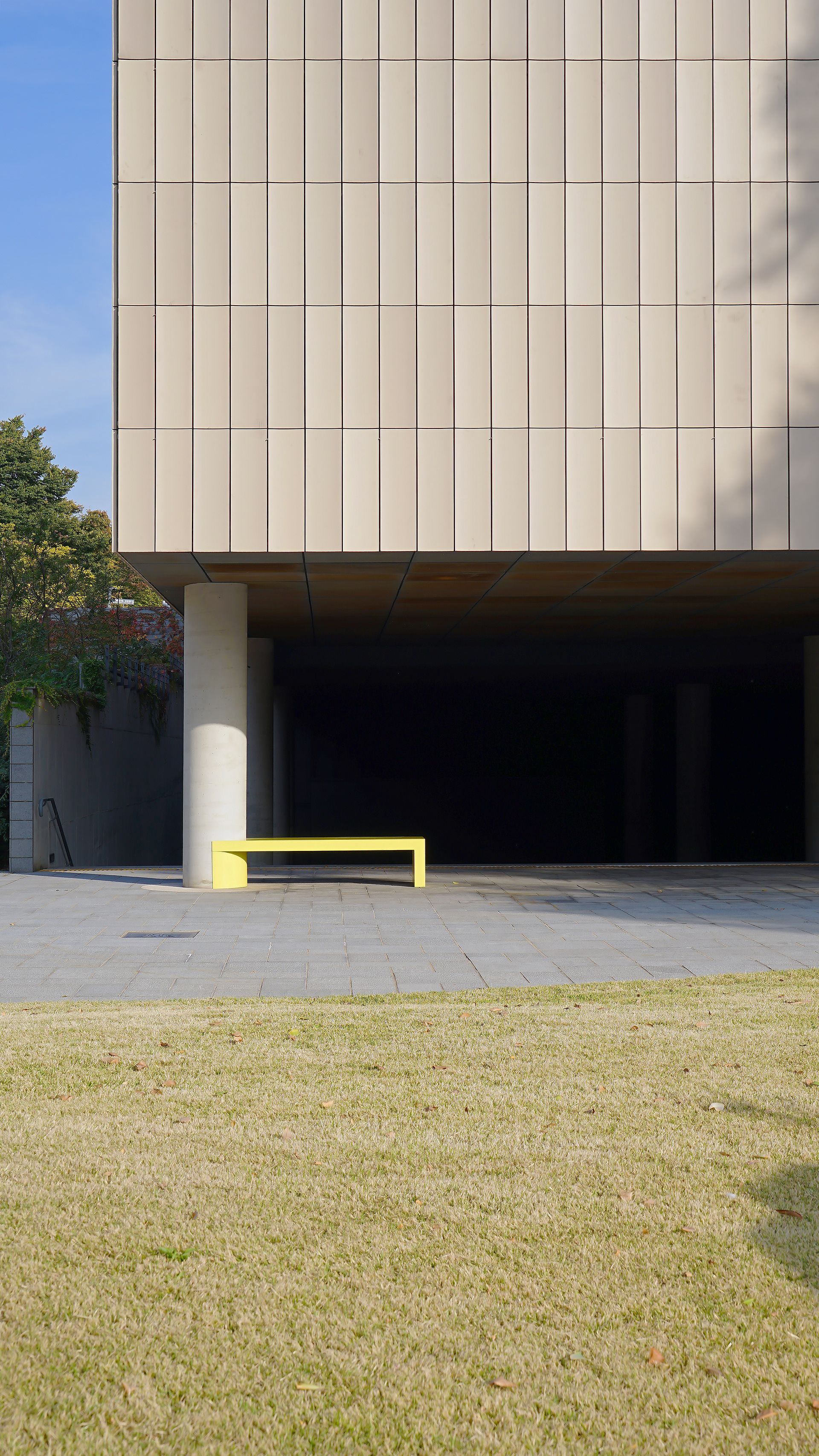
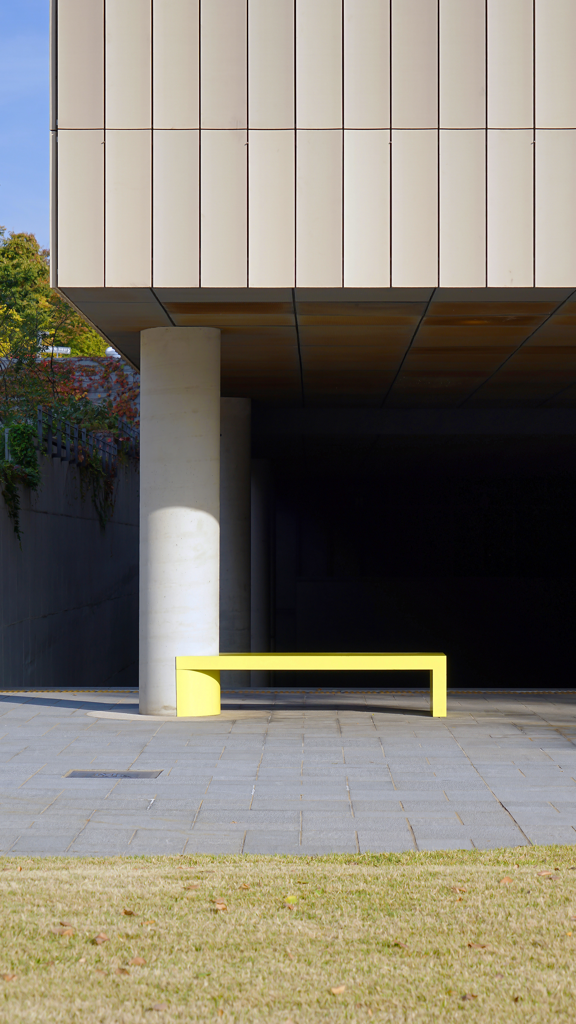
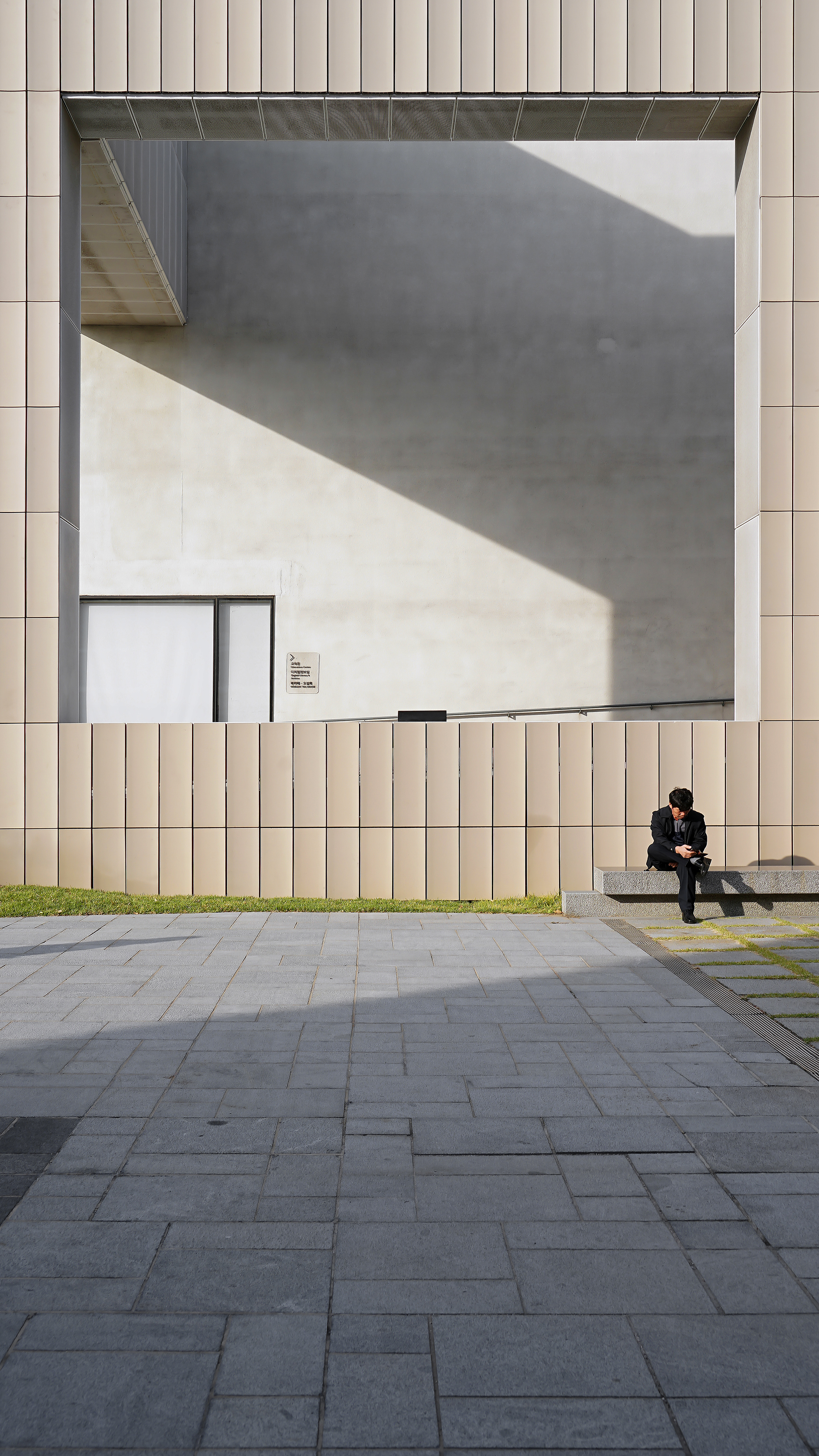
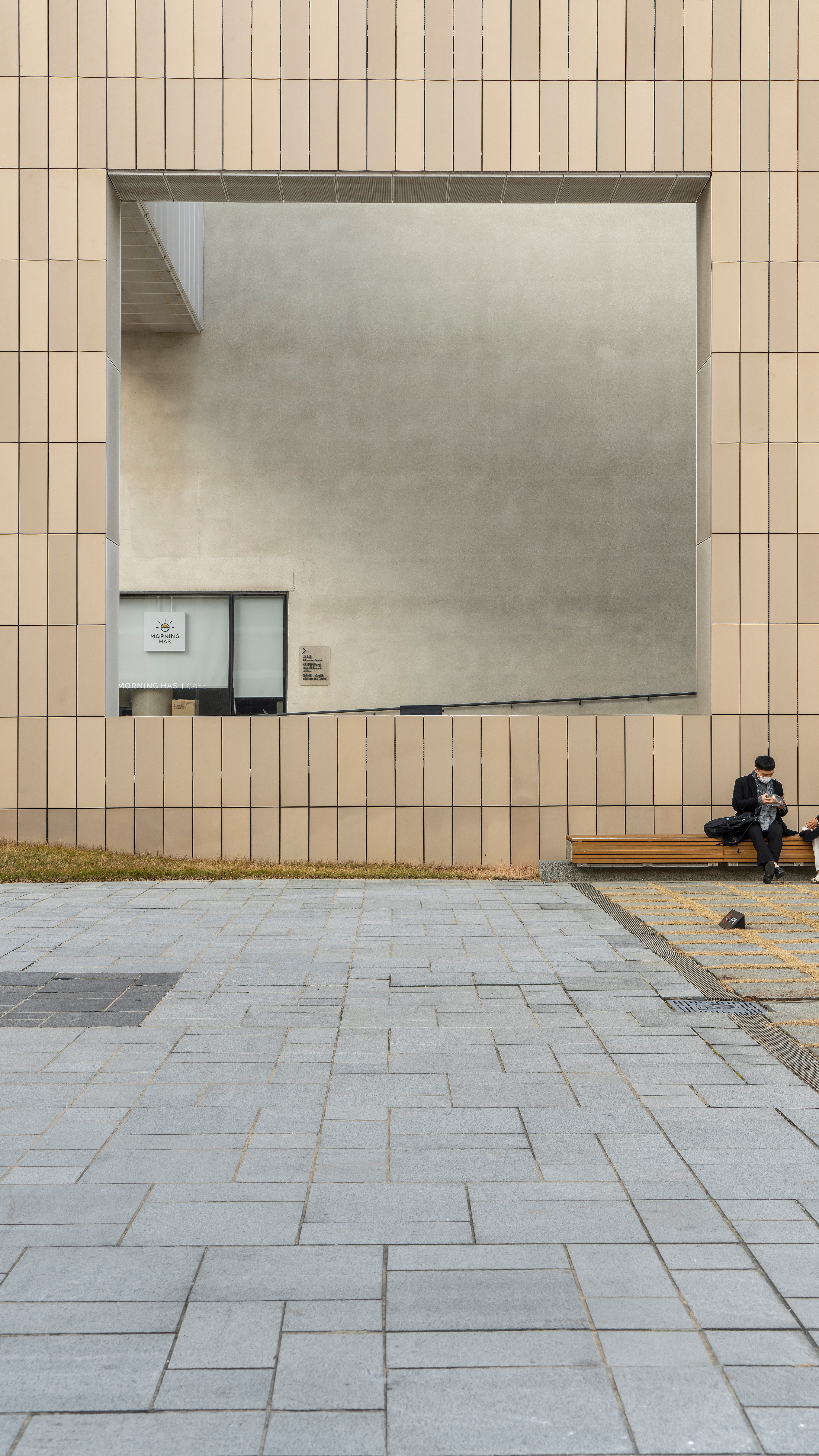
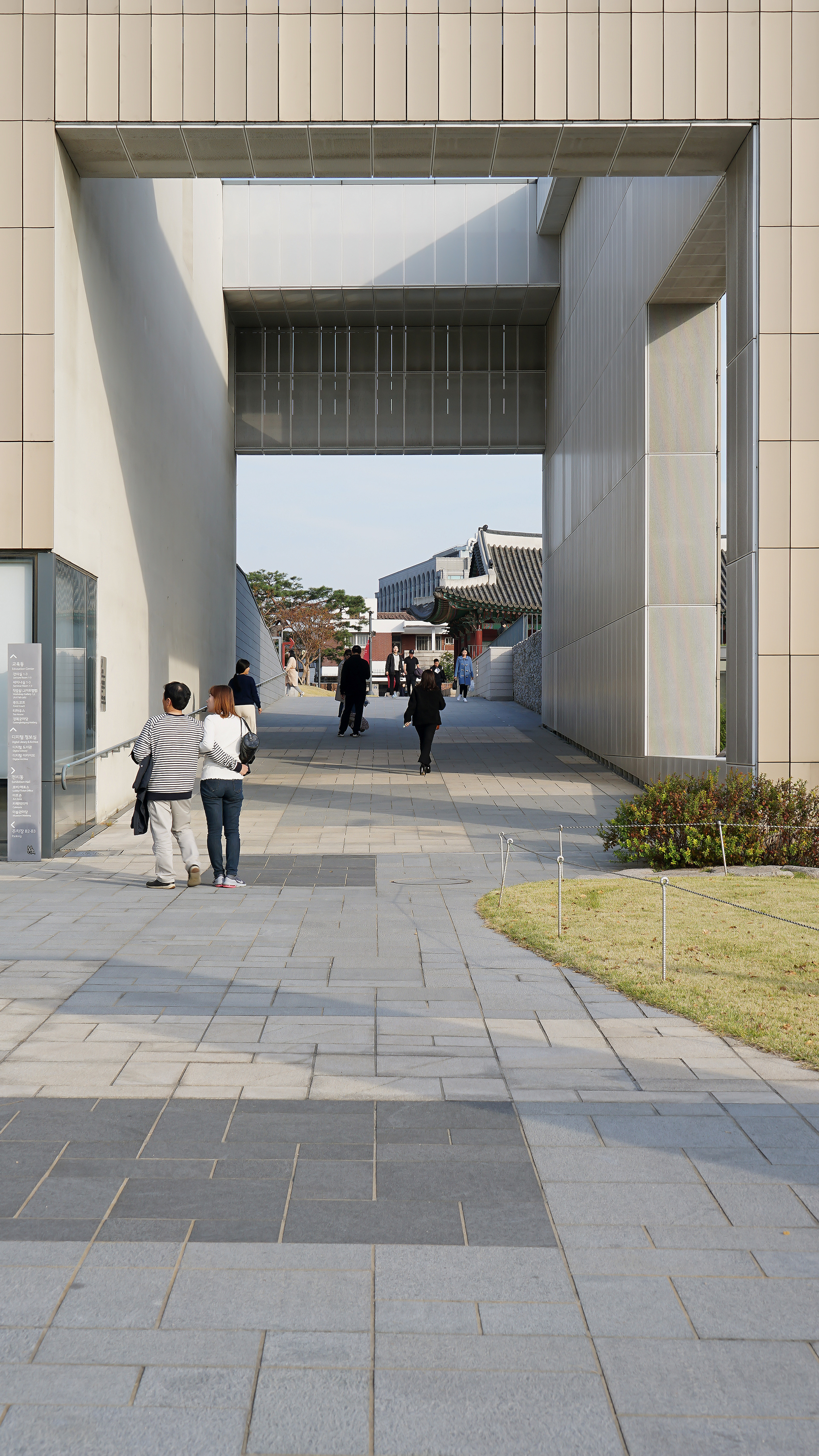
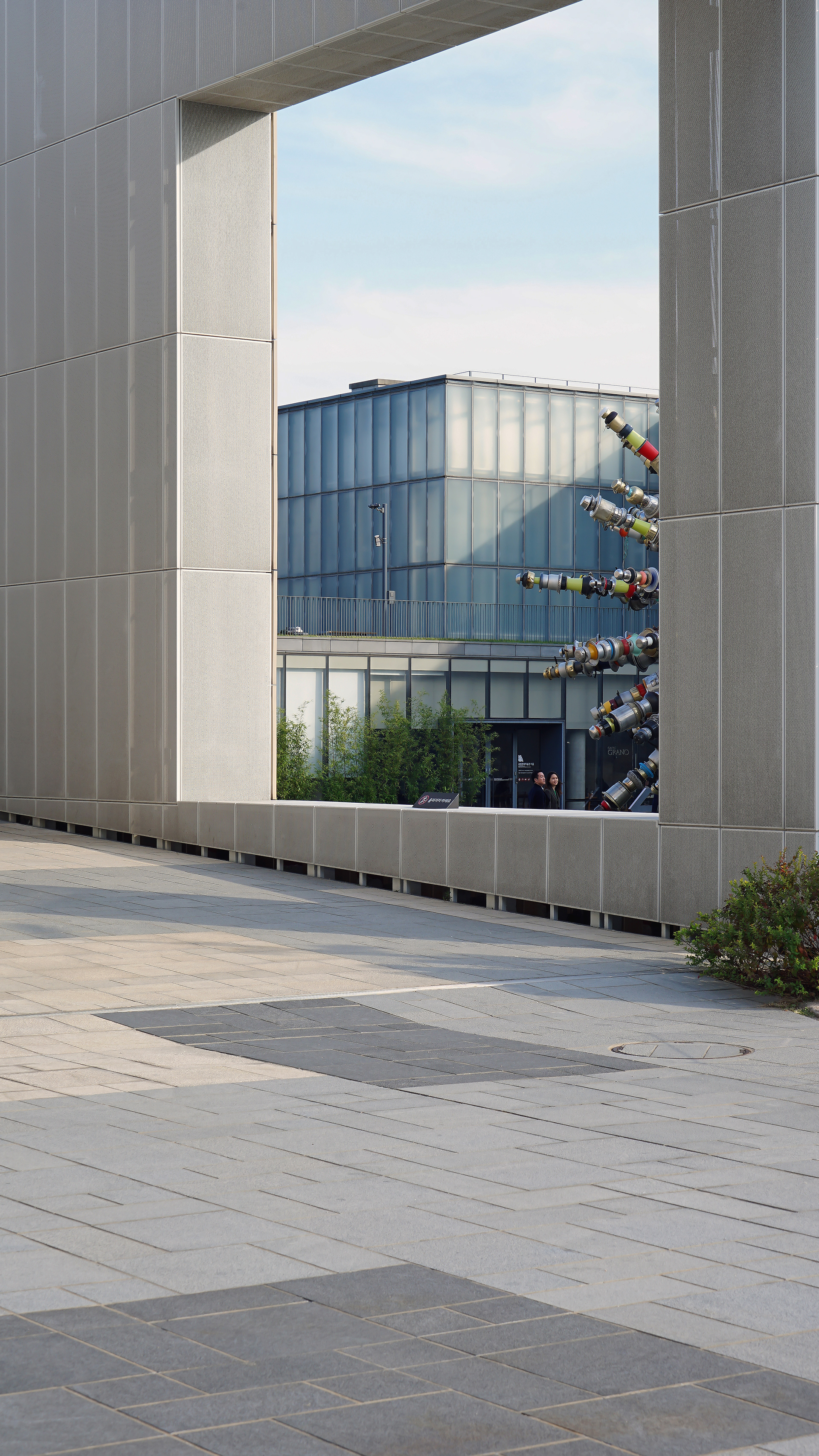
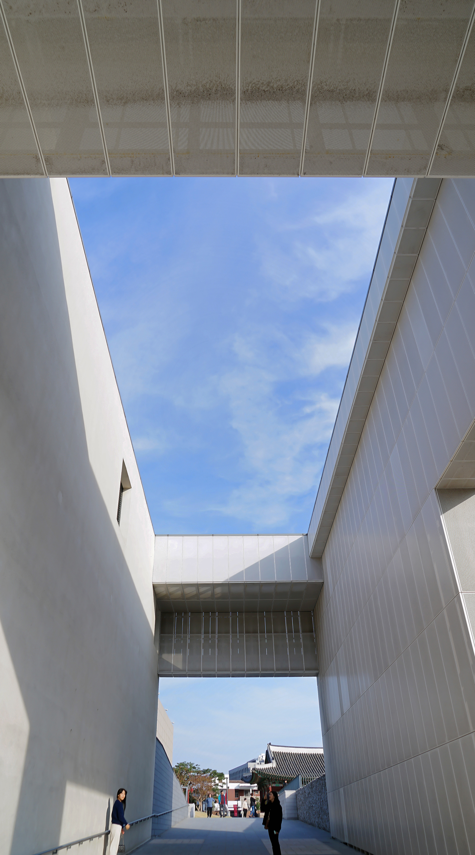
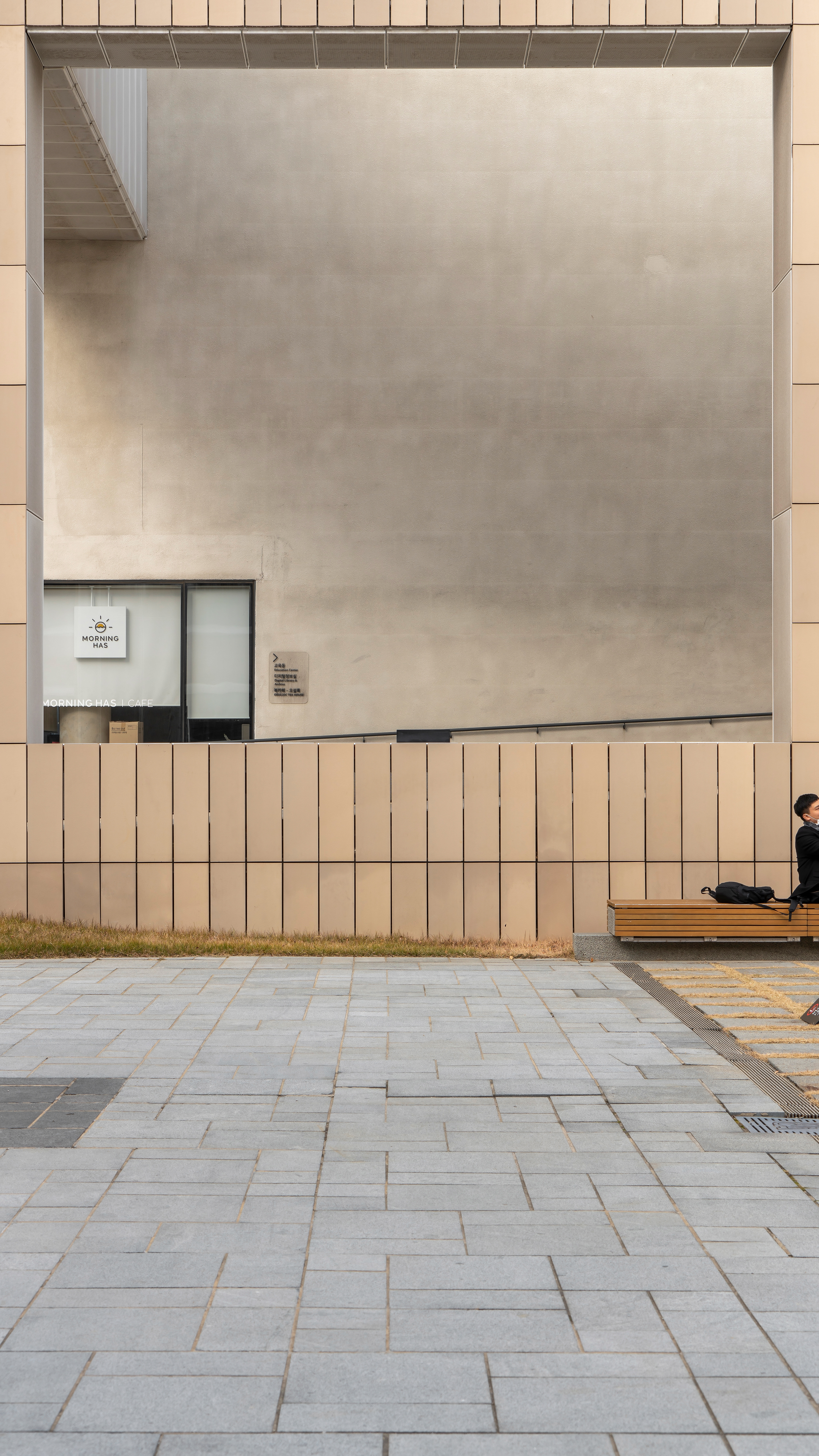
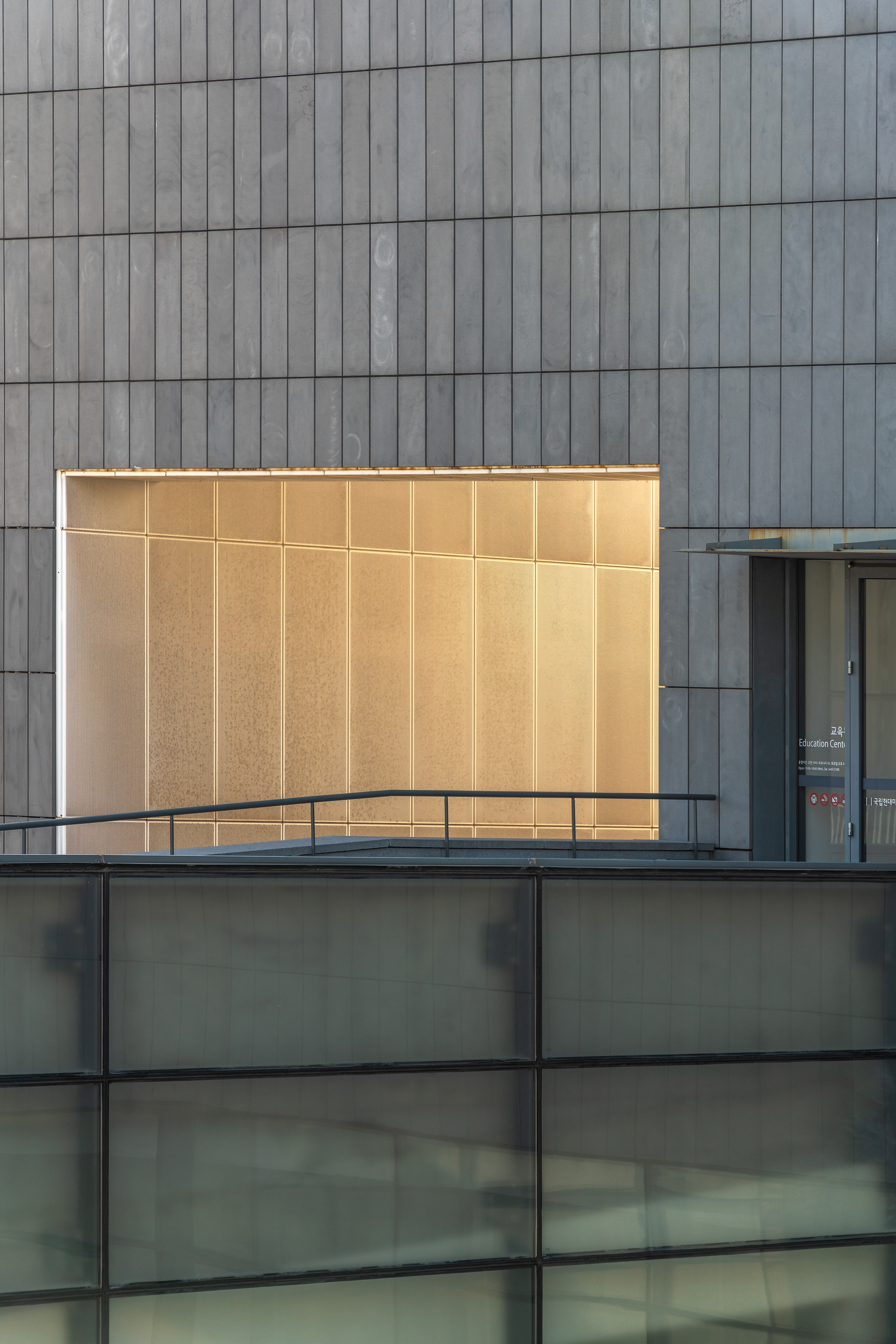
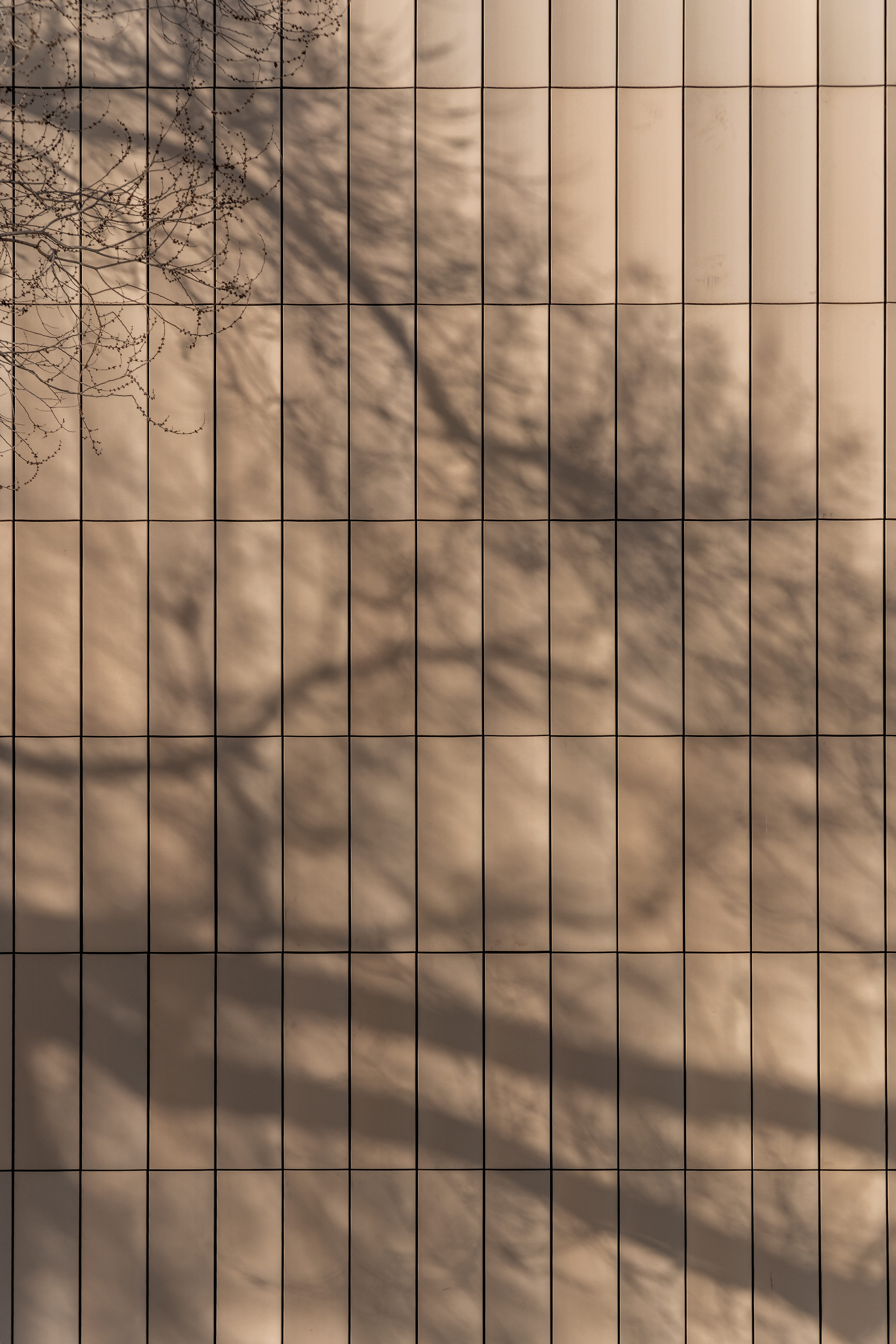
Central Yard And Outside Walkways .
When viewed from the outside, the National Museum of Modern and Contemporary Art Seoul Pavilion is mostly white panels.
Only the entrance for ticketing is made of red masonry bricks, so it looks like another building, but the inside is all connected.
Next to the ticketing area, there is a large central courtyard where large-scale installations and sculptures are installed at each exhibition.
The square-shaped panel used as the exterior material and the tile shape of the floor maintain the unity,
which is in stark contrast to the traditional Korean building.
───────────────
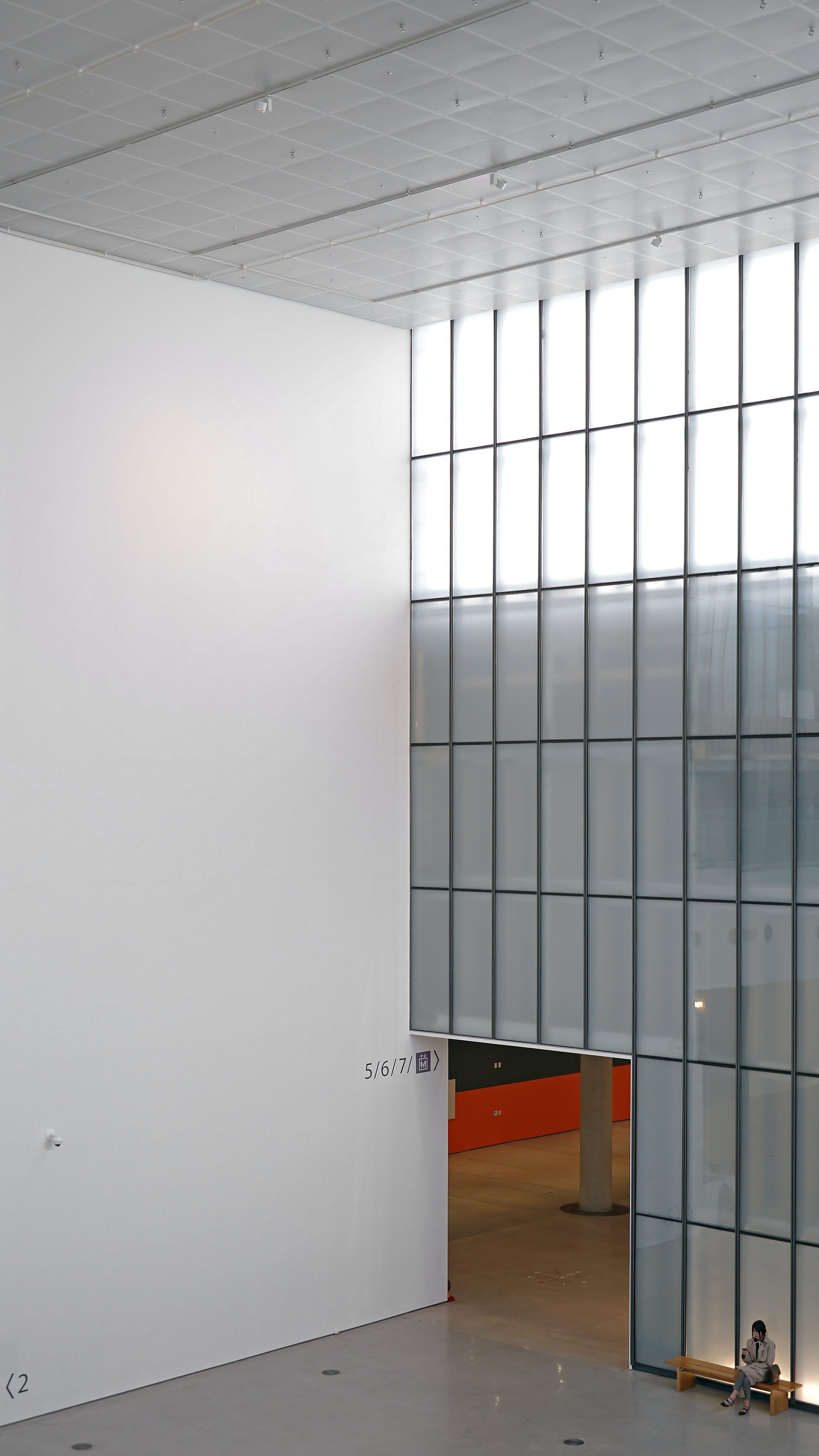
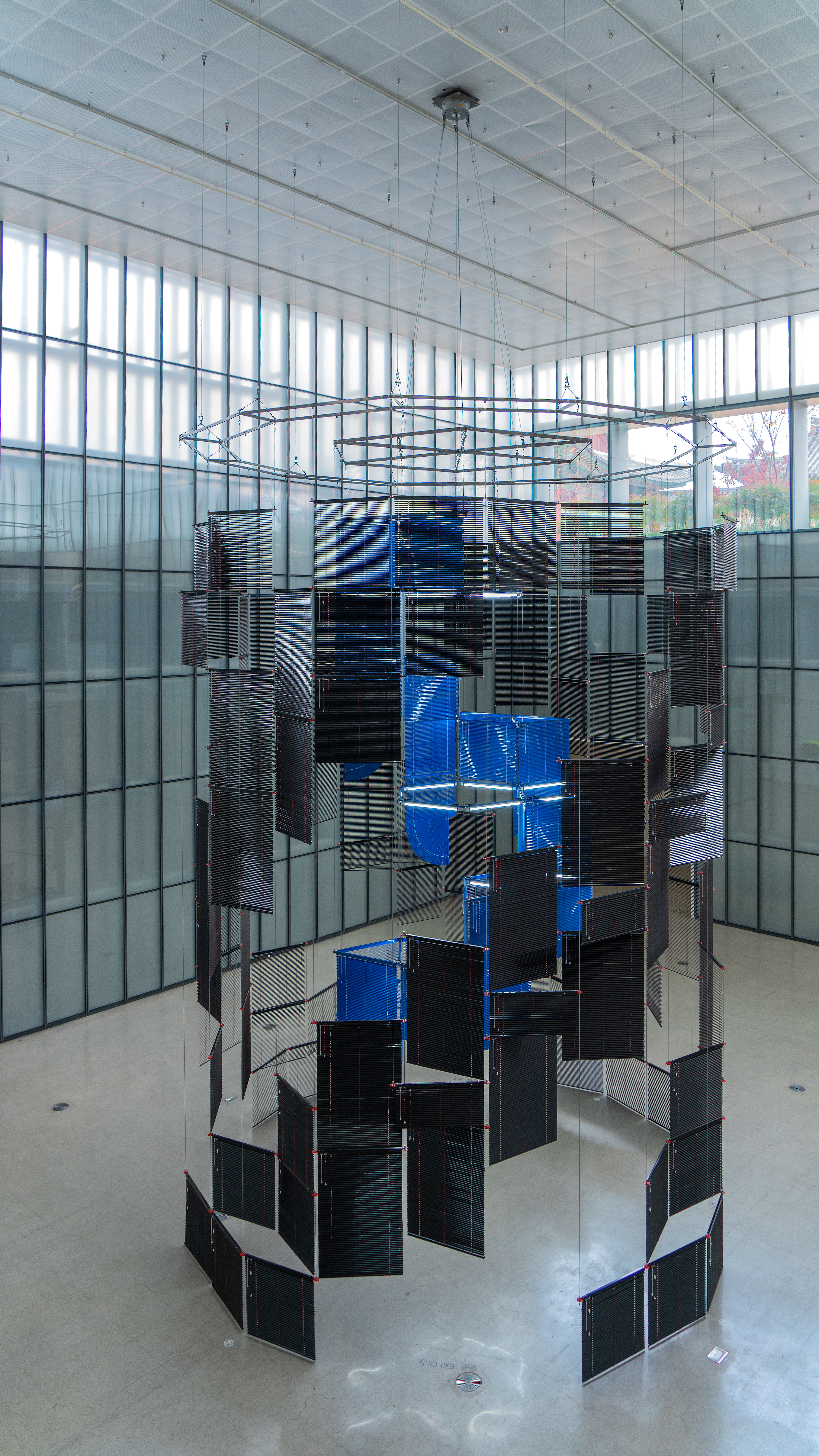
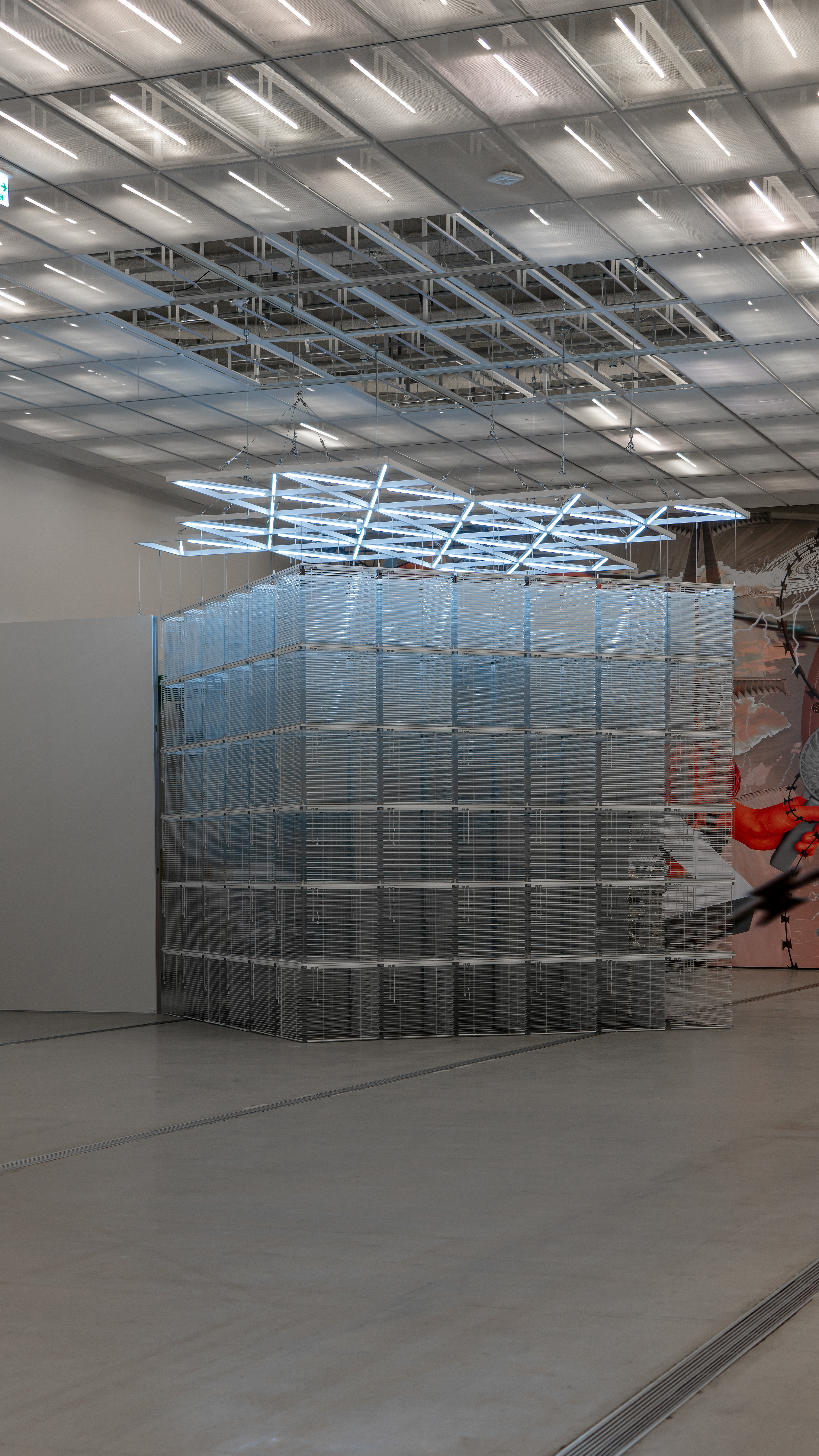

Exhibition Space .
As soon as you enter the interior, the ceiling and side walls are transparent everywhere,
so the sunlight pouring into the interior is beautiful.
Due to the white panels and concrete painting, the interior is almost pure white.
The high floor height of the building gives a really big sense of space.
Due to the height of the floor, which seems to be three stories high,
the sound of footsteps and words of people reverberates like inside a cave.
The white concrete wall and the paneled ceiling seamlessly harmonize so that there is no awkward part looking around.
