───────────────
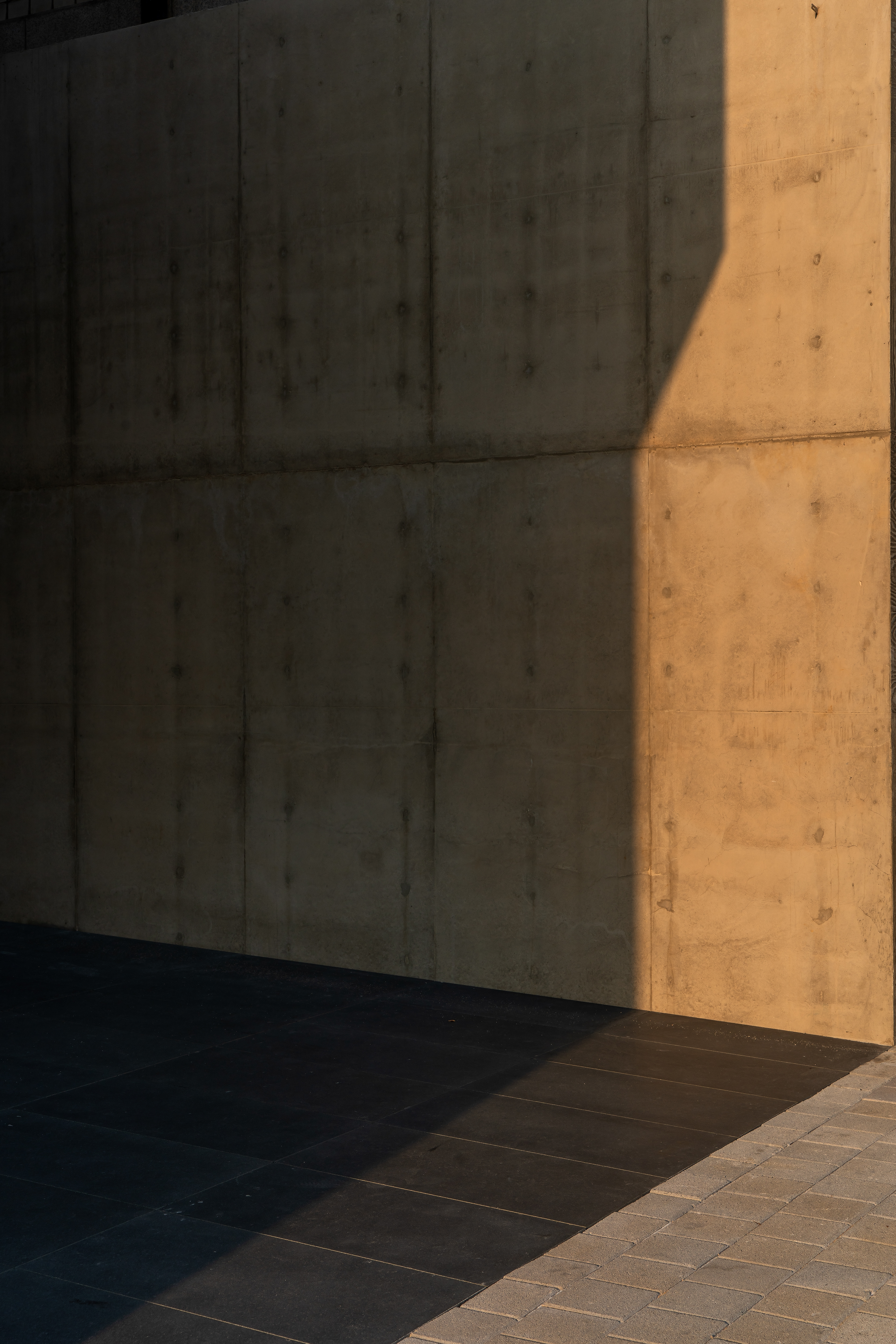
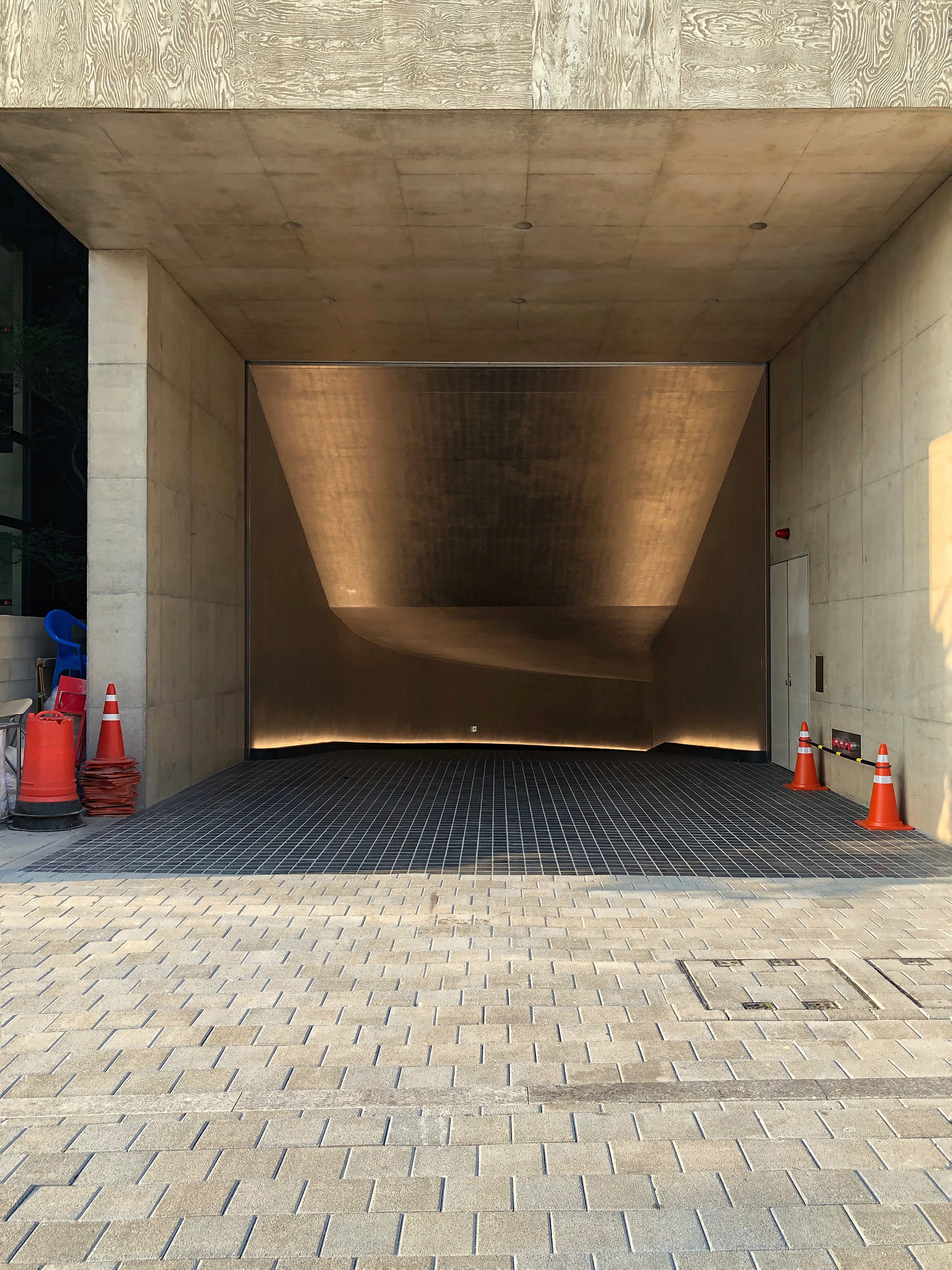
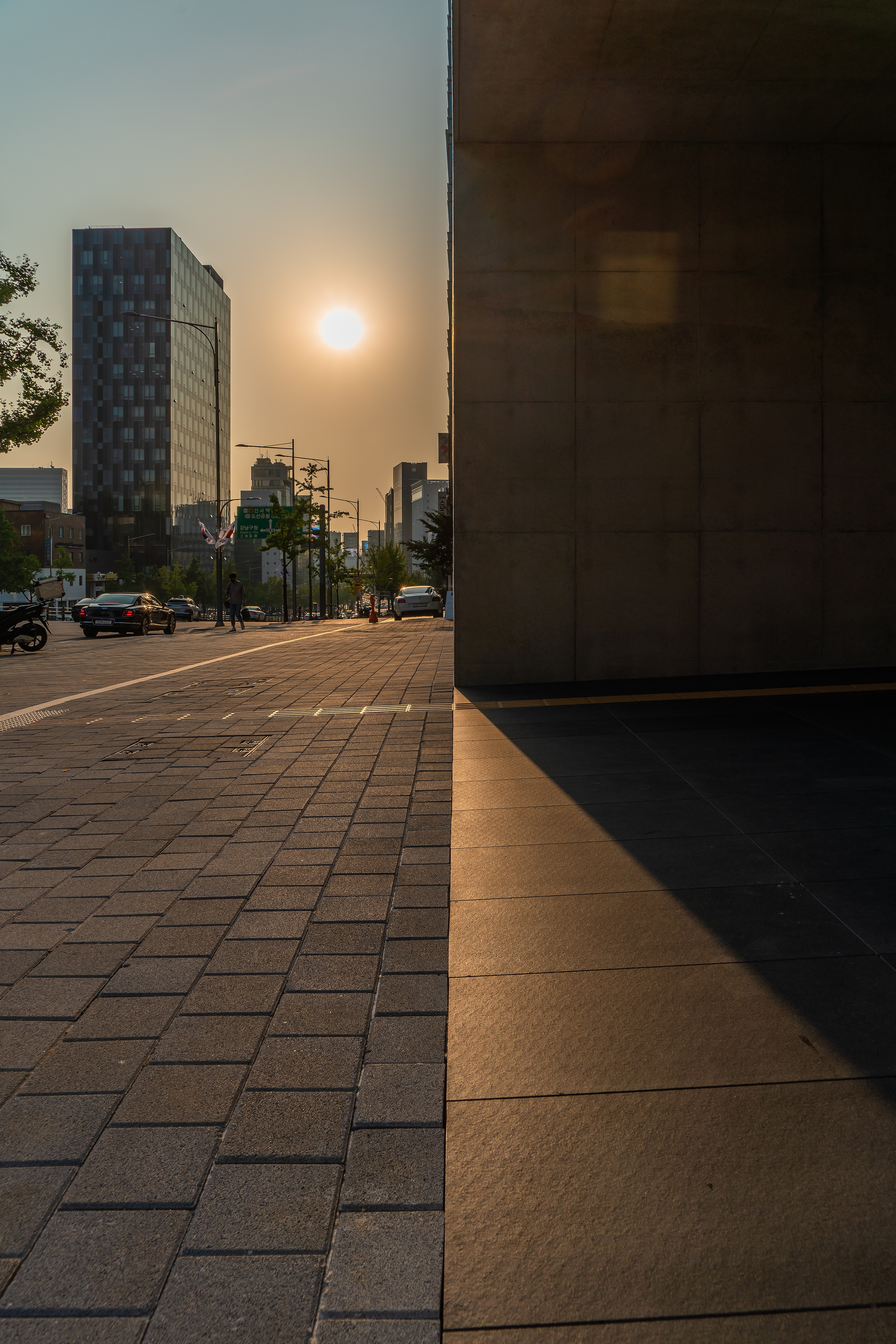
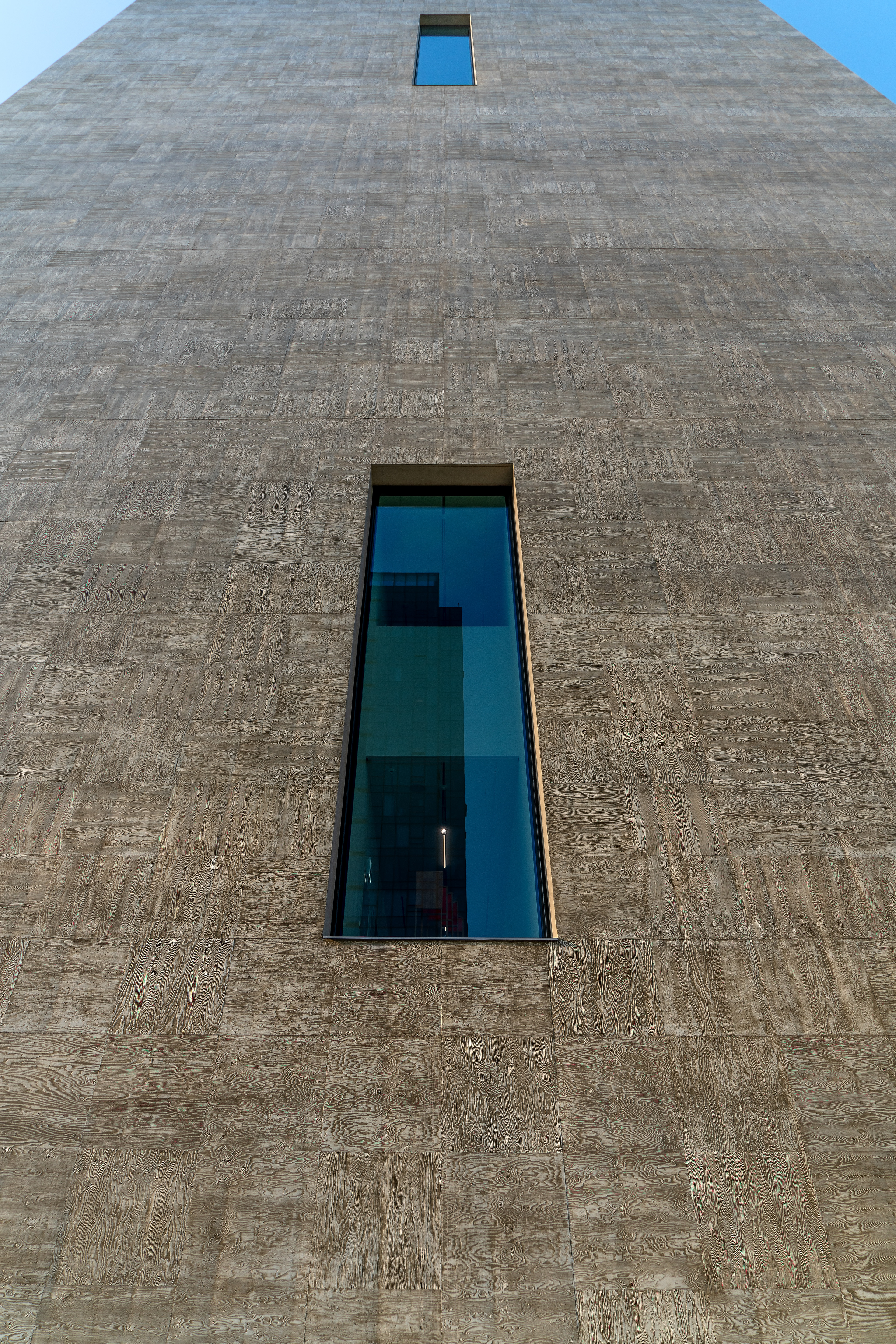
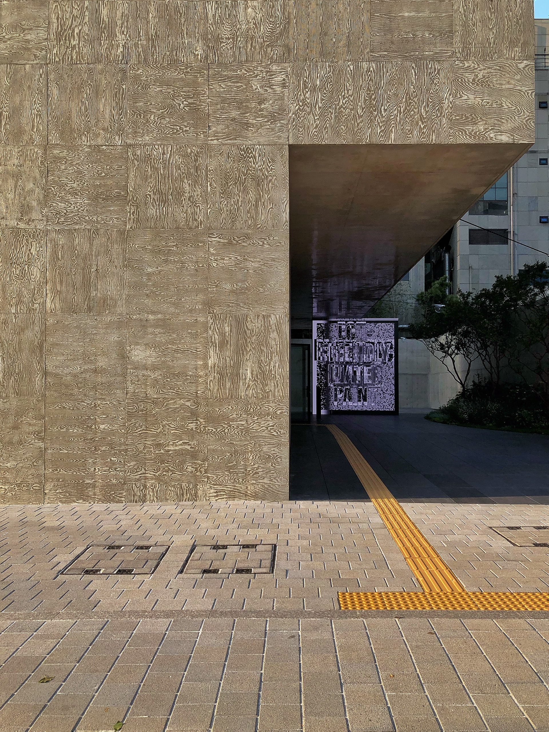
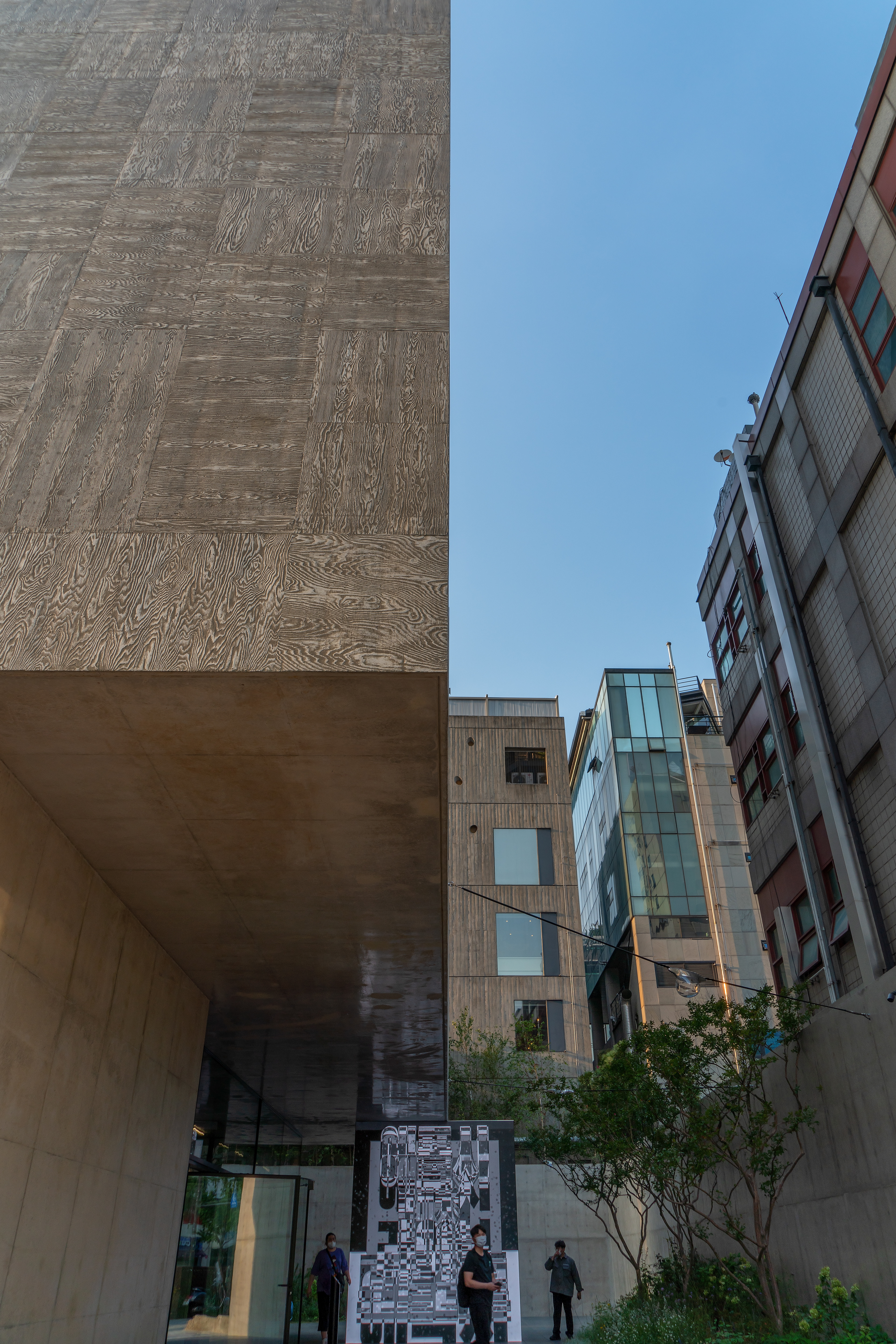
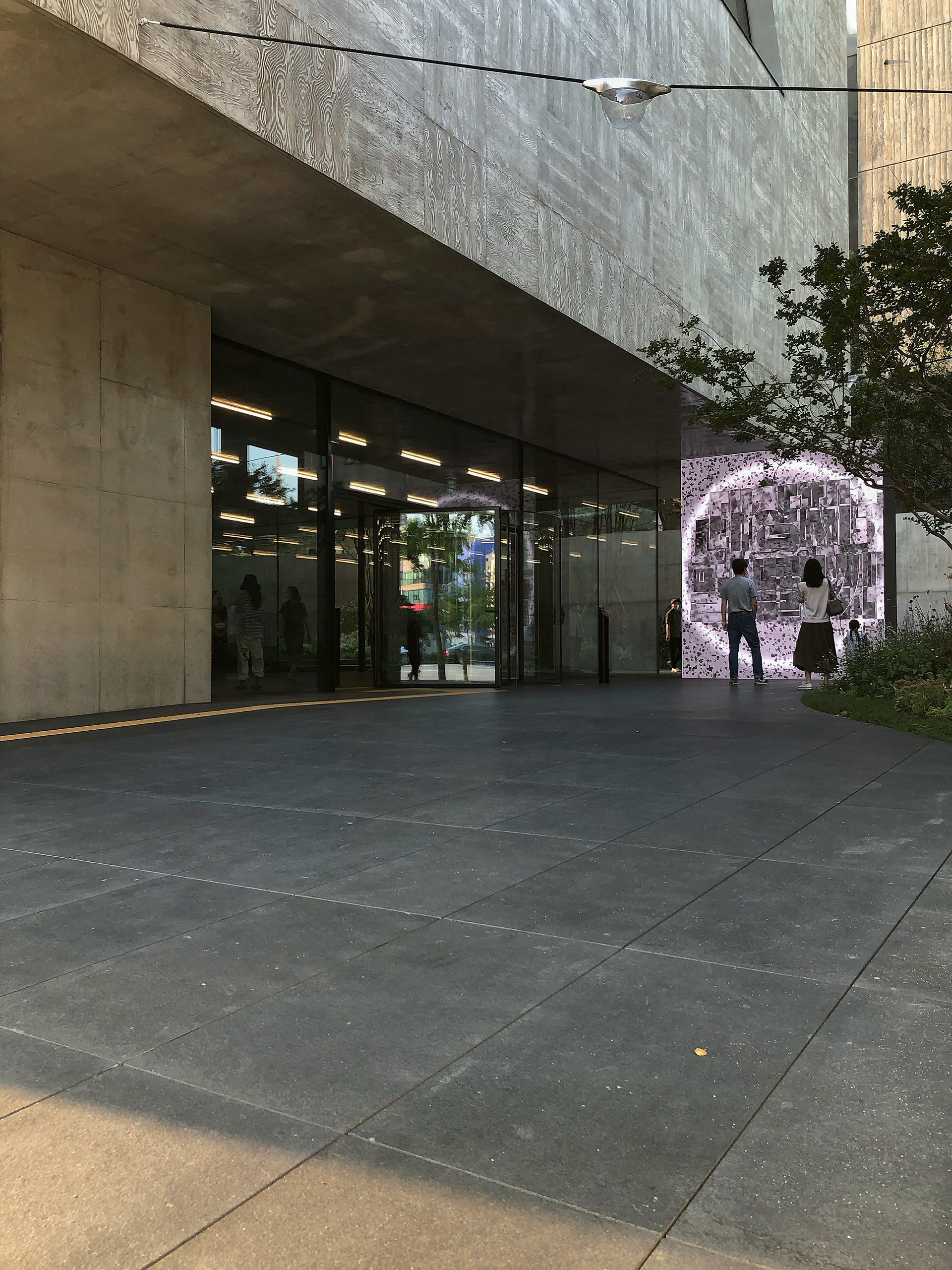
Exterior And Surroundings .
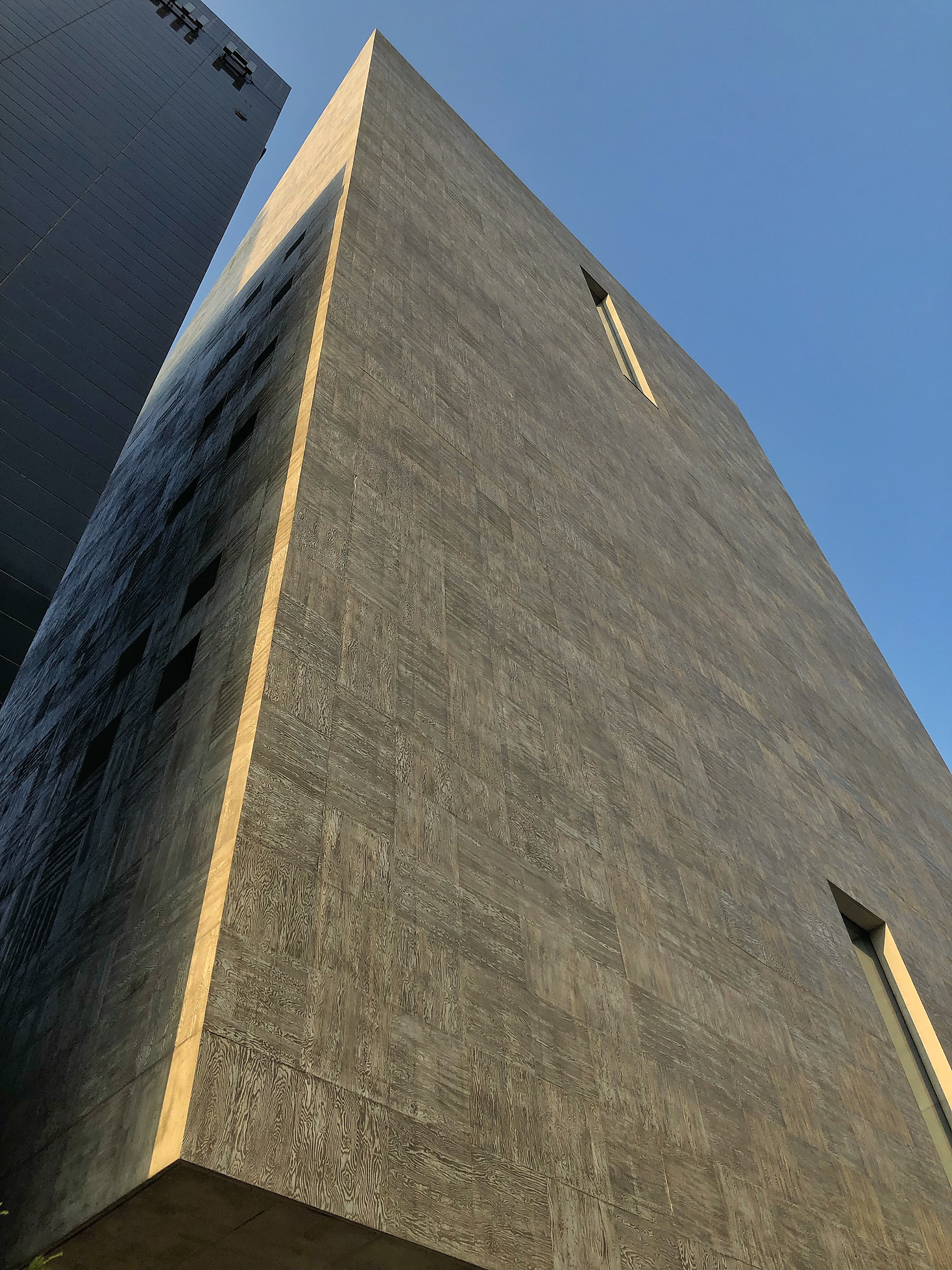
The new building of the Songeun Cultural Foundation can be seen at a glance because of its distinctly different appearance
from other buildings in the vicinity just by looking at an aerial photograph.
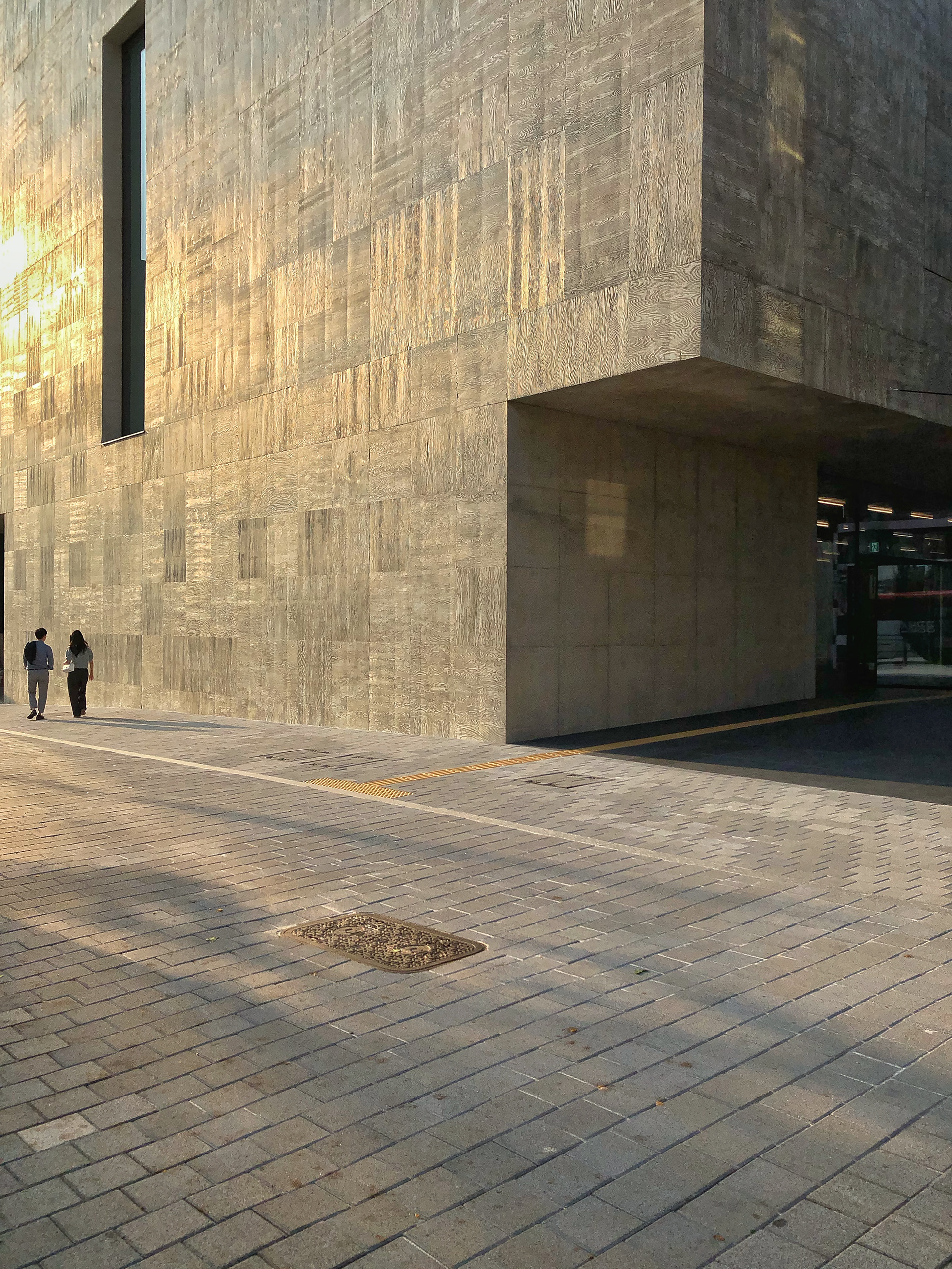
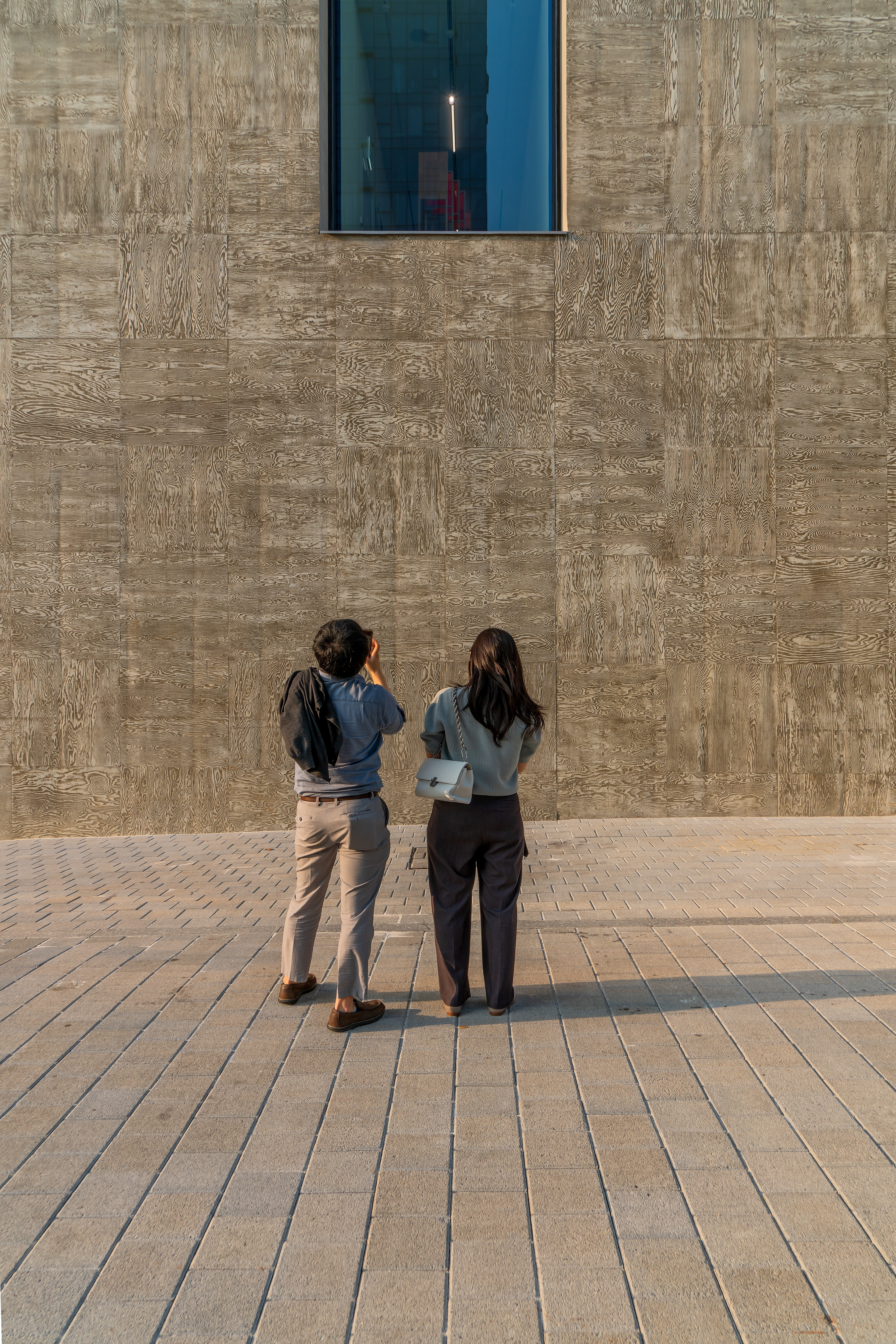
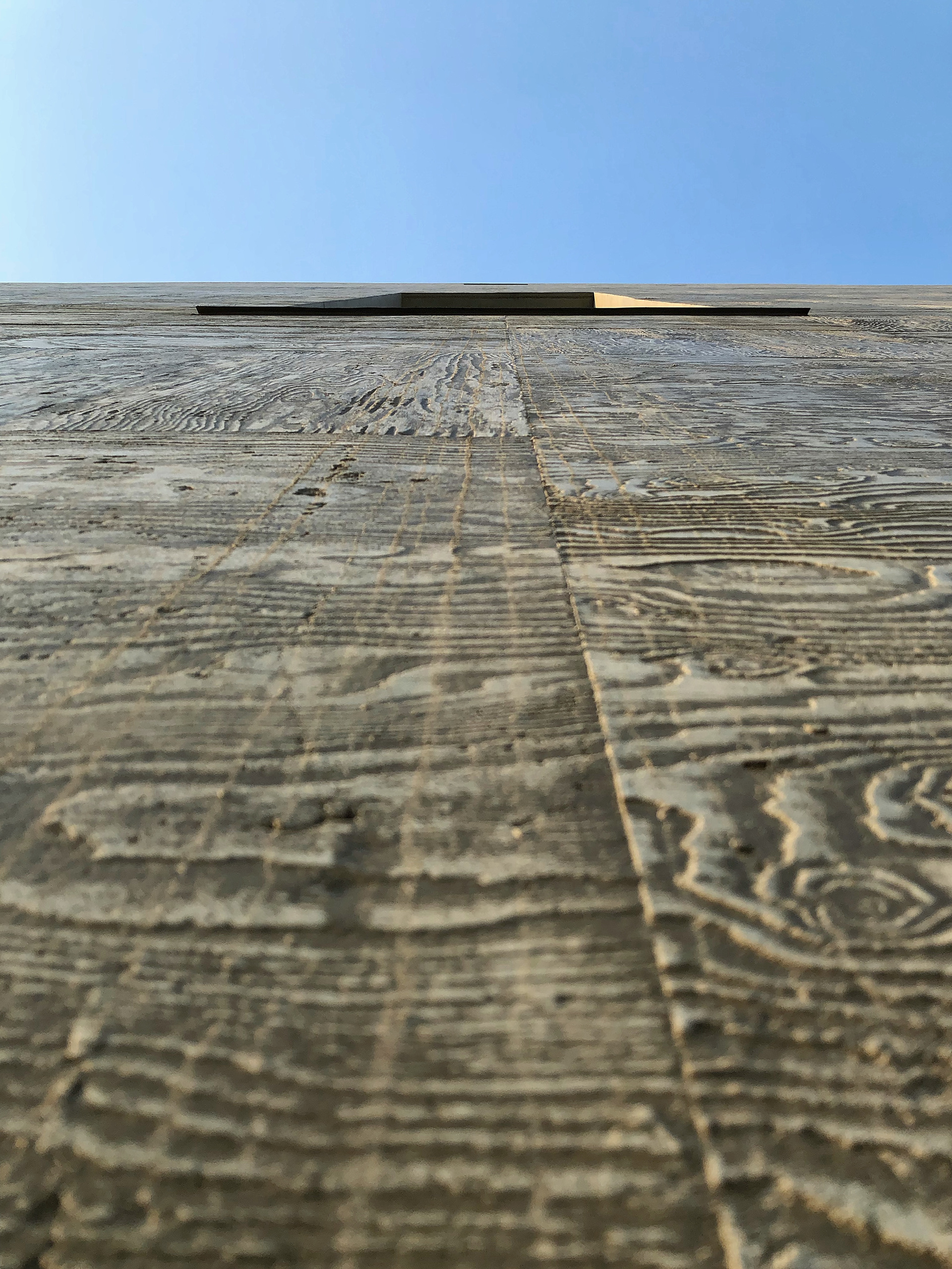
The exterior, reminiscent of a triangular ruler, is designed as if one wall were cut to form a perfect rectangle.
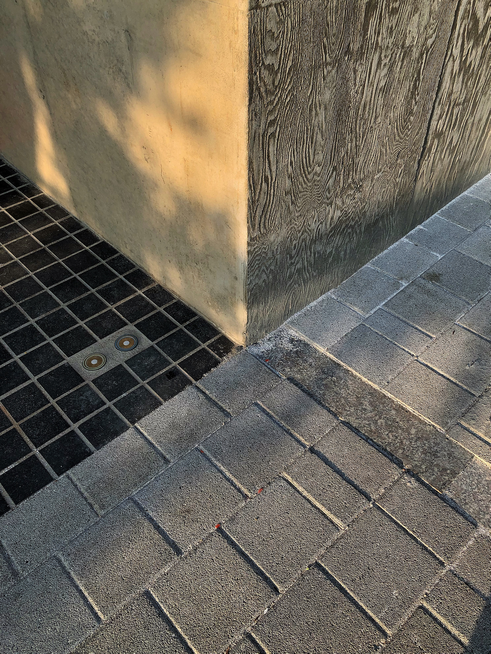
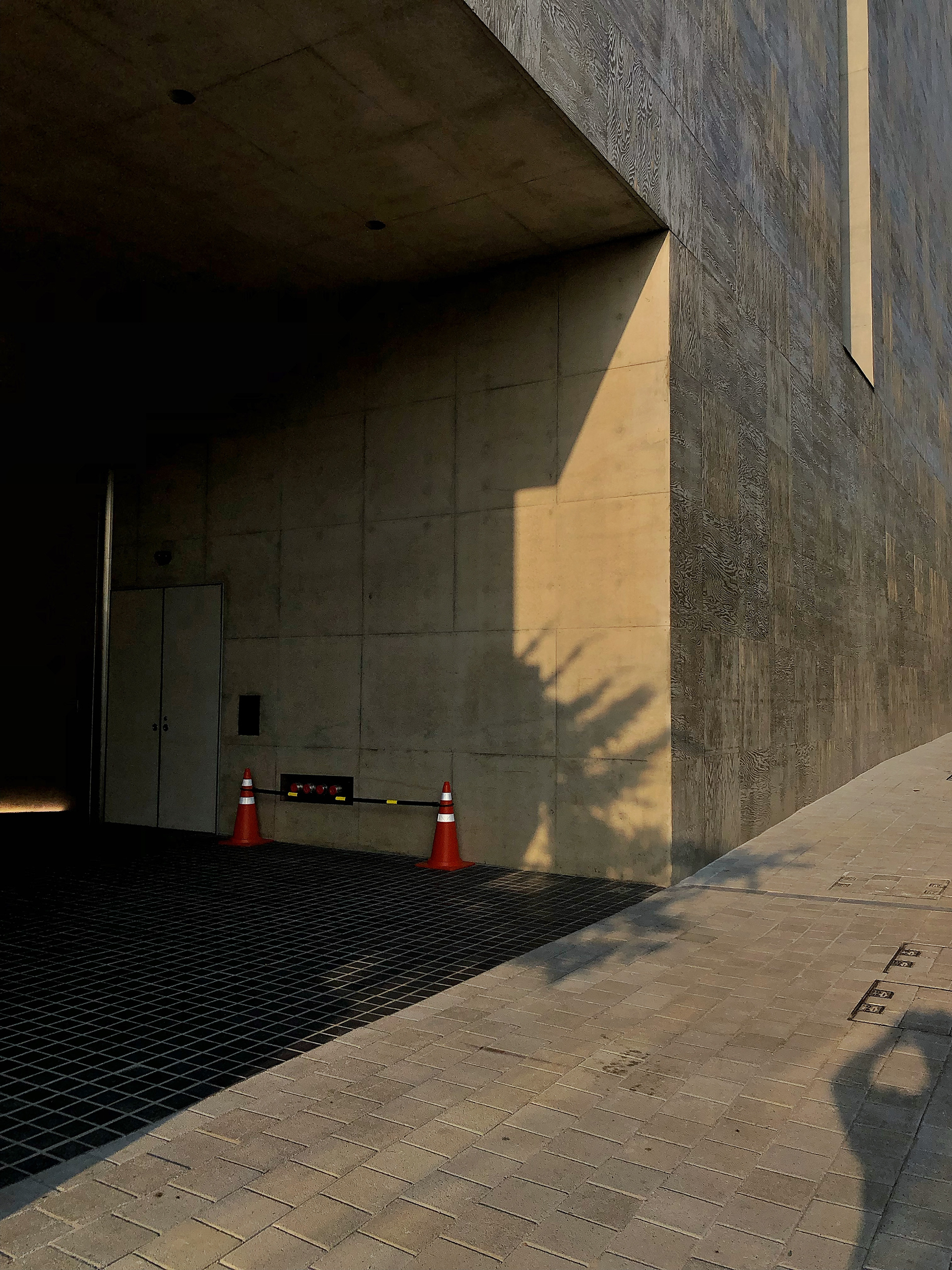
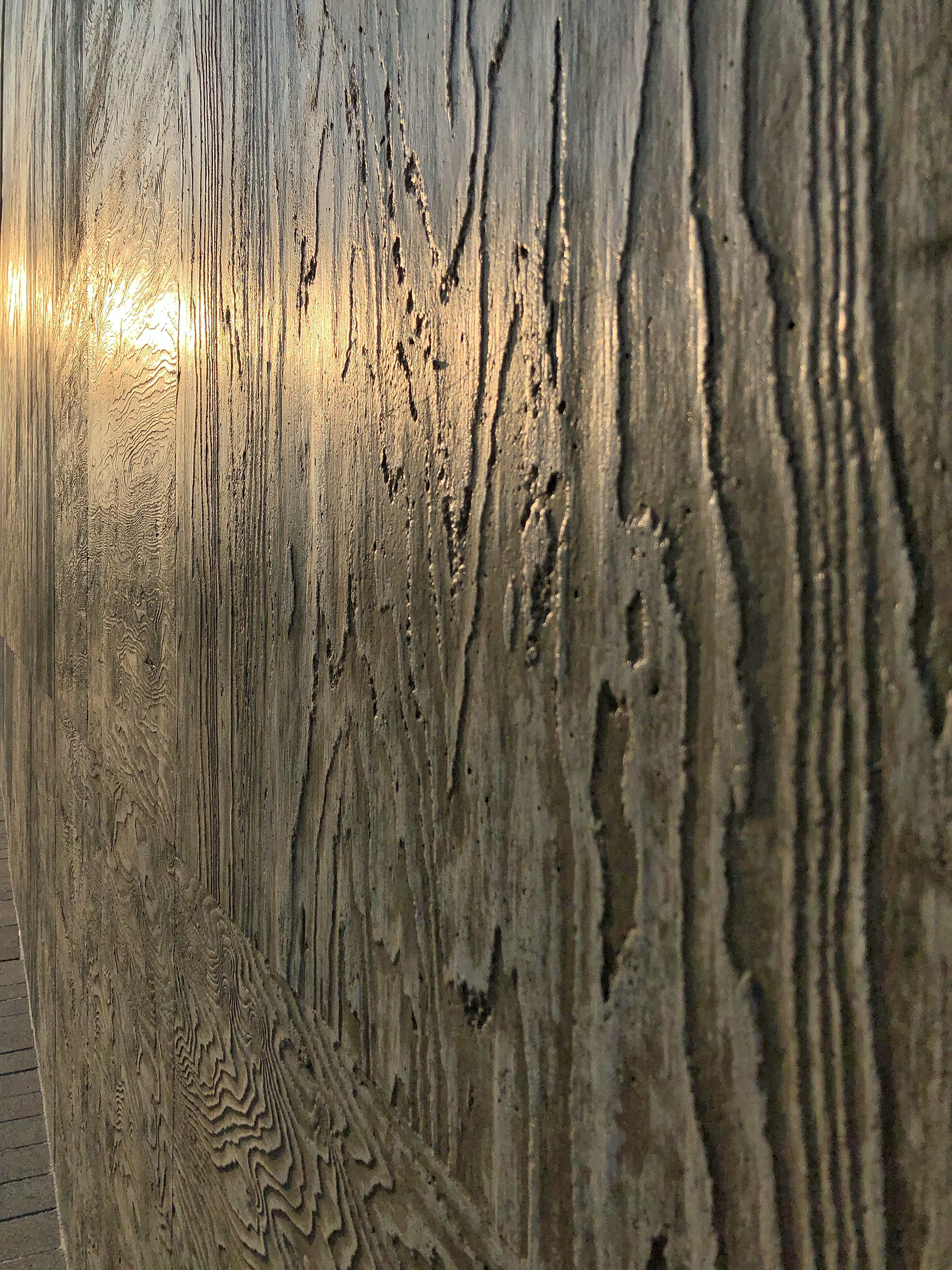
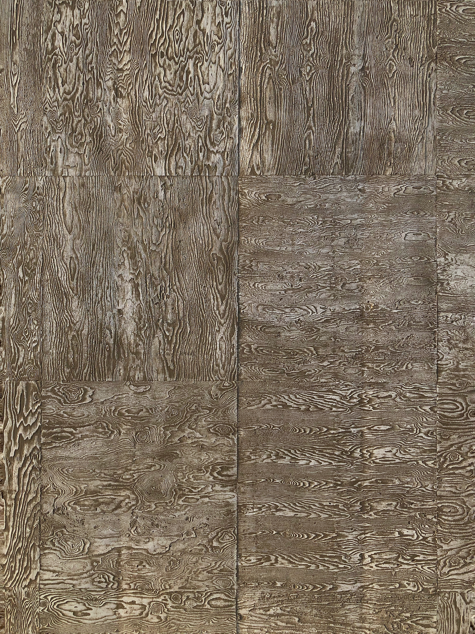
When you get closer and look at the exterior of the building,
the shape of the wood grain is so densely engraved that it resembles a tree ring pattern.
With the exception of the triangular-shaped windows that have been dug along the triangular facade on the side,
it is clean with no protrusions or corners.
───────────────
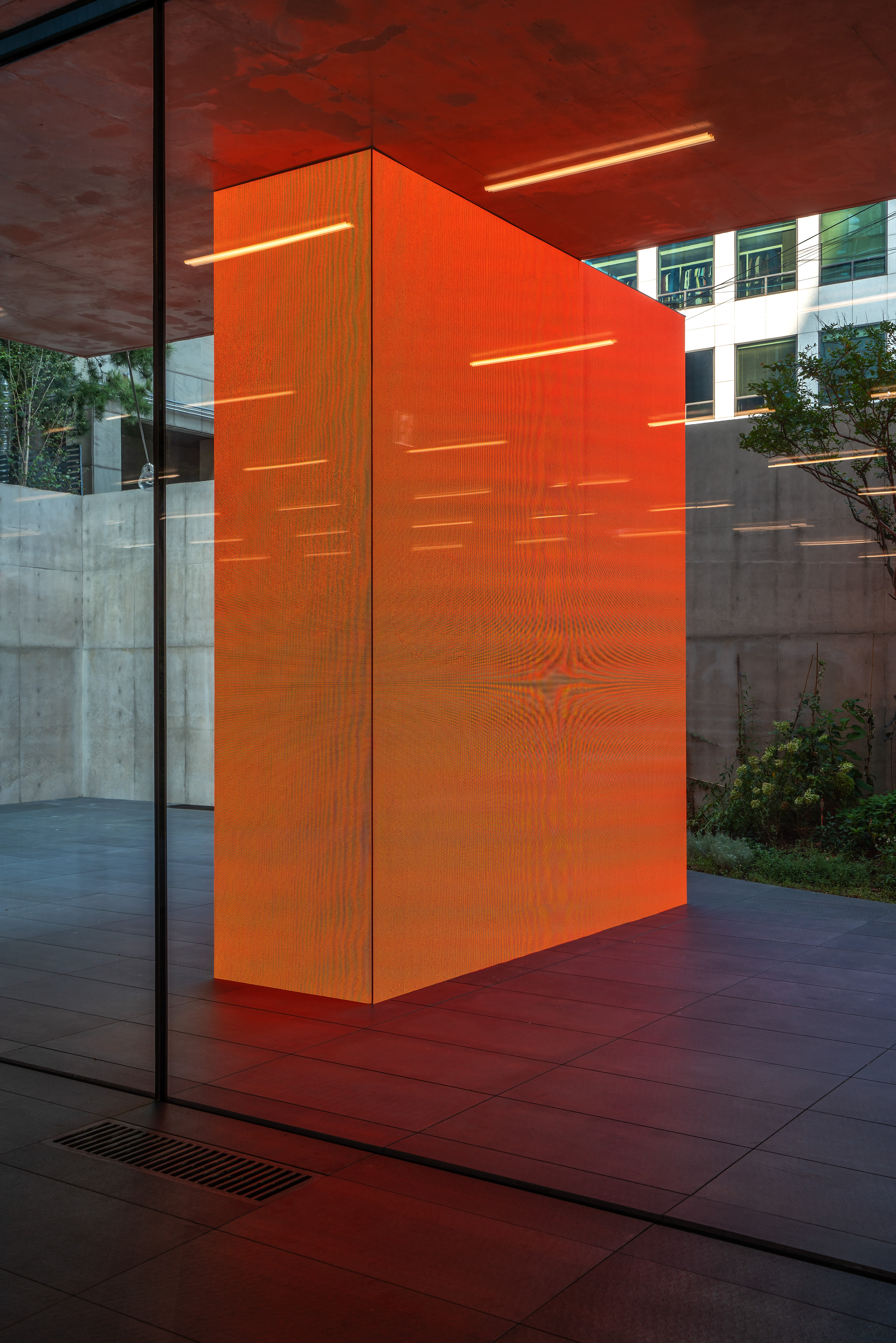
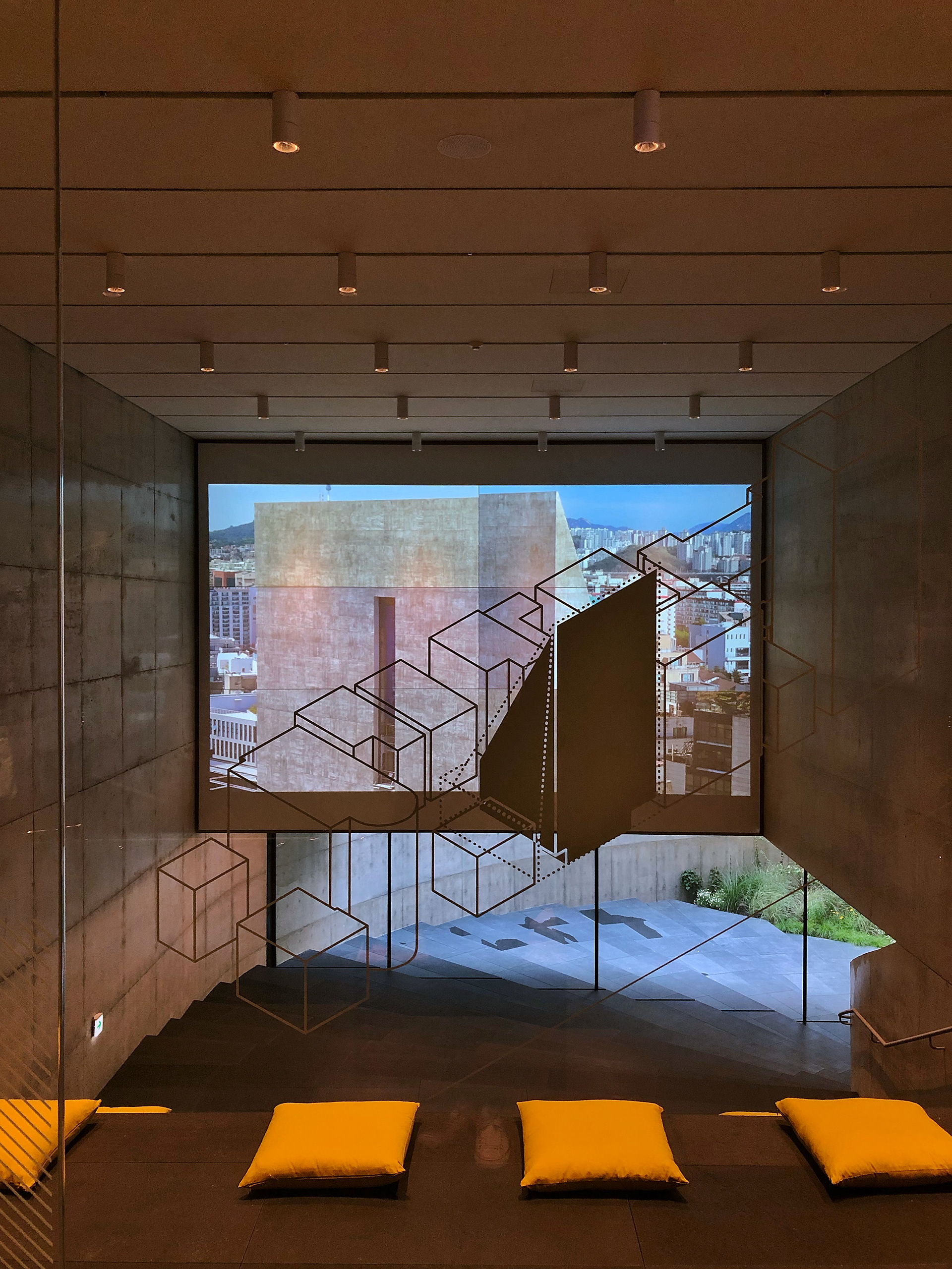
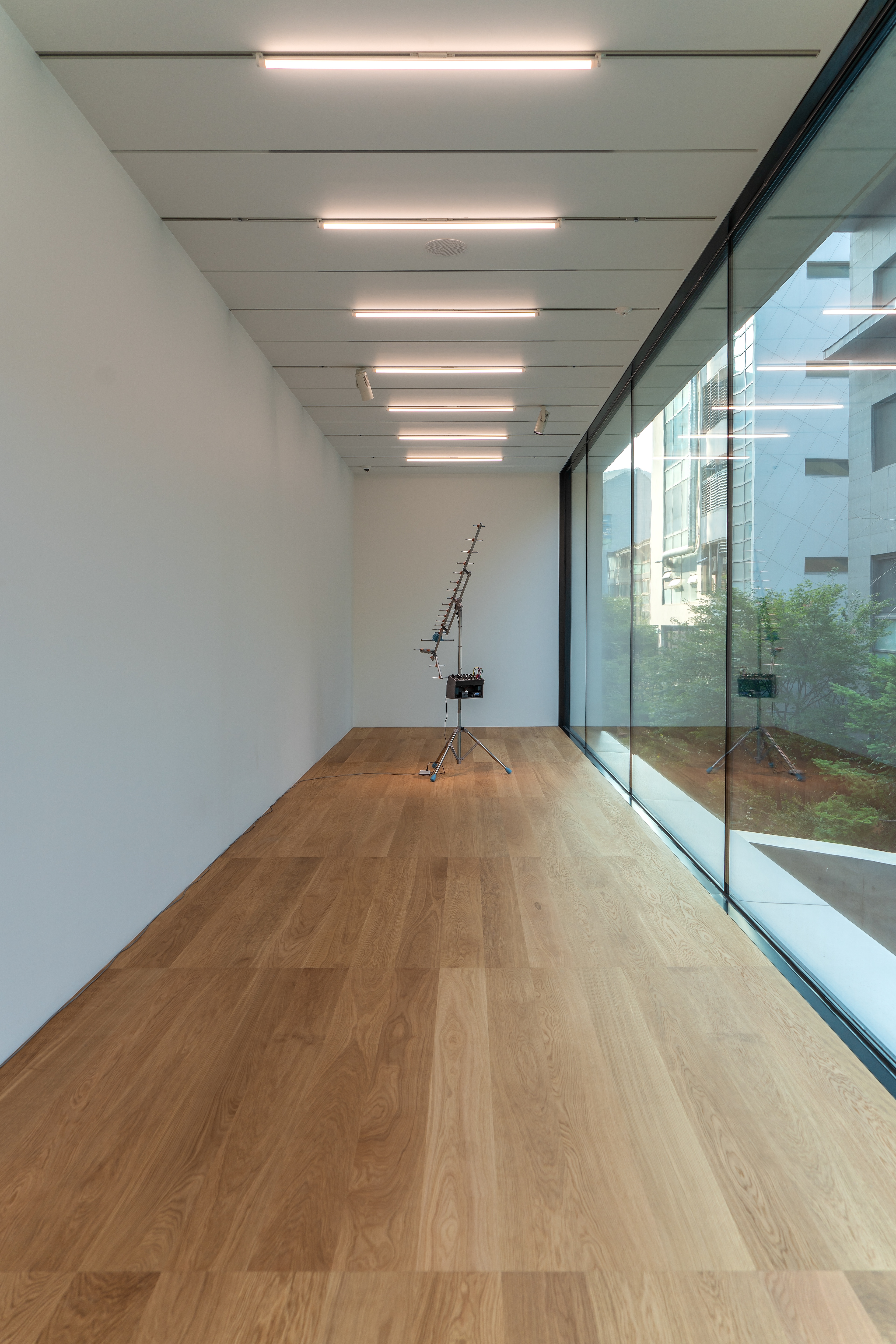
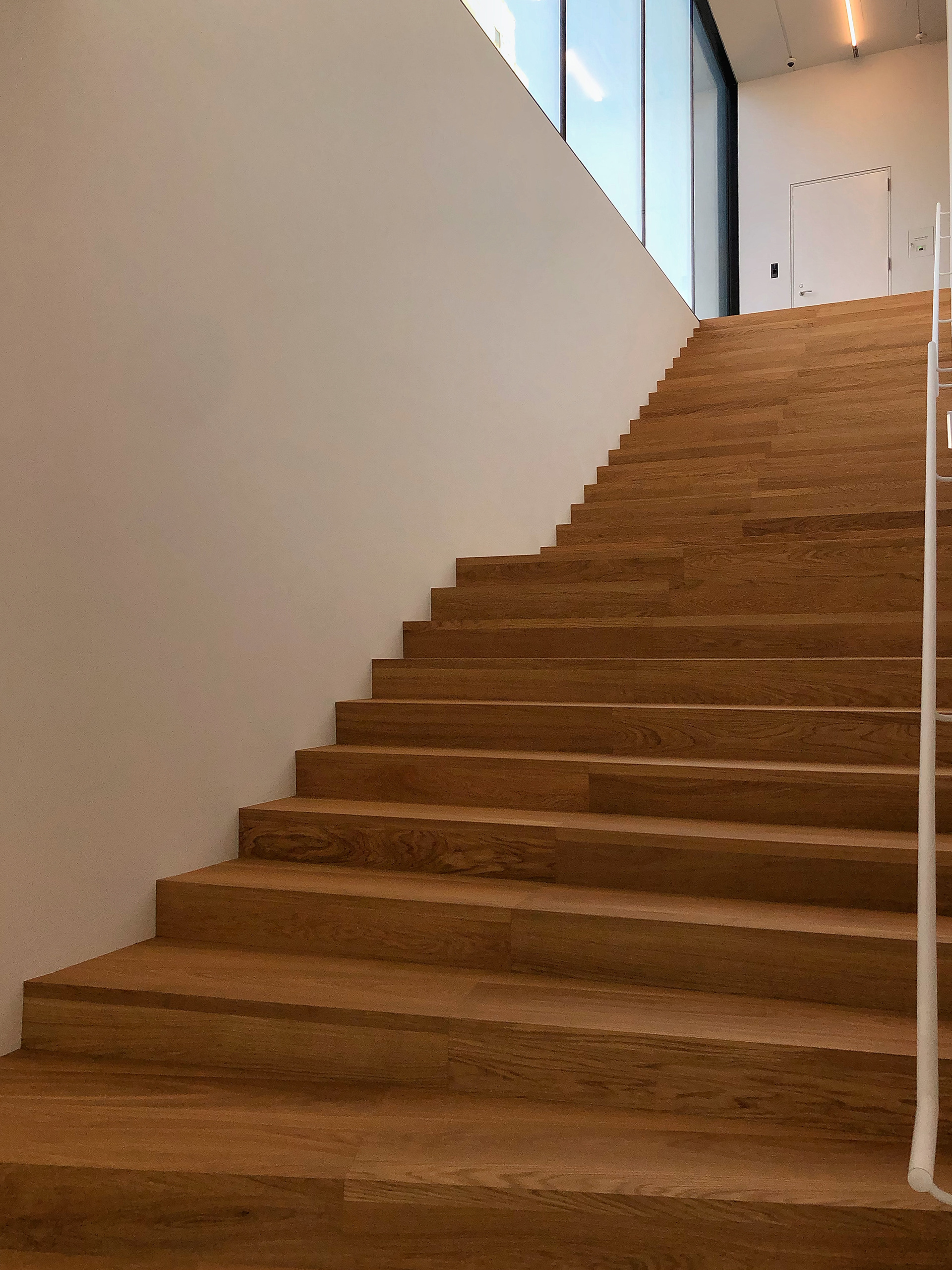
Information Desk & First Floor Space .
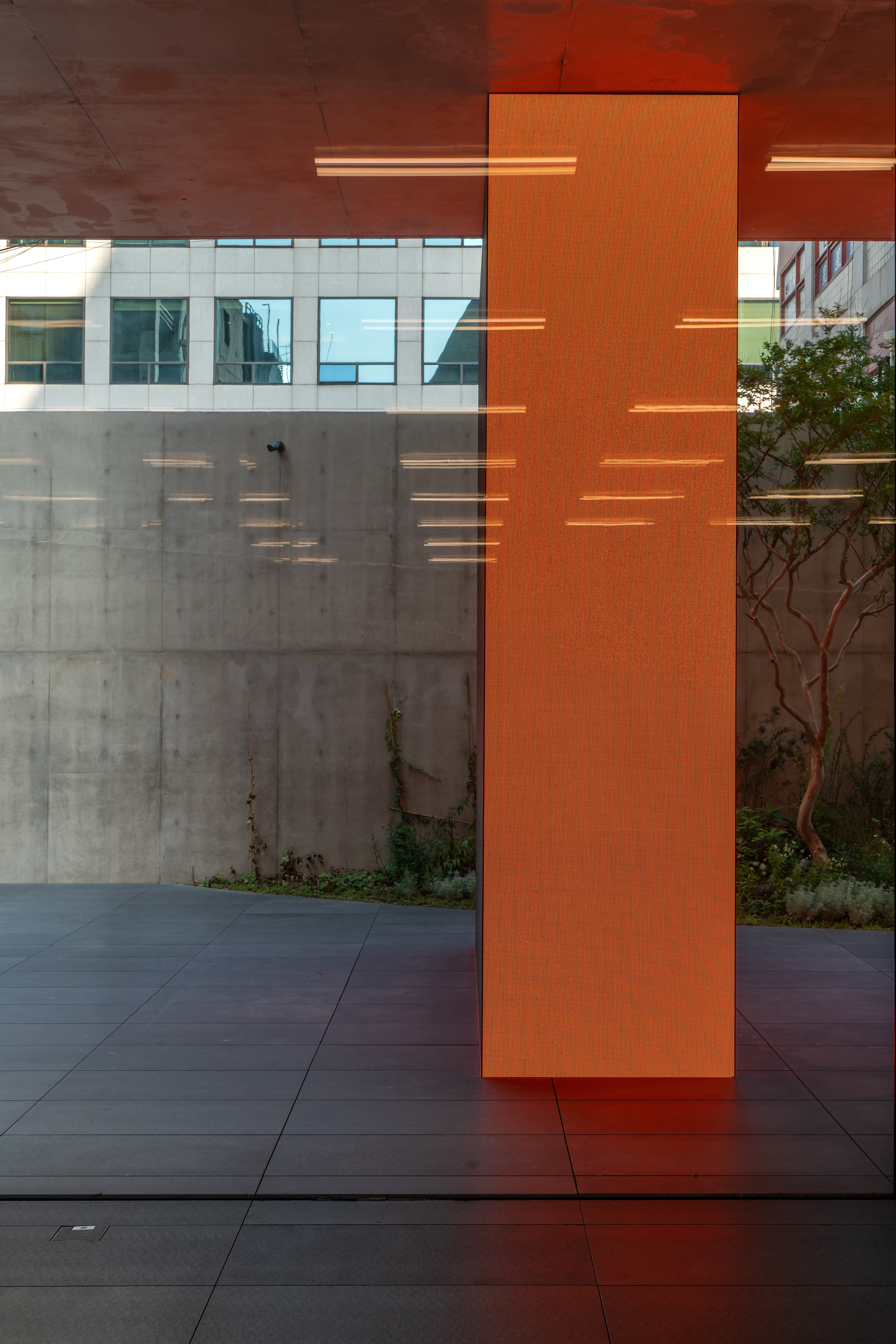
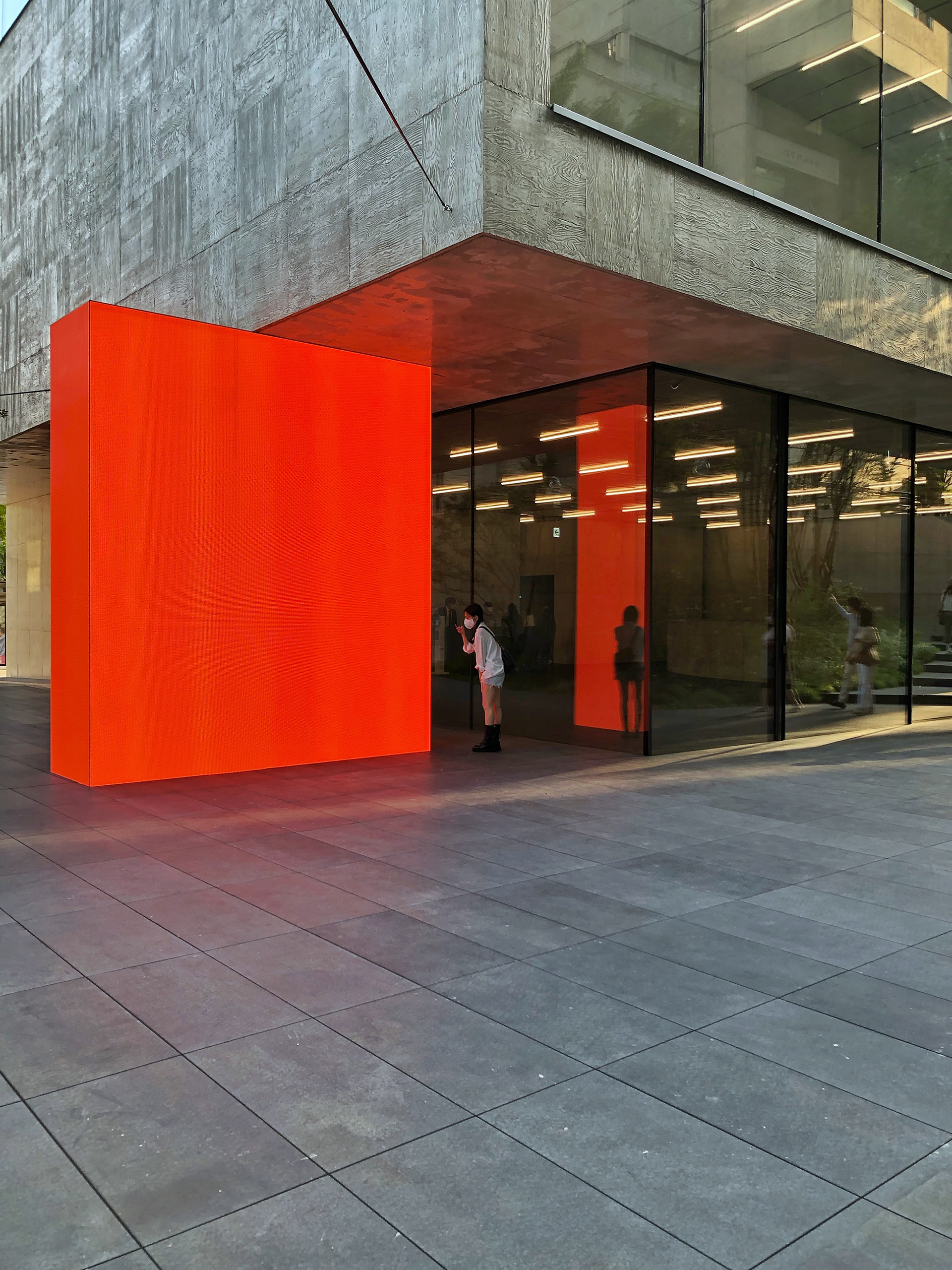
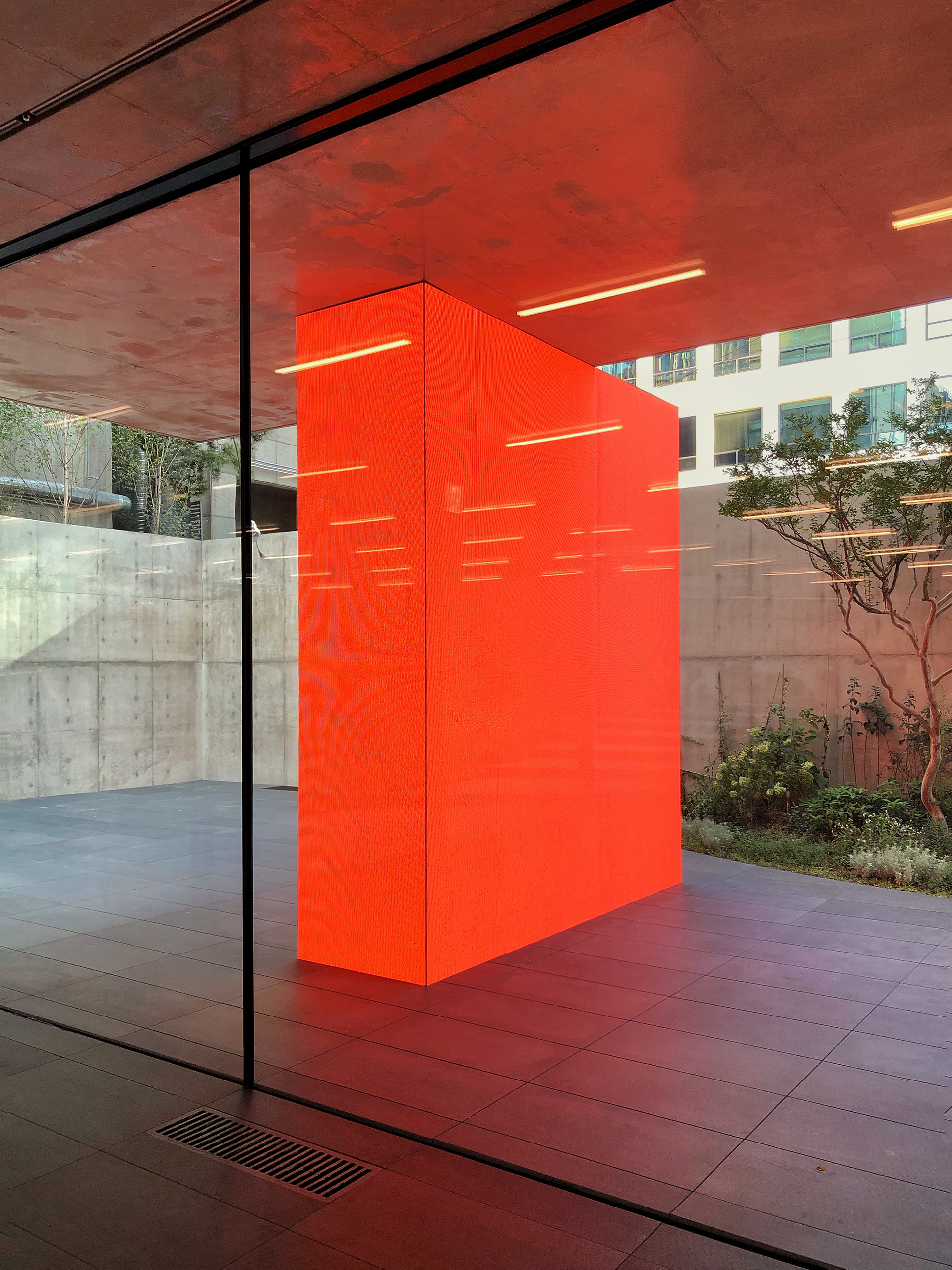
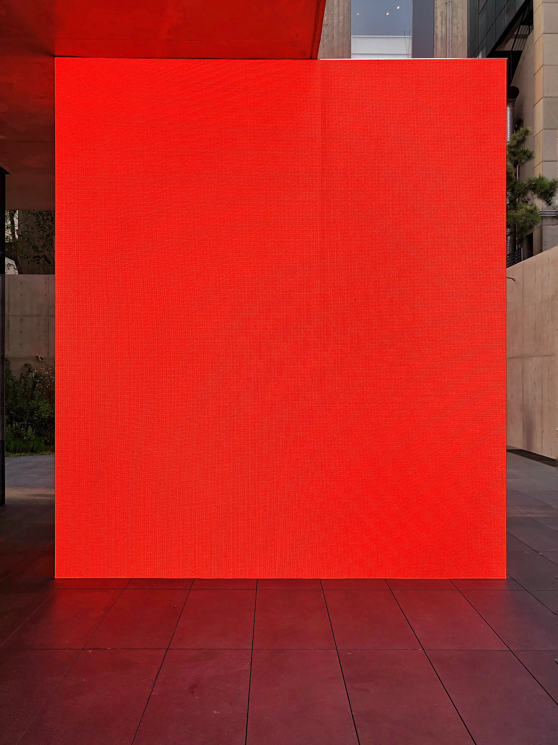
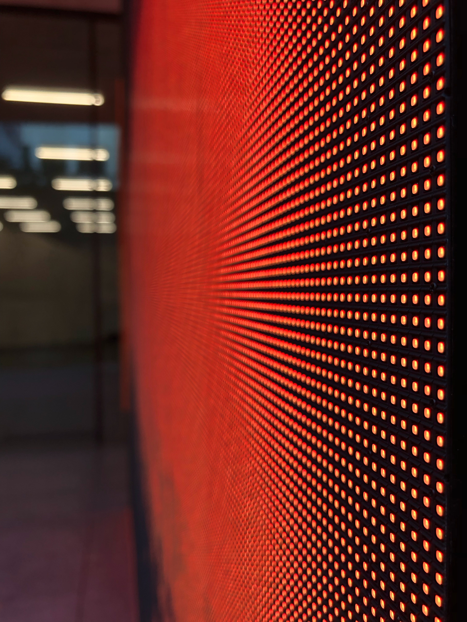
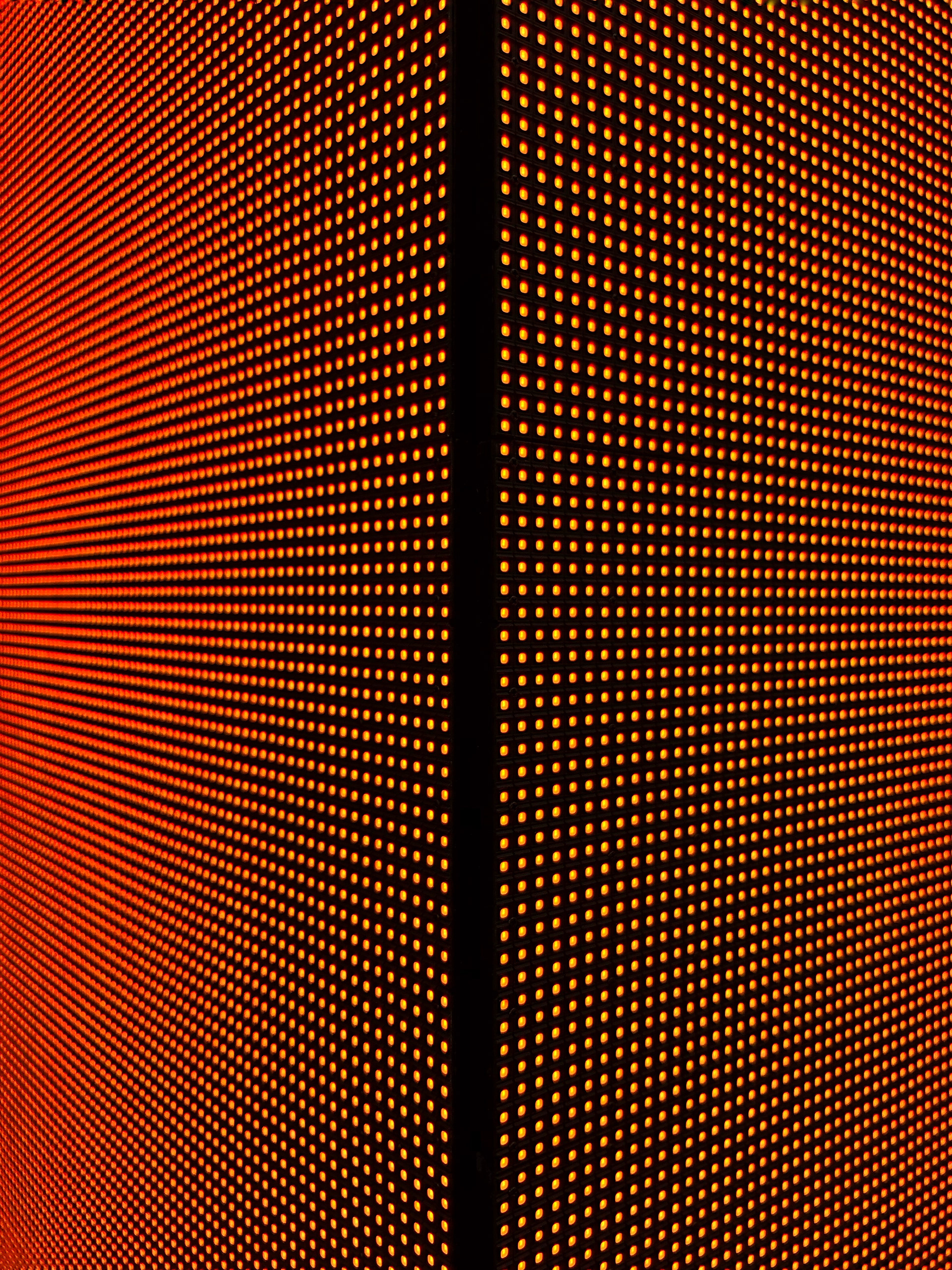
As you approach the entrance, you will find a display bar with countless light emitting diodes embedded in it.
The light of this display bar changes periodically, repeating that the posters of the
exhibition currently on display in Songeun are revealed and disappeared.
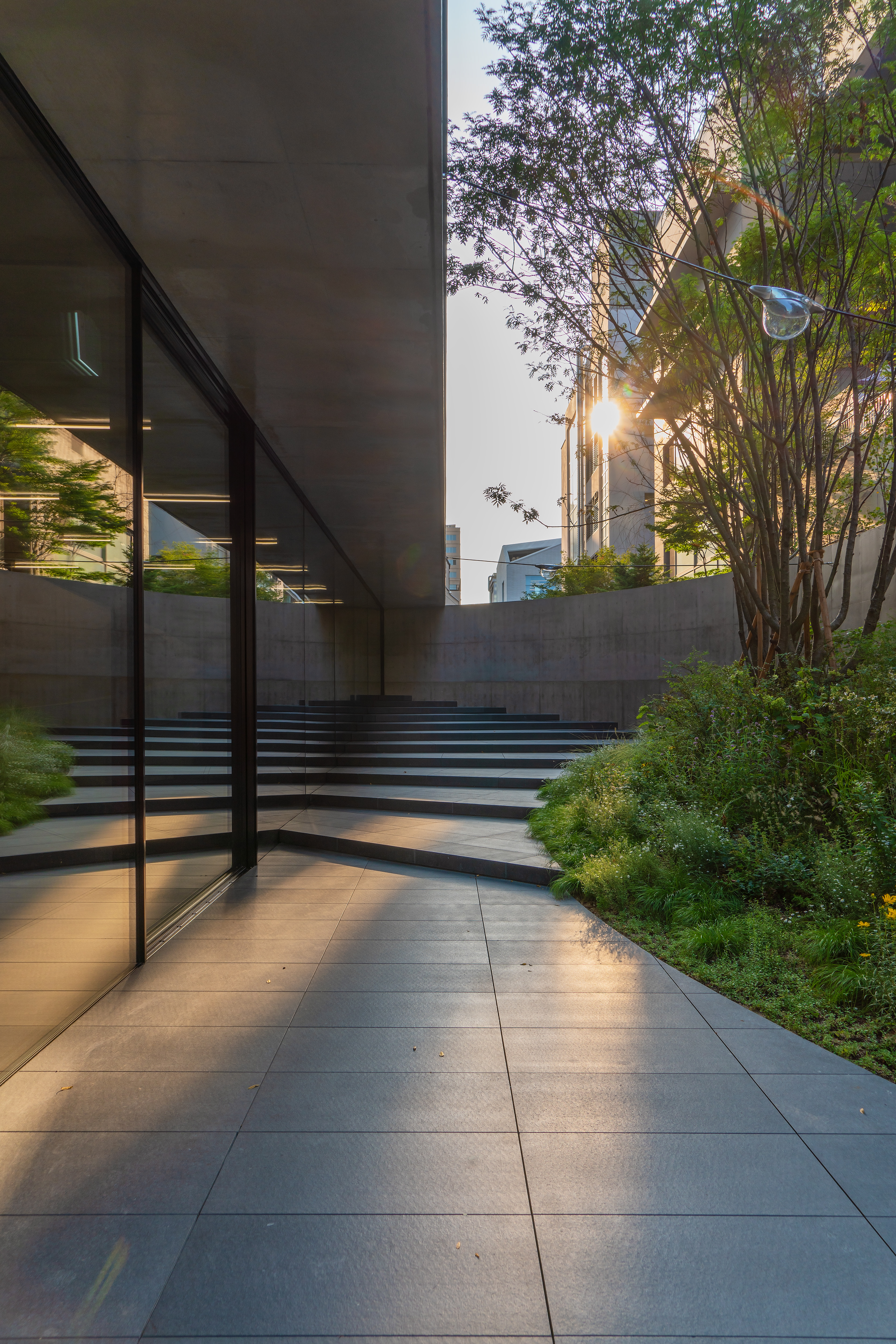
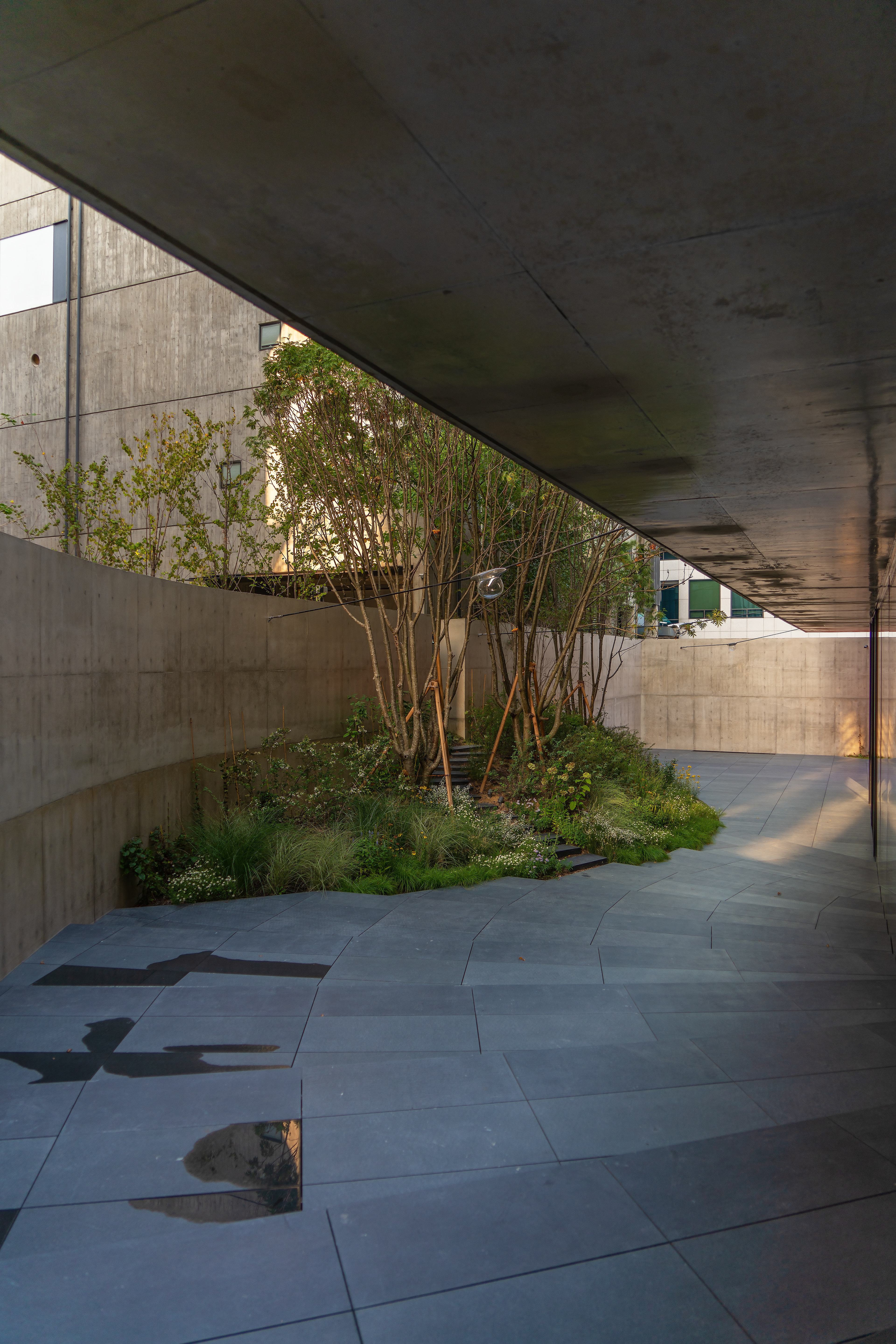
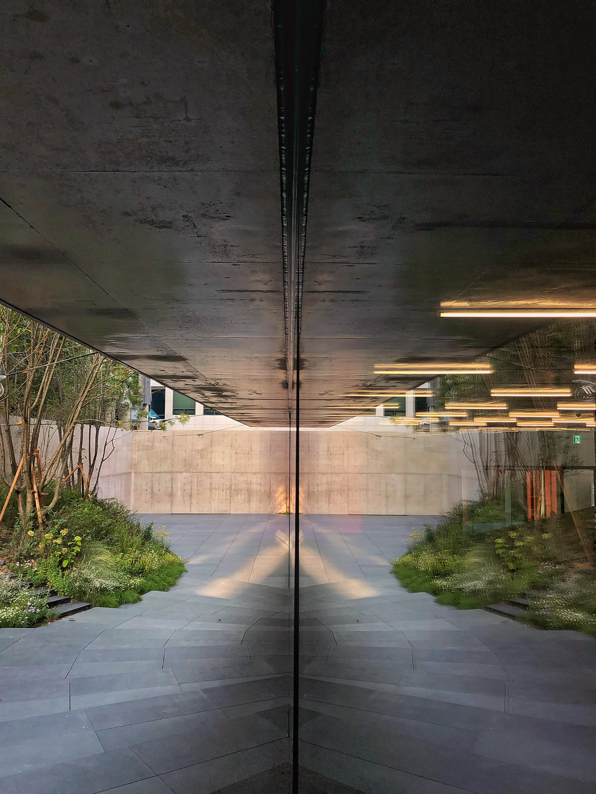
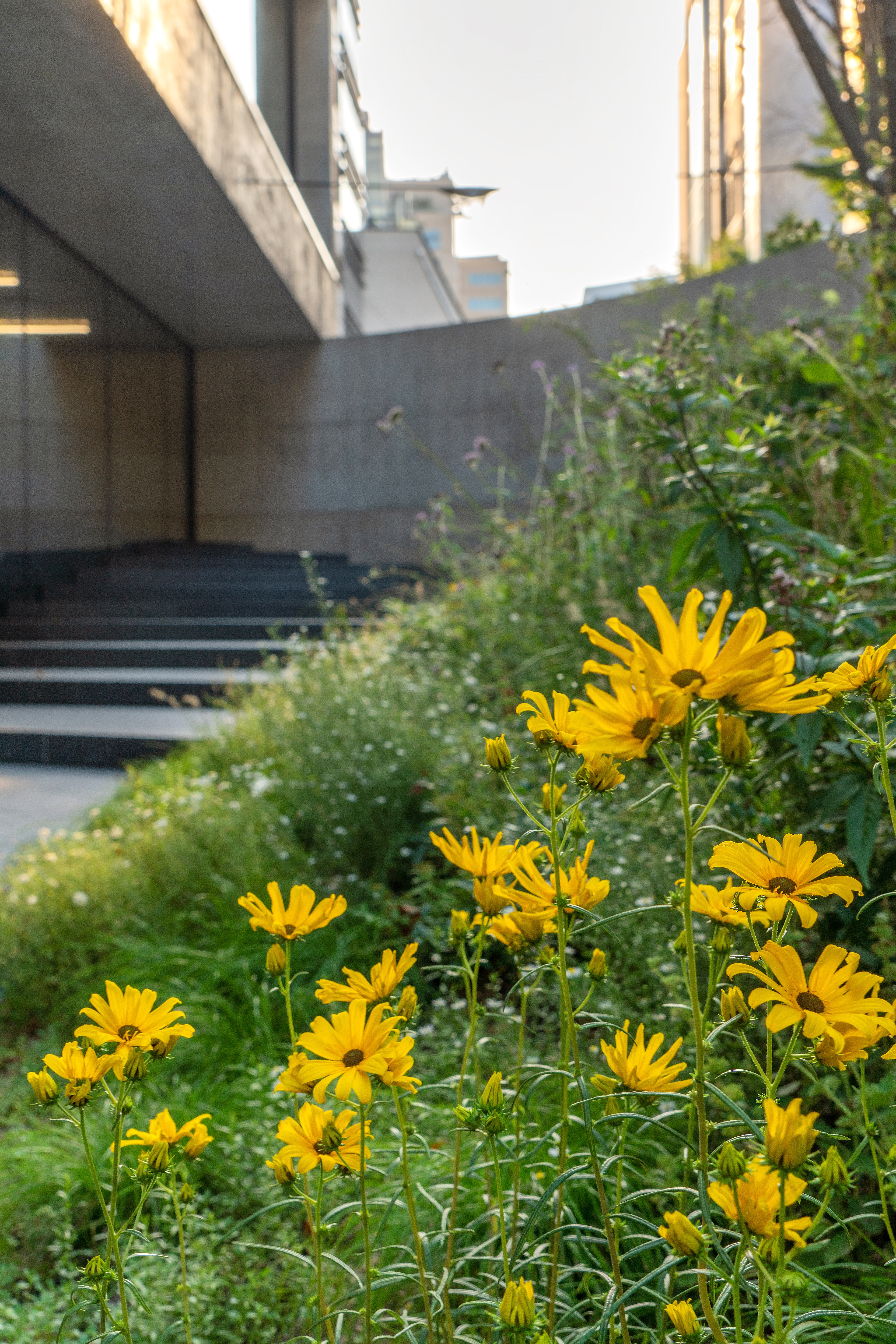
Upon entering the back, there is a small but well-appointed landscaped space next to the straight glass windows.
It is a garden that gives a refreshing feeling to the space on the first floor,
which may seem a little desolate, with green plants in full bloom in the middle of all sides of concrete.
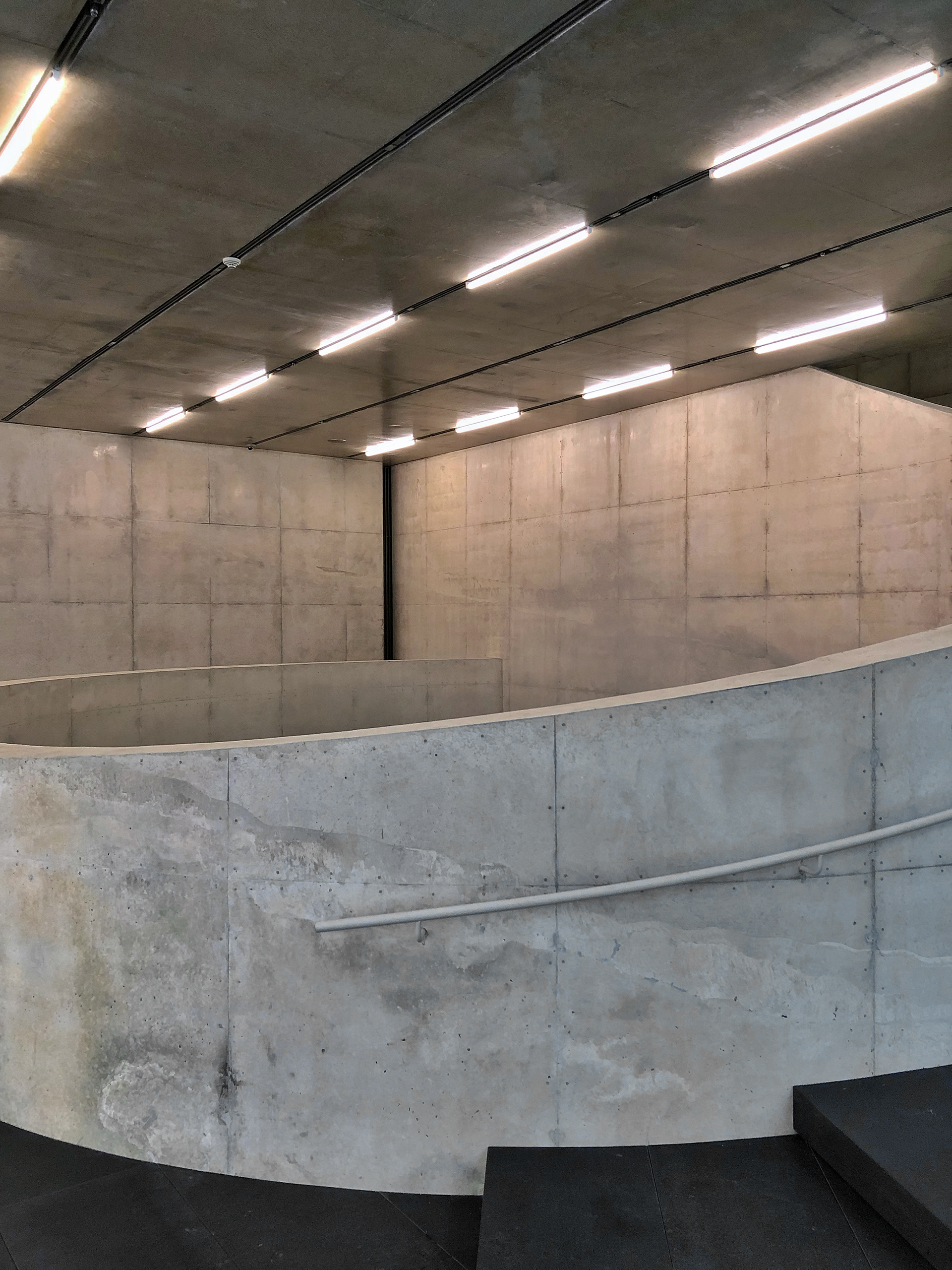
After entering the building, the minimalist concept was taken as it is with LED bar lighting
in a simple design that gives a sense of unity with the exterior.
───────────────
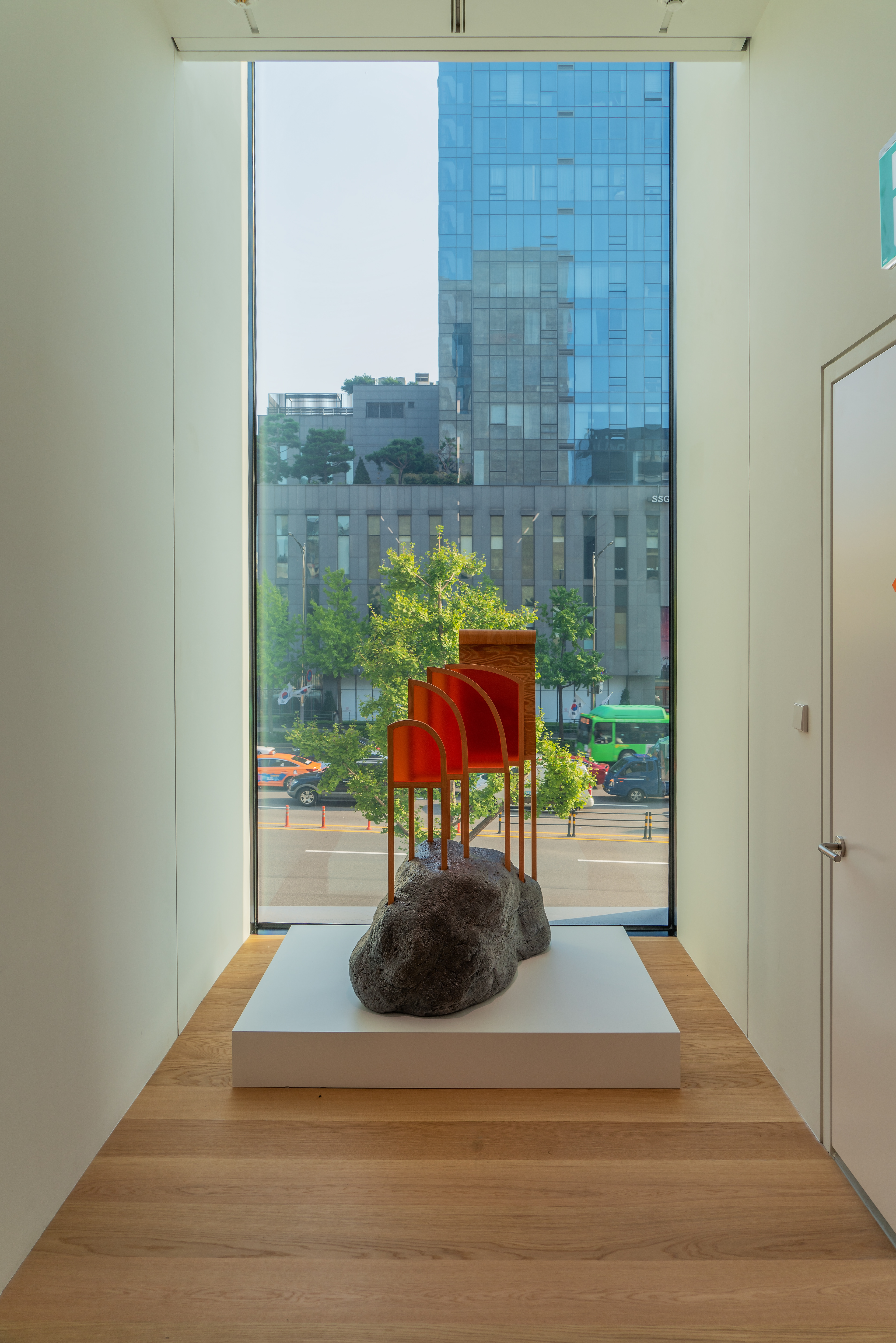
Seceond Floor & Exhibition Space .
I went through the space on the first floor to the second floor. Long vertical window seen from outside.
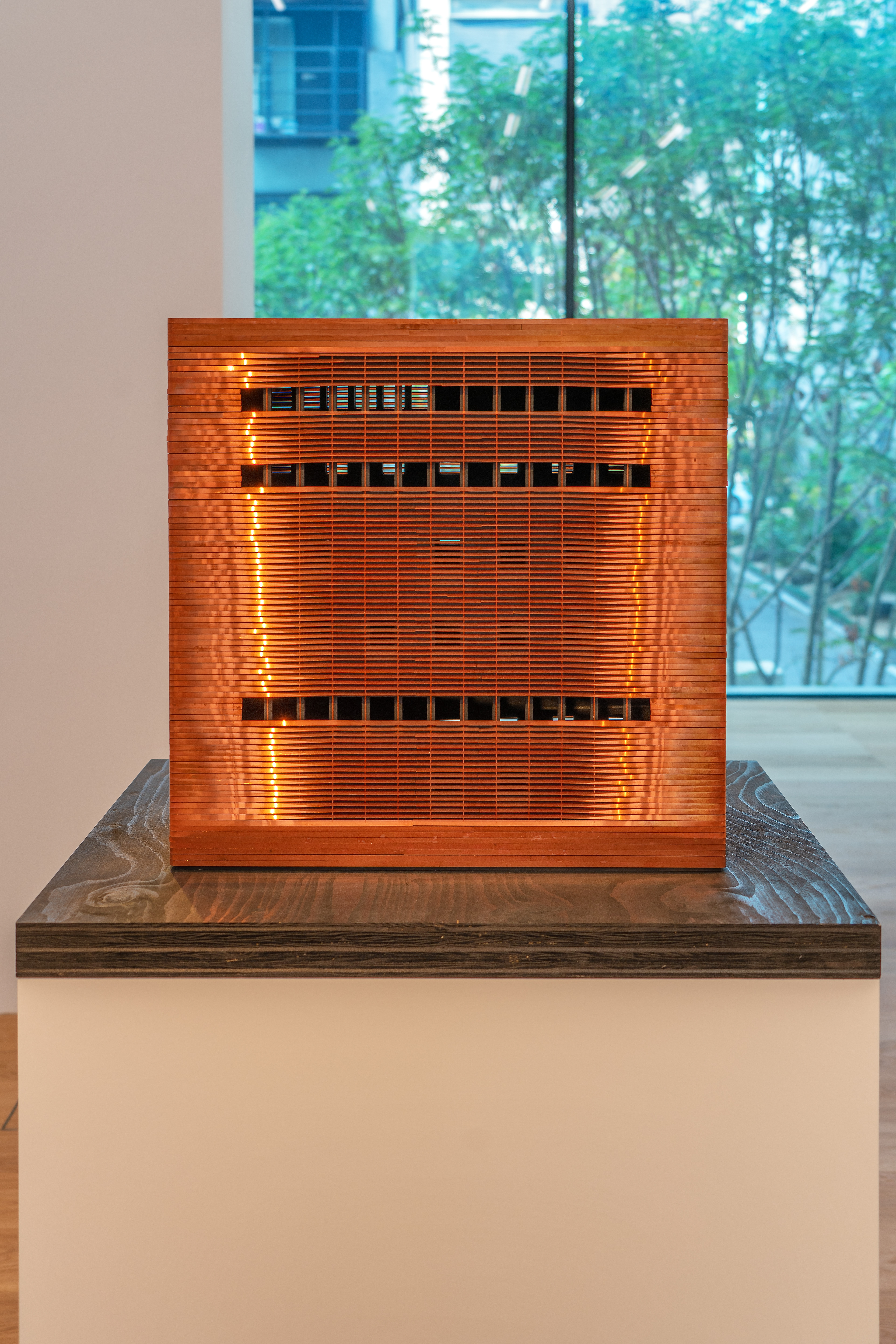
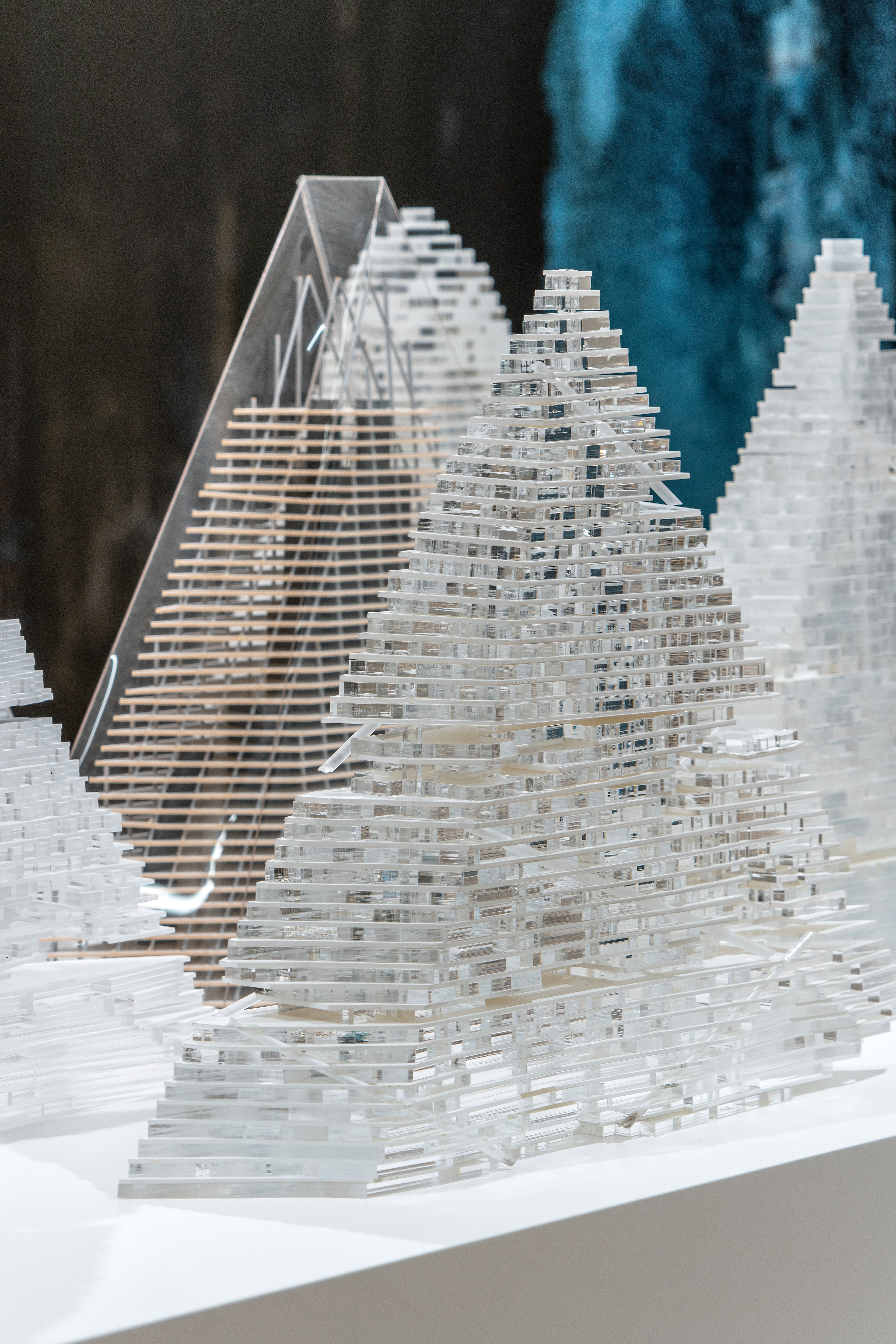
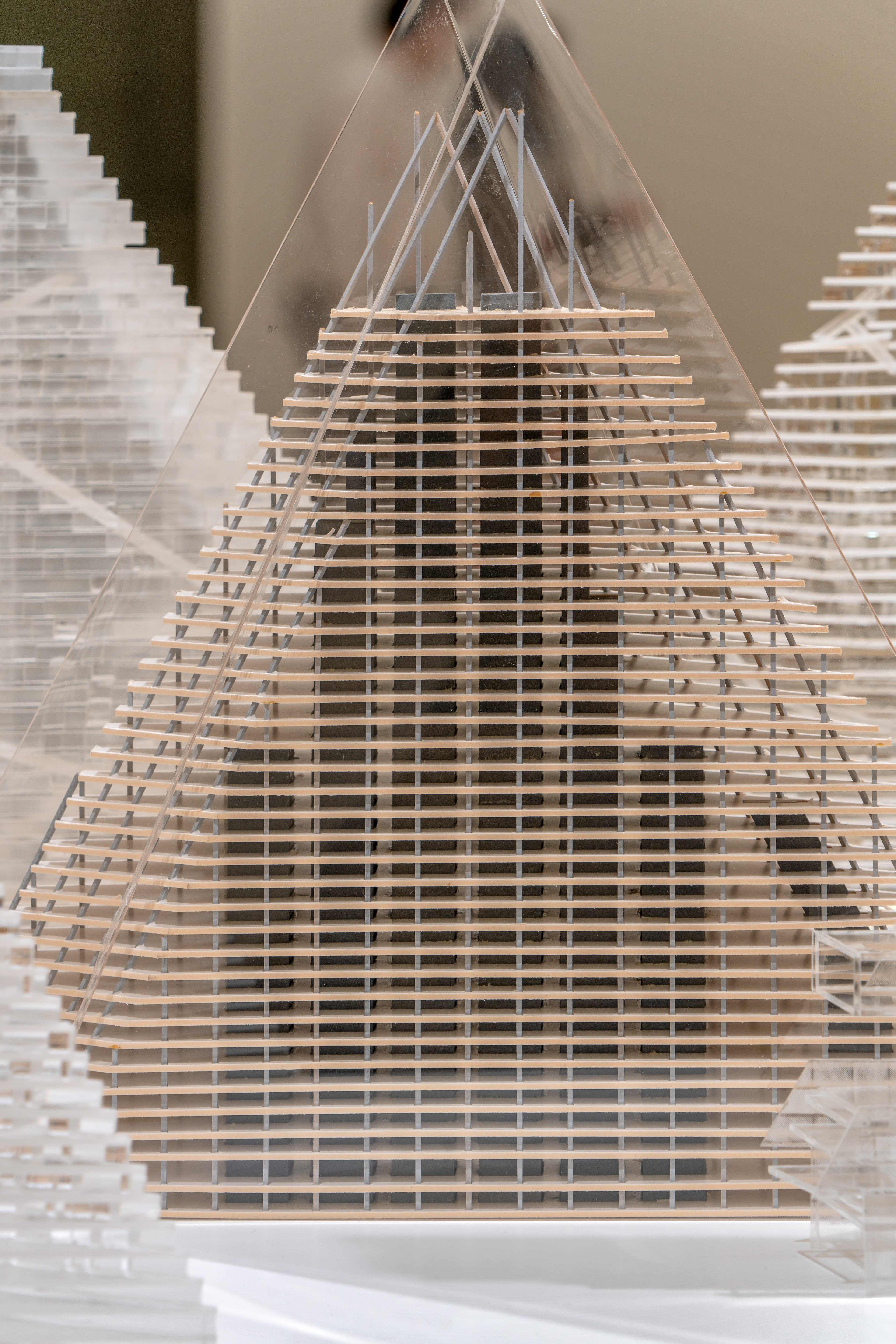
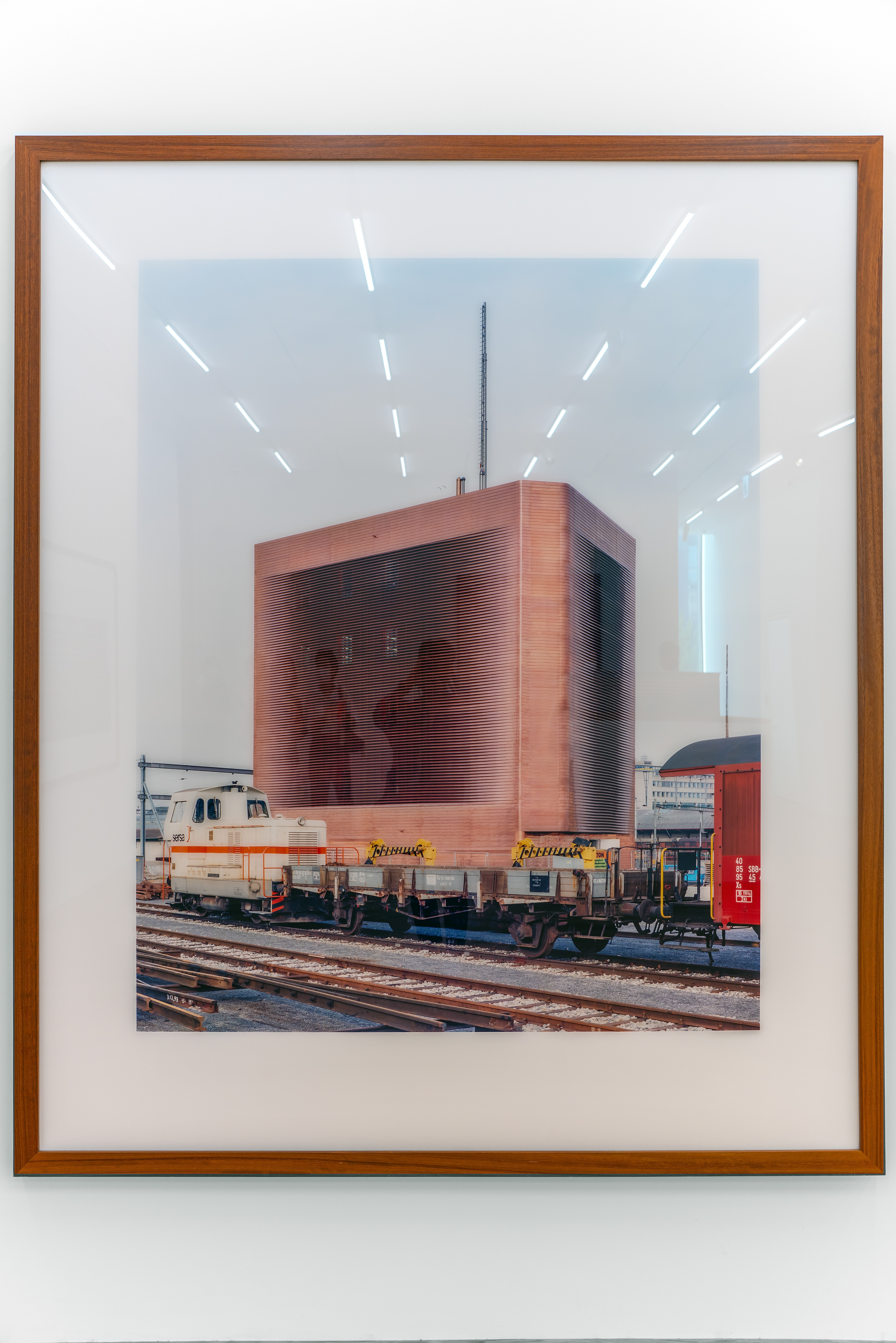
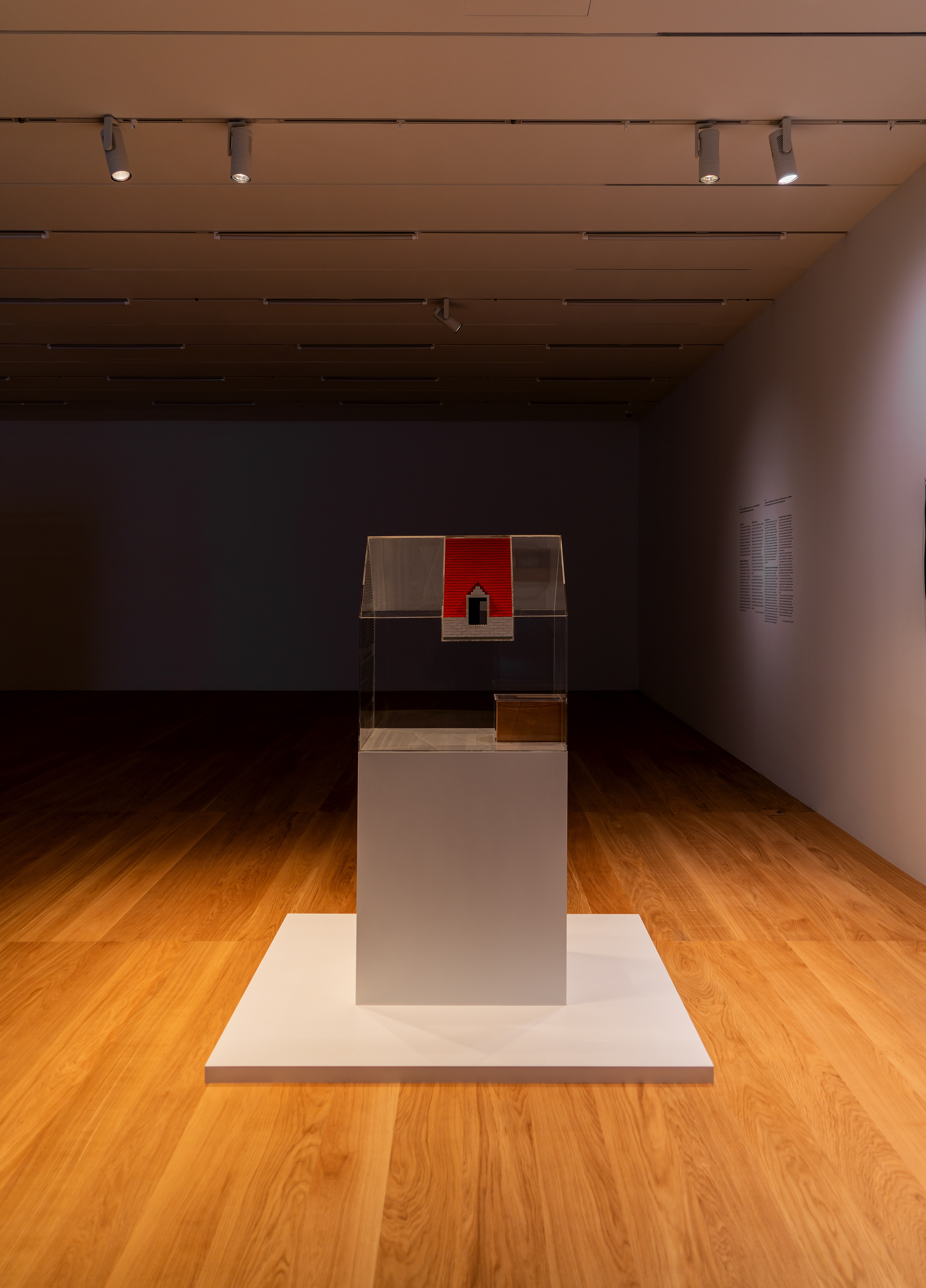
If you look inside, the work is on display inside. The contents of the exhibition also included other buildings by
Herzog de Meuron, who designed Song Eun.
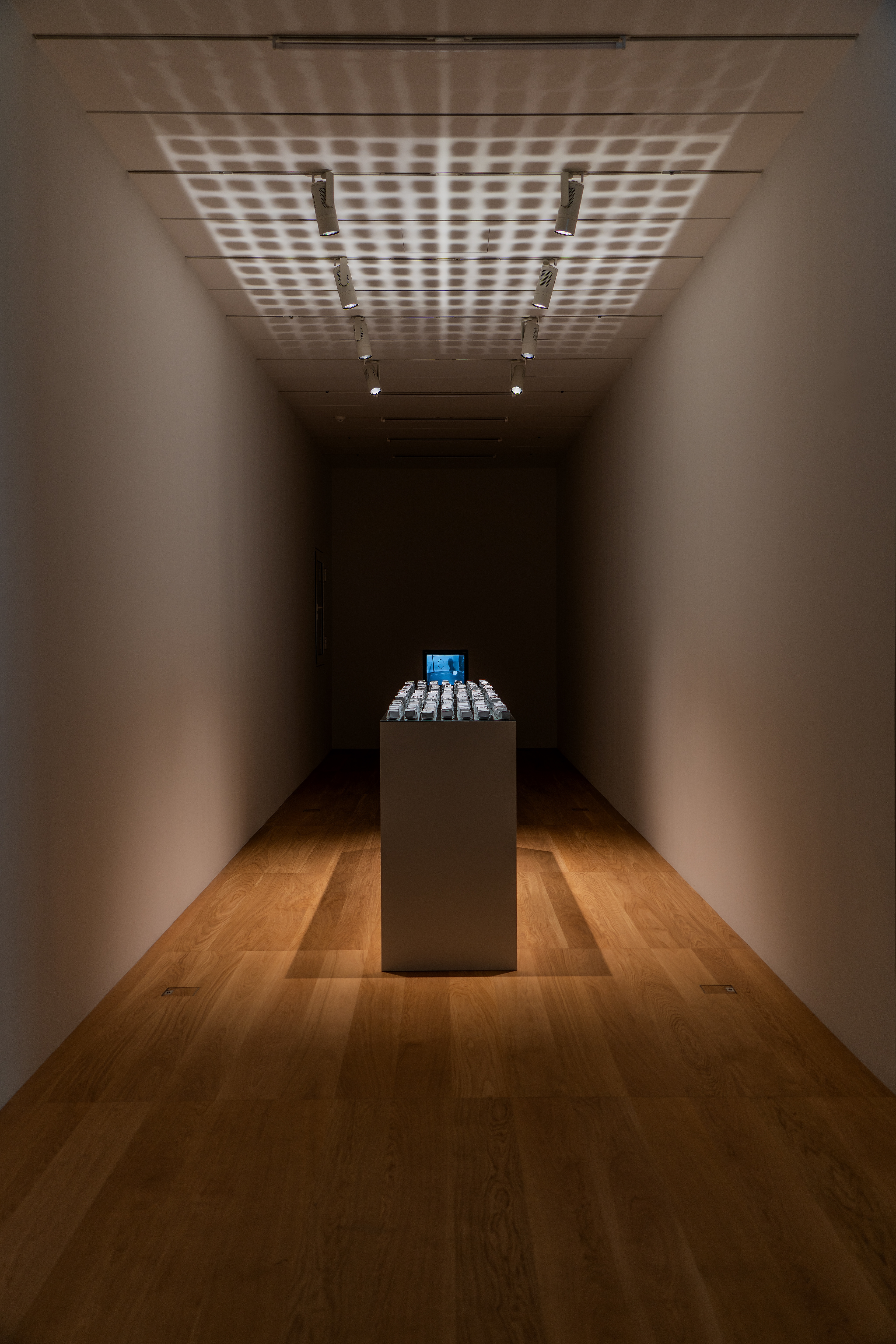
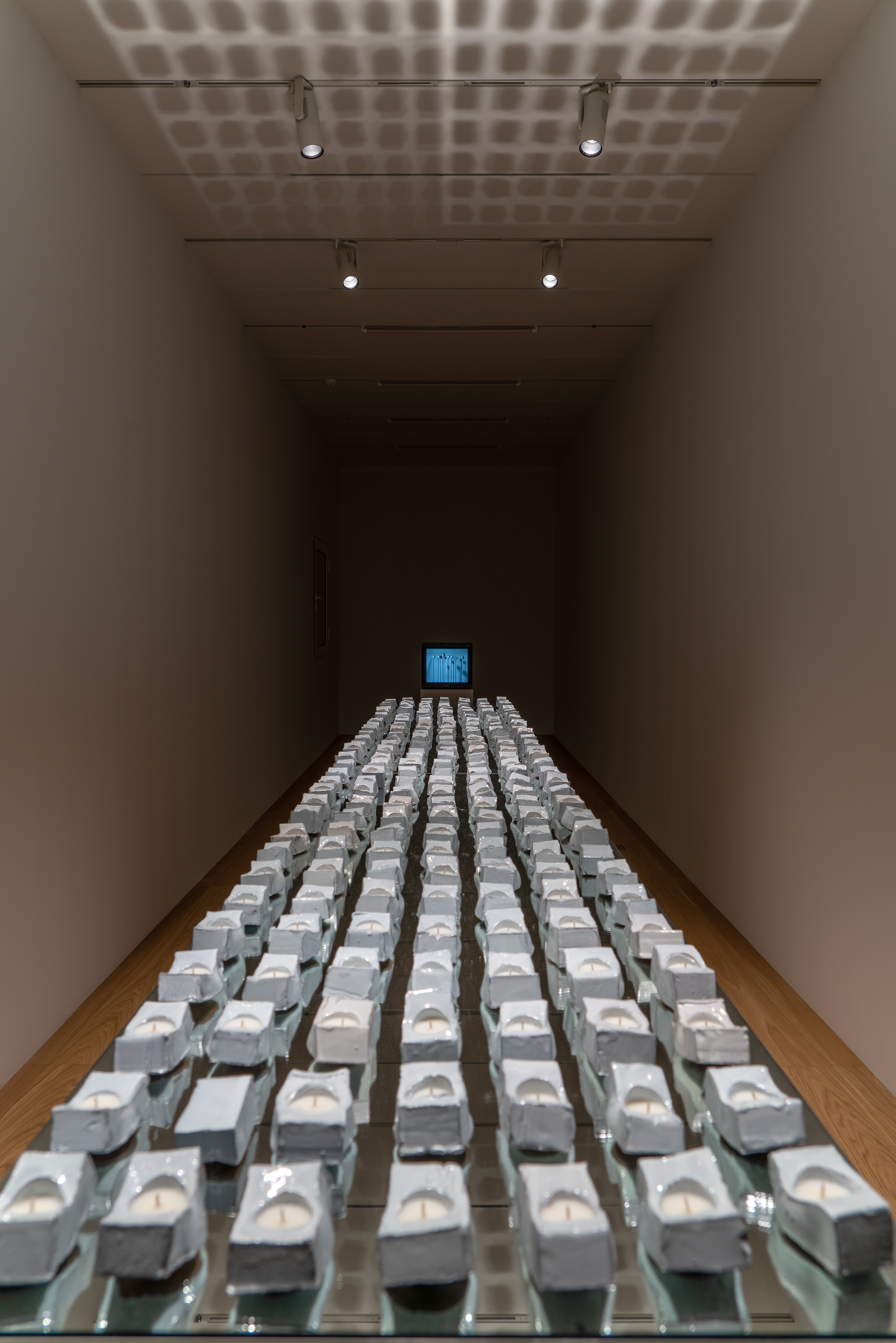
By arranging the works in a wide space, the blank space was widened to maximize the sense of space.
With a wooden floor, white walls and ceiling, and a bar-shaped LED bar installed,
the 2nd floor also emphasizes a minimalistic feel with a unified theme with the 1st floor.
───────────────
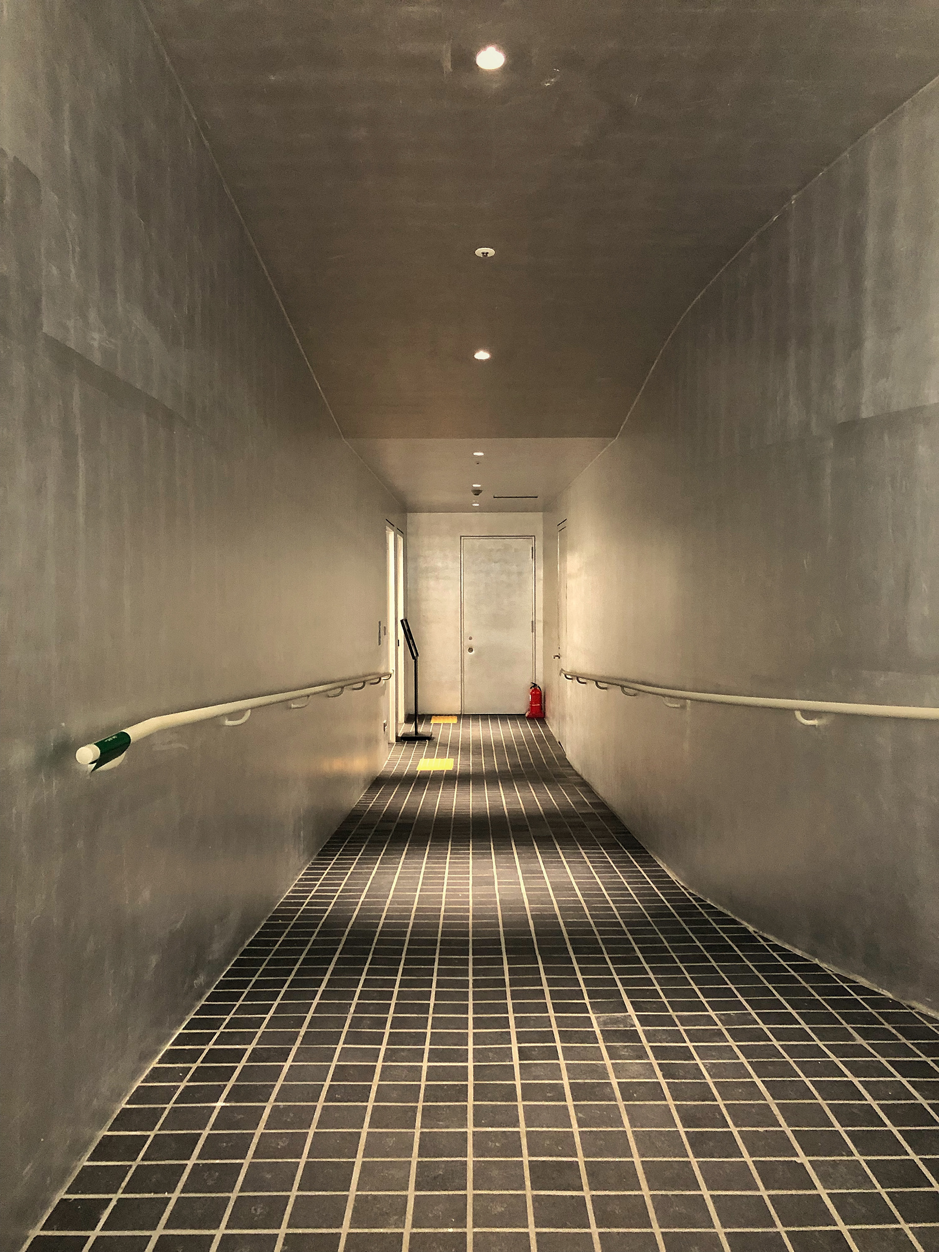
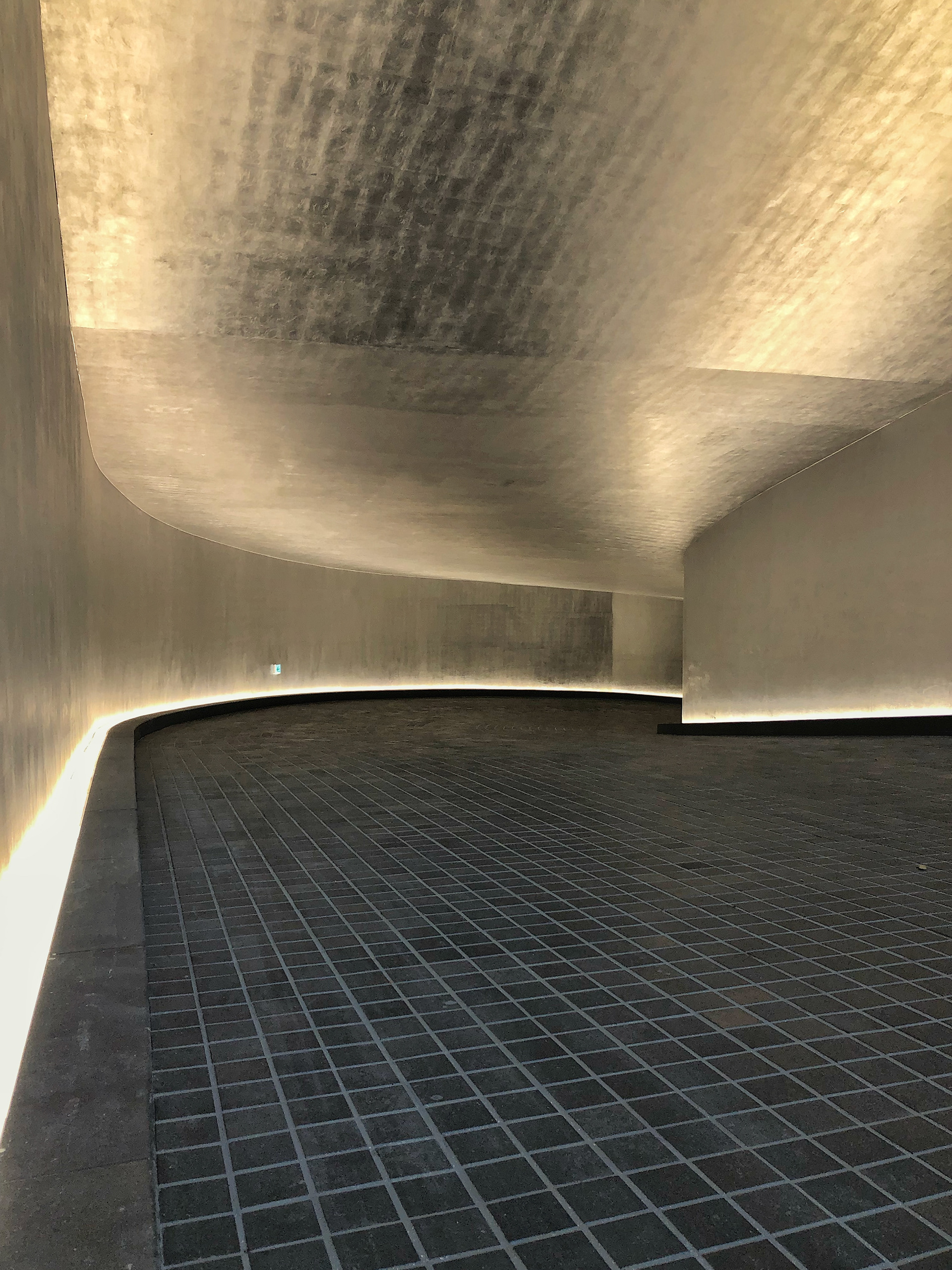
Underground Space & Toilet .
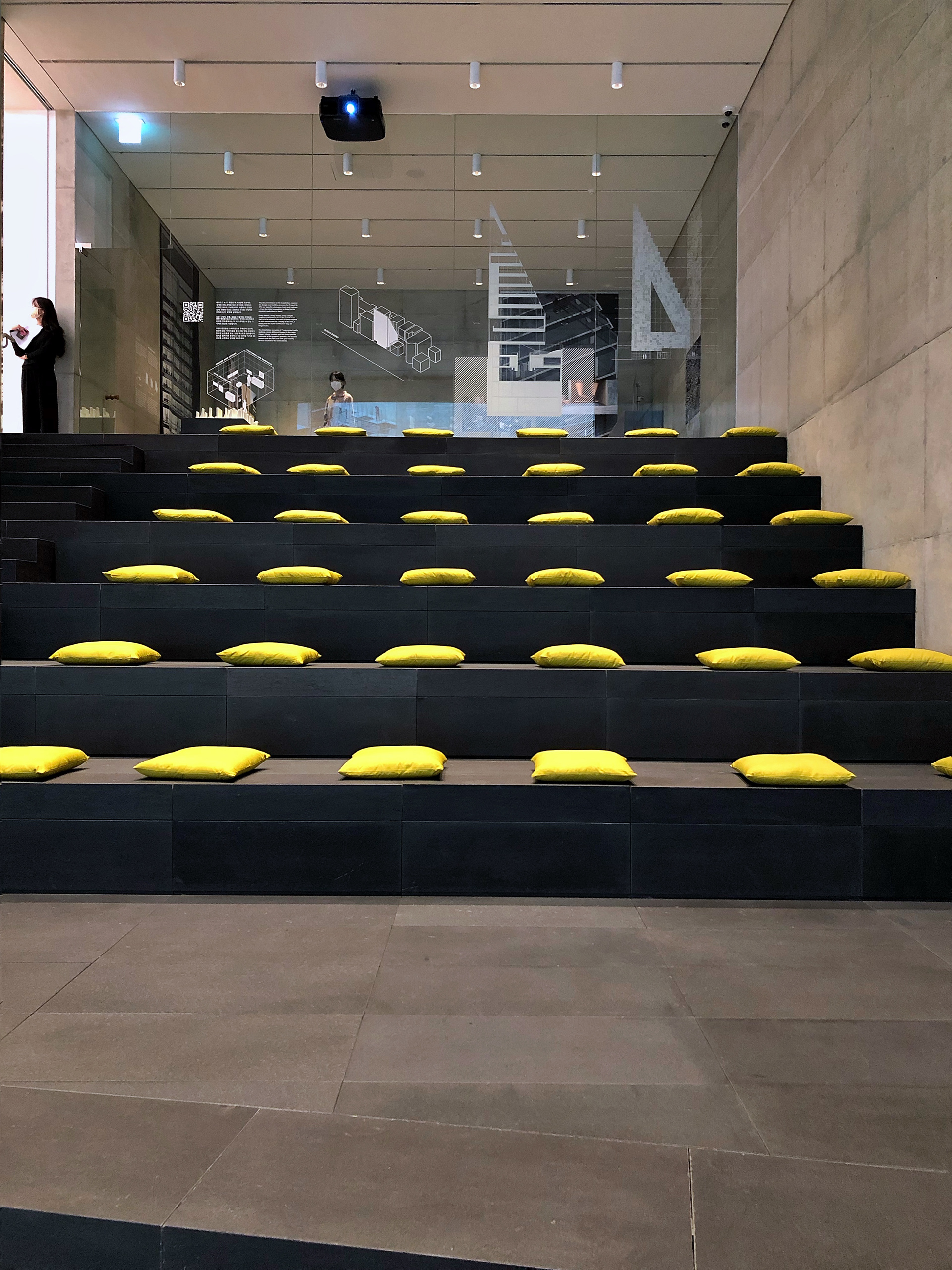
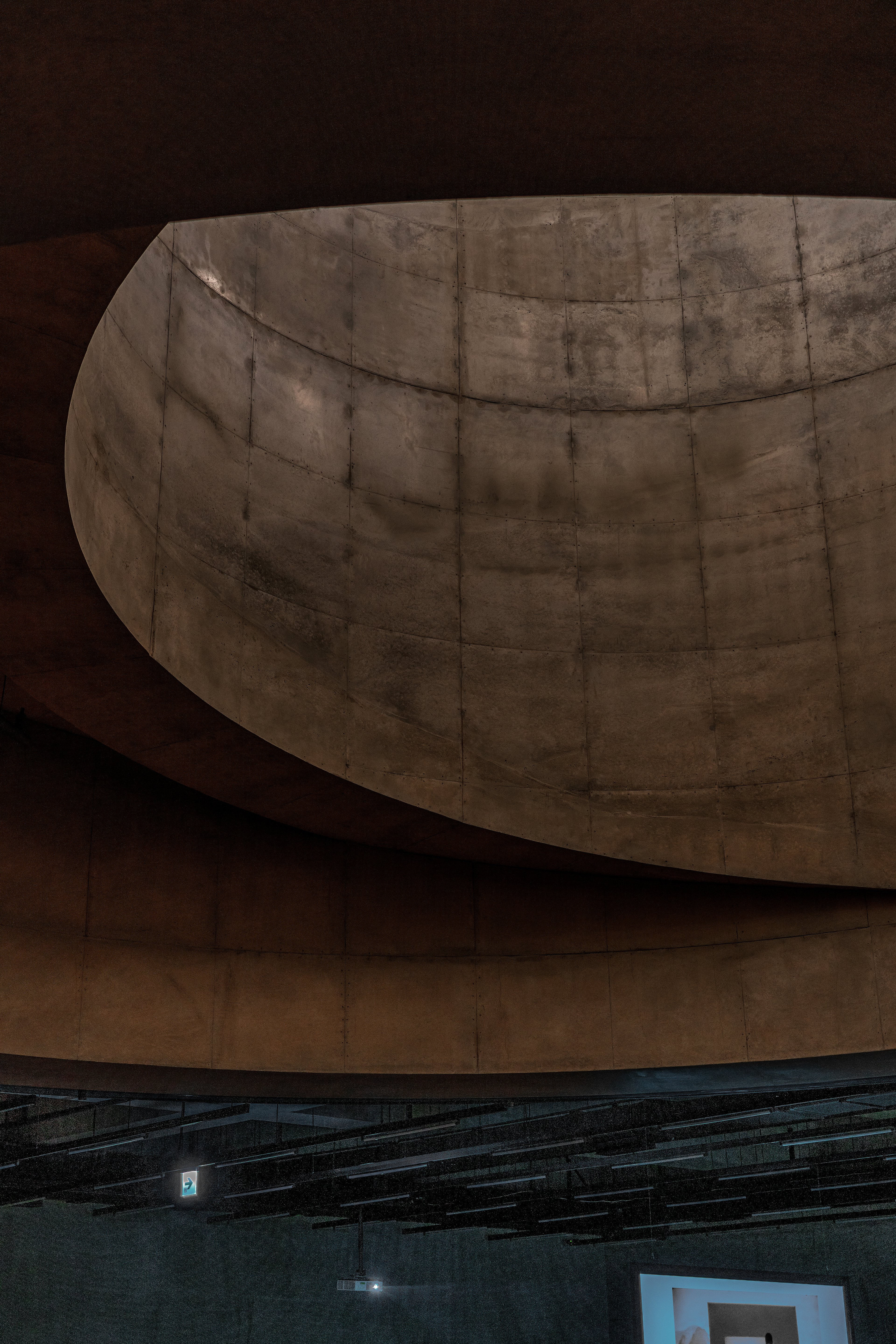
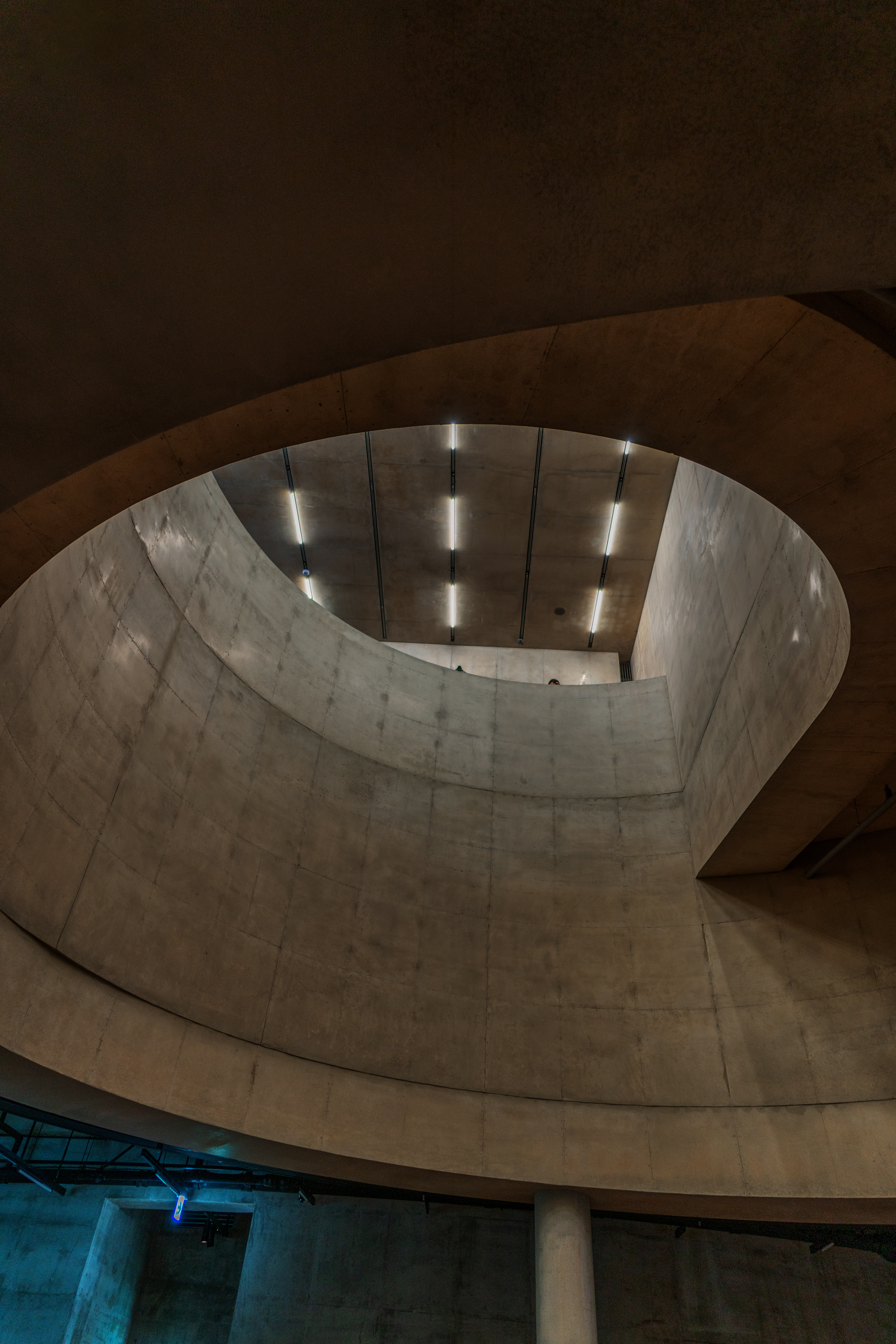
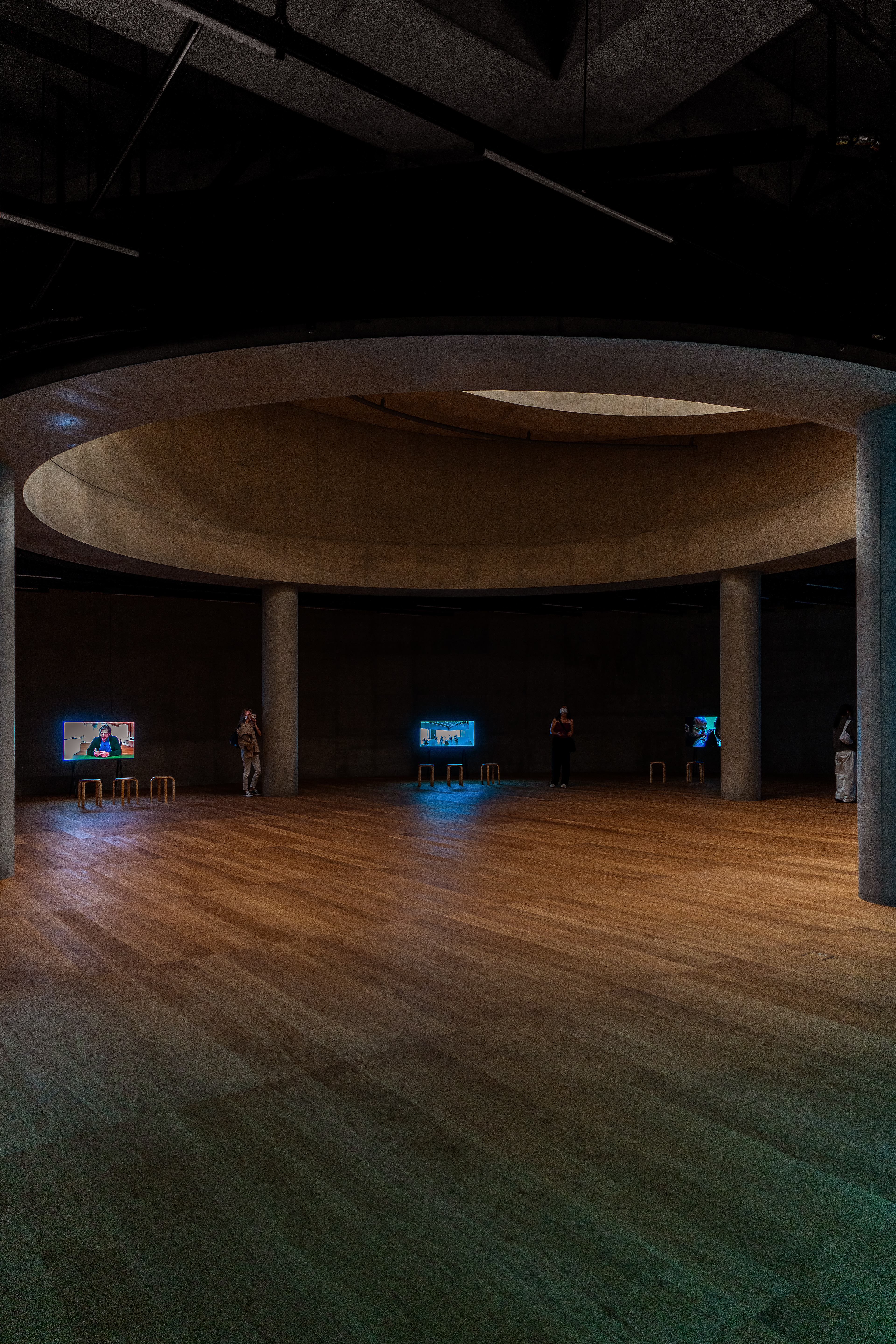
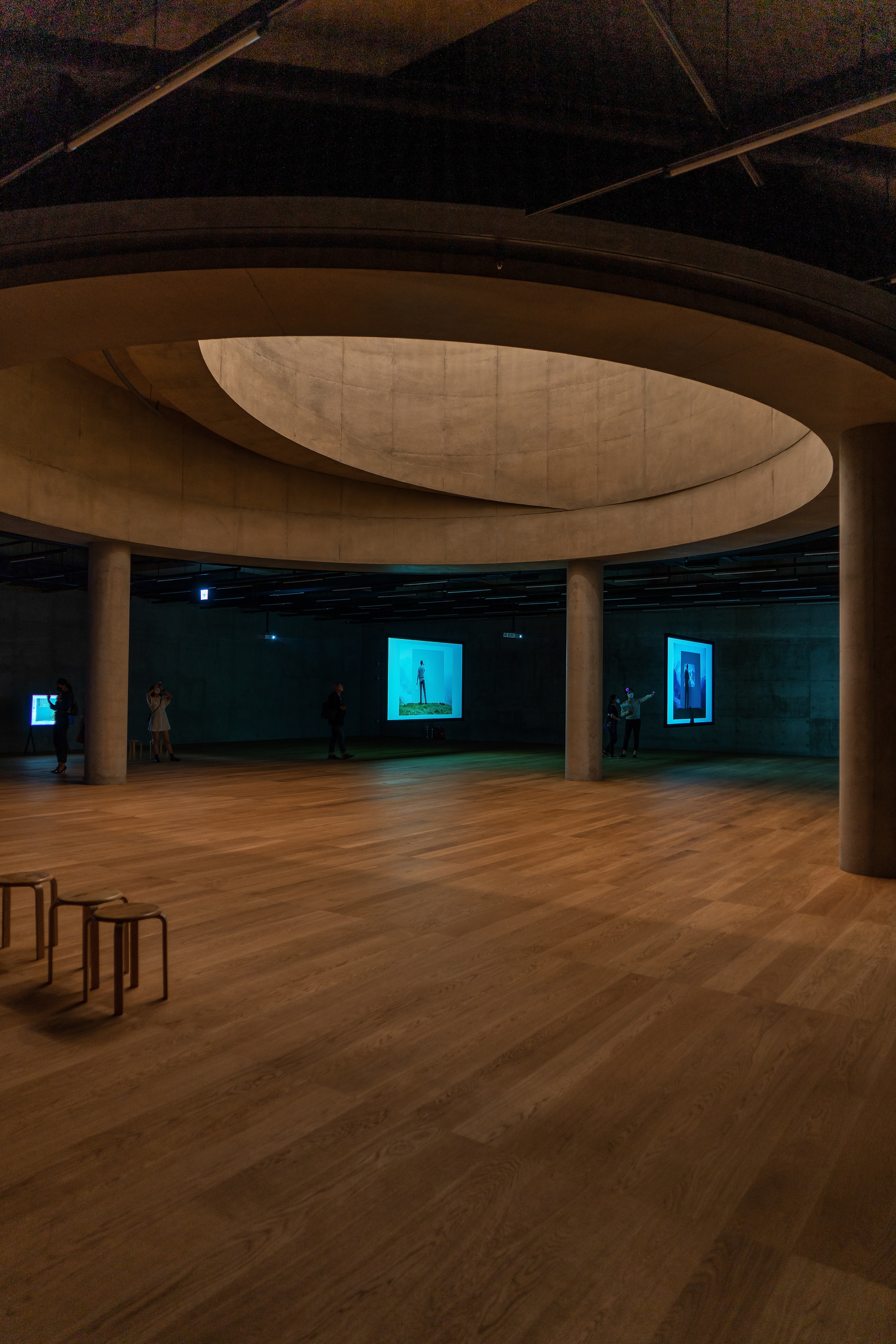
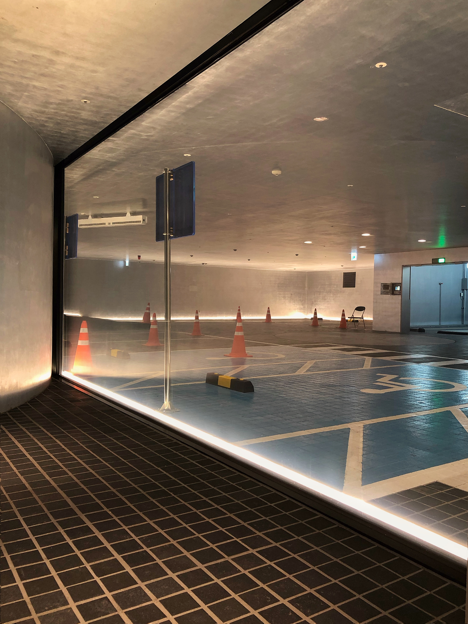
We arrived at the underground space, the most important space of Song Eun and the highlight of this building.
Looking up from the basement floor, the large open hole seen on the first floor gives the impression that the light falling from the first floor is pouring down.
The round stairs have an atypical spiral structure, so the scene looks different depending on where you look at it as you go around it.
The light from the first floor was maximized so that you could feel the light pouring from the first floor by darkening
it by not lighting it intentionally in the basement. The daylight orange lighting blends with the wooden floor, creating a mysterious feeling.
───────────────
- Overall Design and Construction Planning -
Herzog & De Meuron .
