───────────────
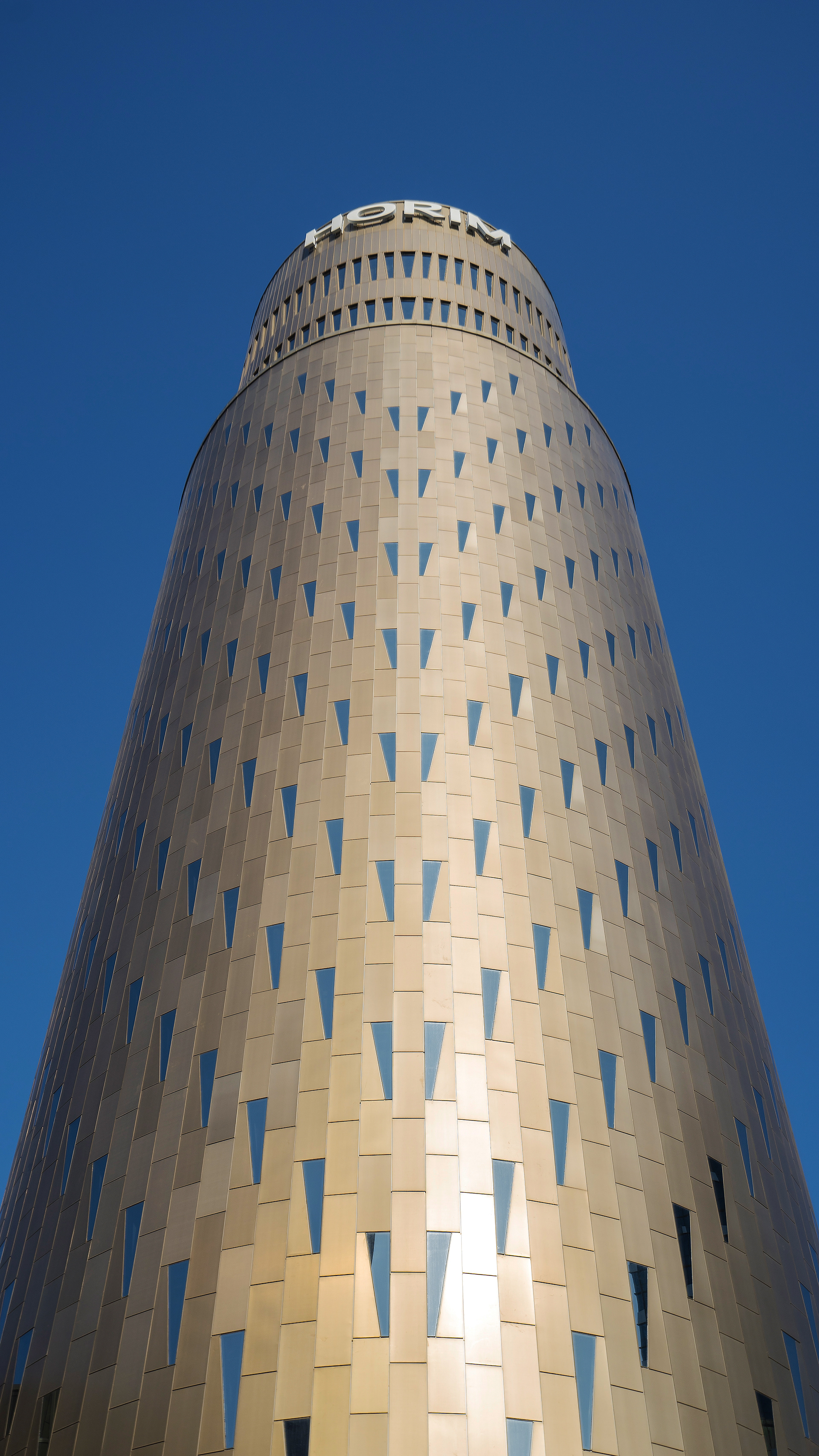

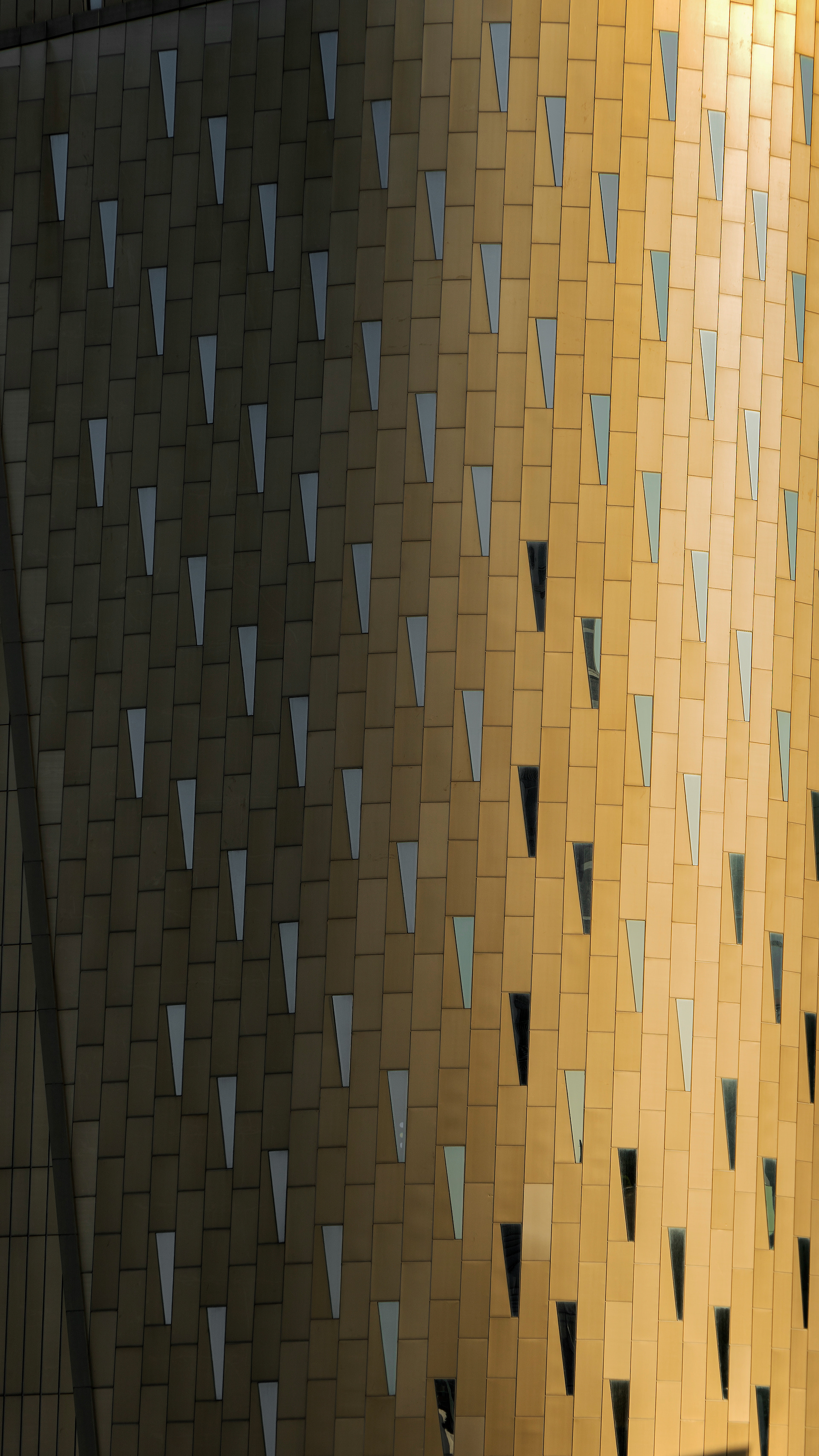
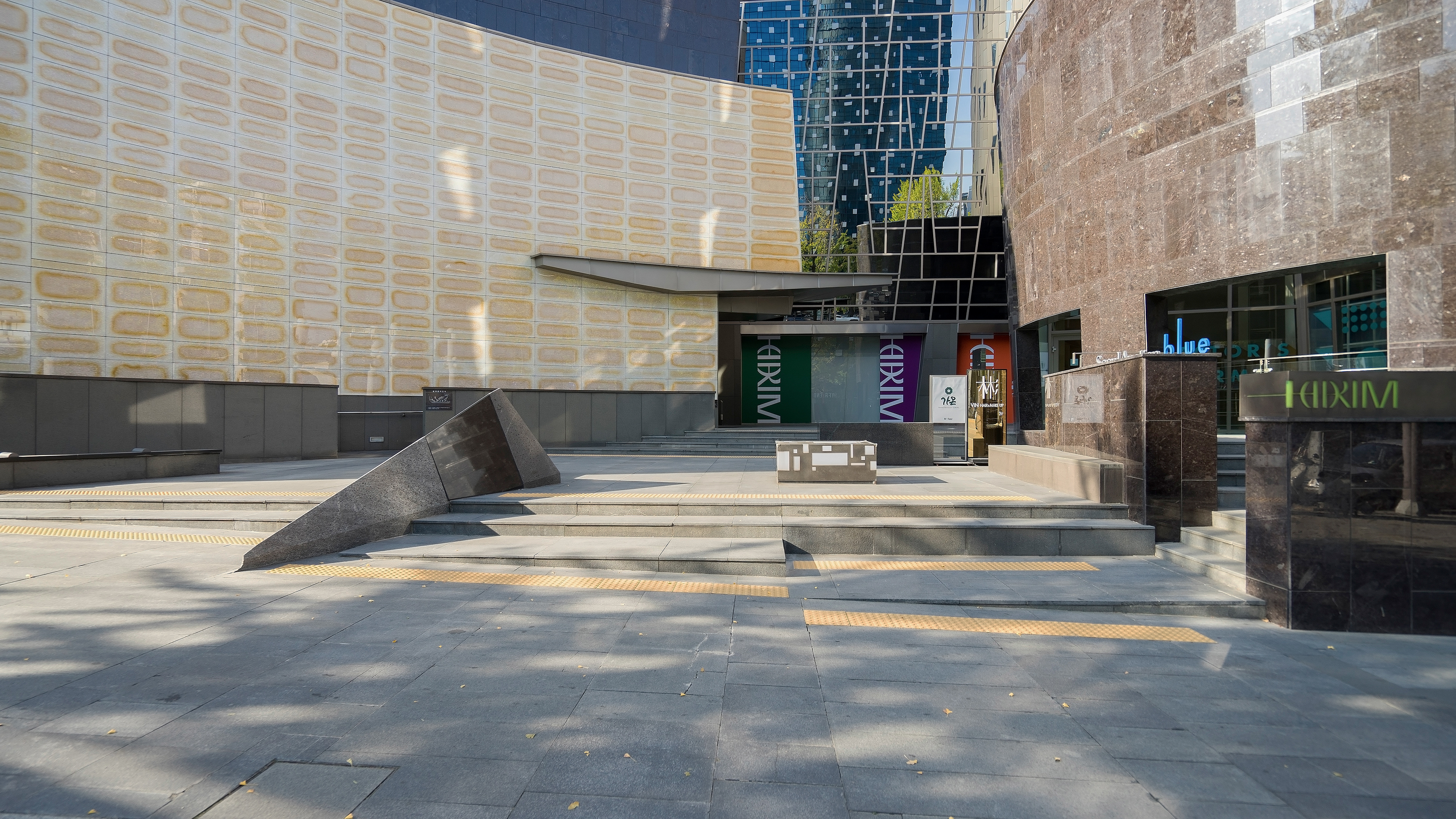


Exterior And Surroundings .
The exterior is very beautiful with the zinc panel tinged with soft gold
and the rhombic-shaped windows scattered between them.
The spaces for people on the 1st and 2nd floors are finished with shiny glossy marble
and blend well with the golden color of the upper floors.
In fact, even from a distance, the building itself is glossy and easily recognizable,
and when viewed up close, it shows a better appearance.
───────────────
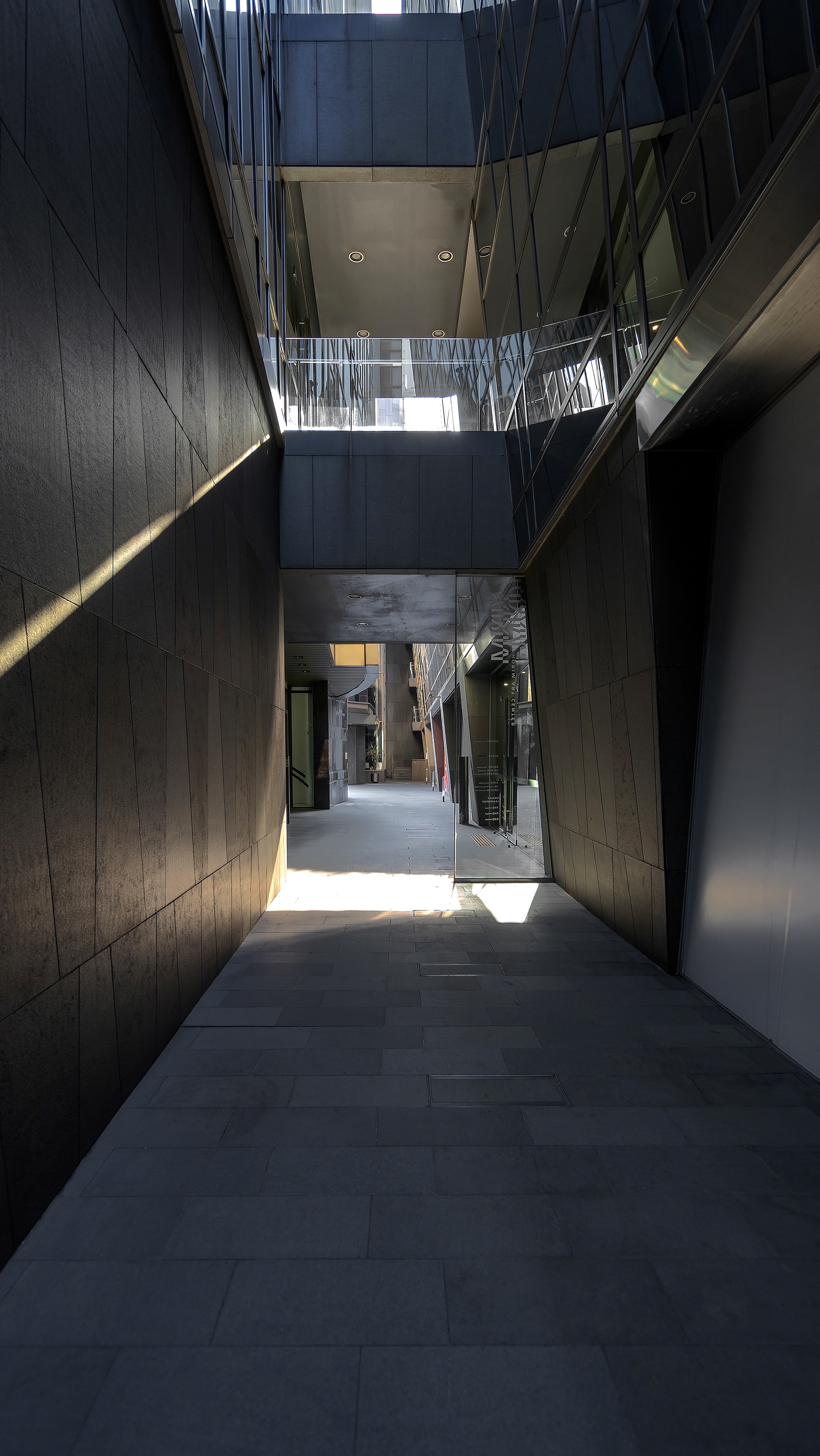

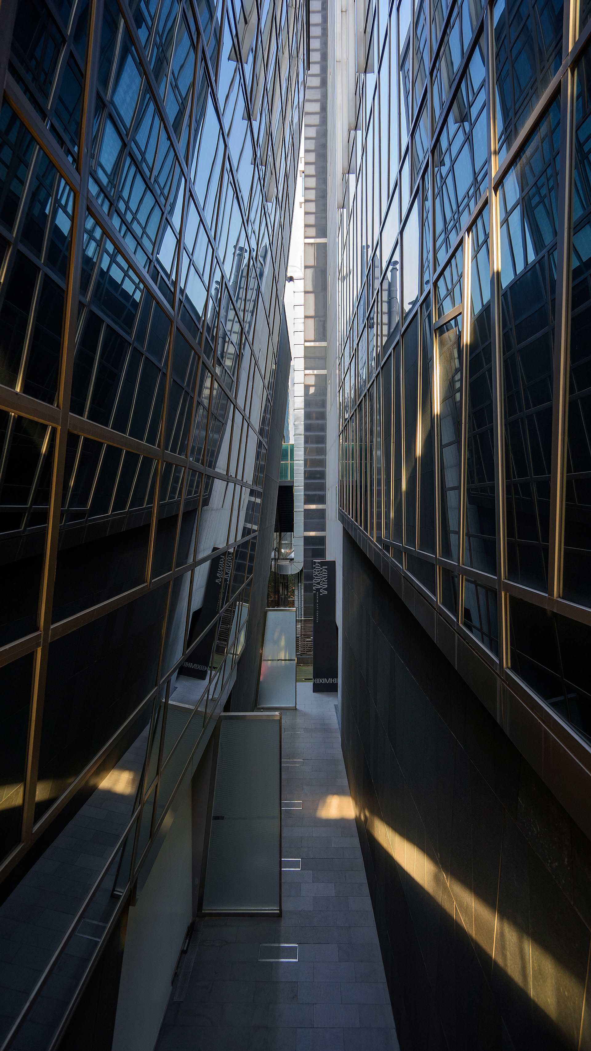
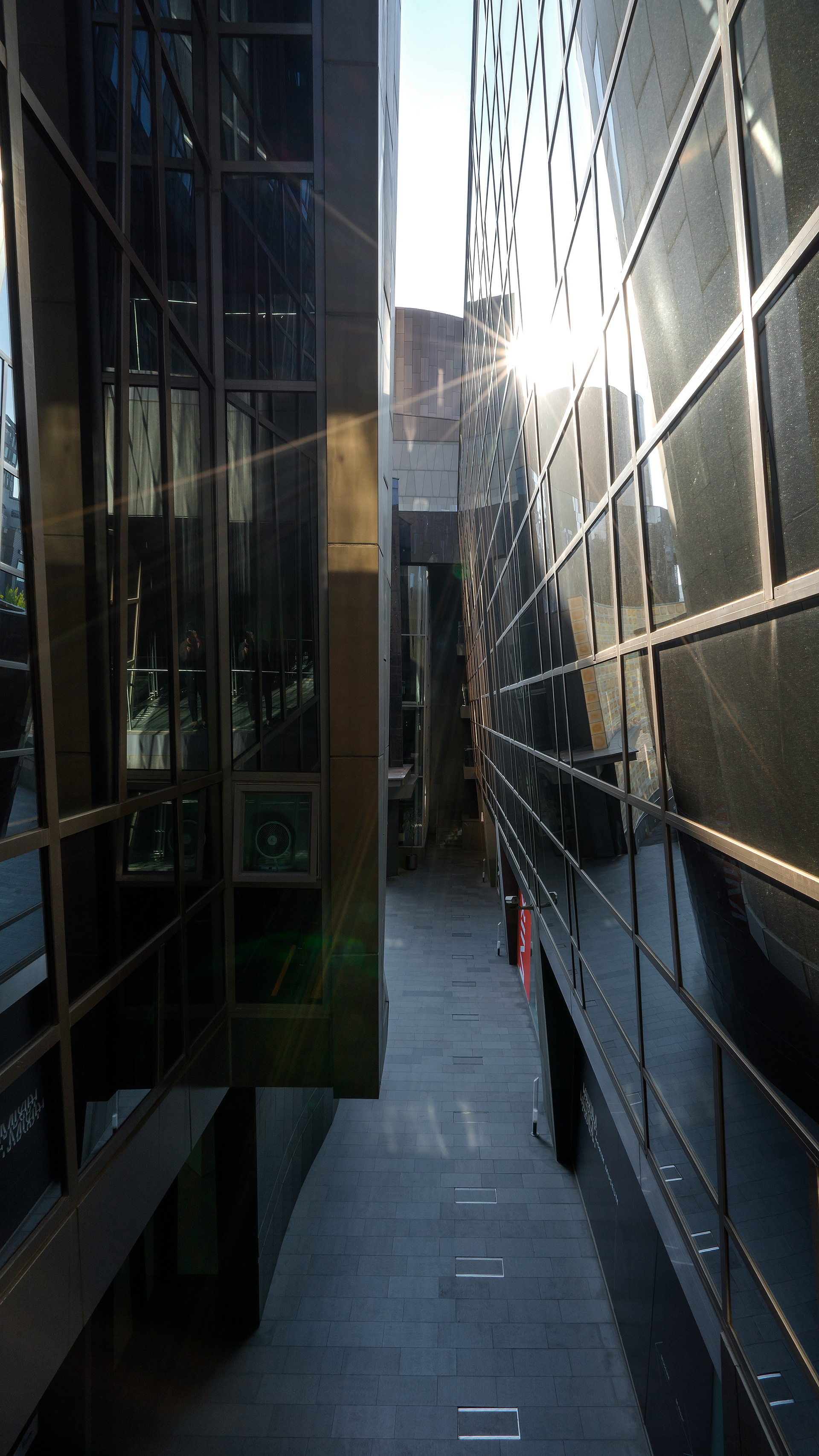
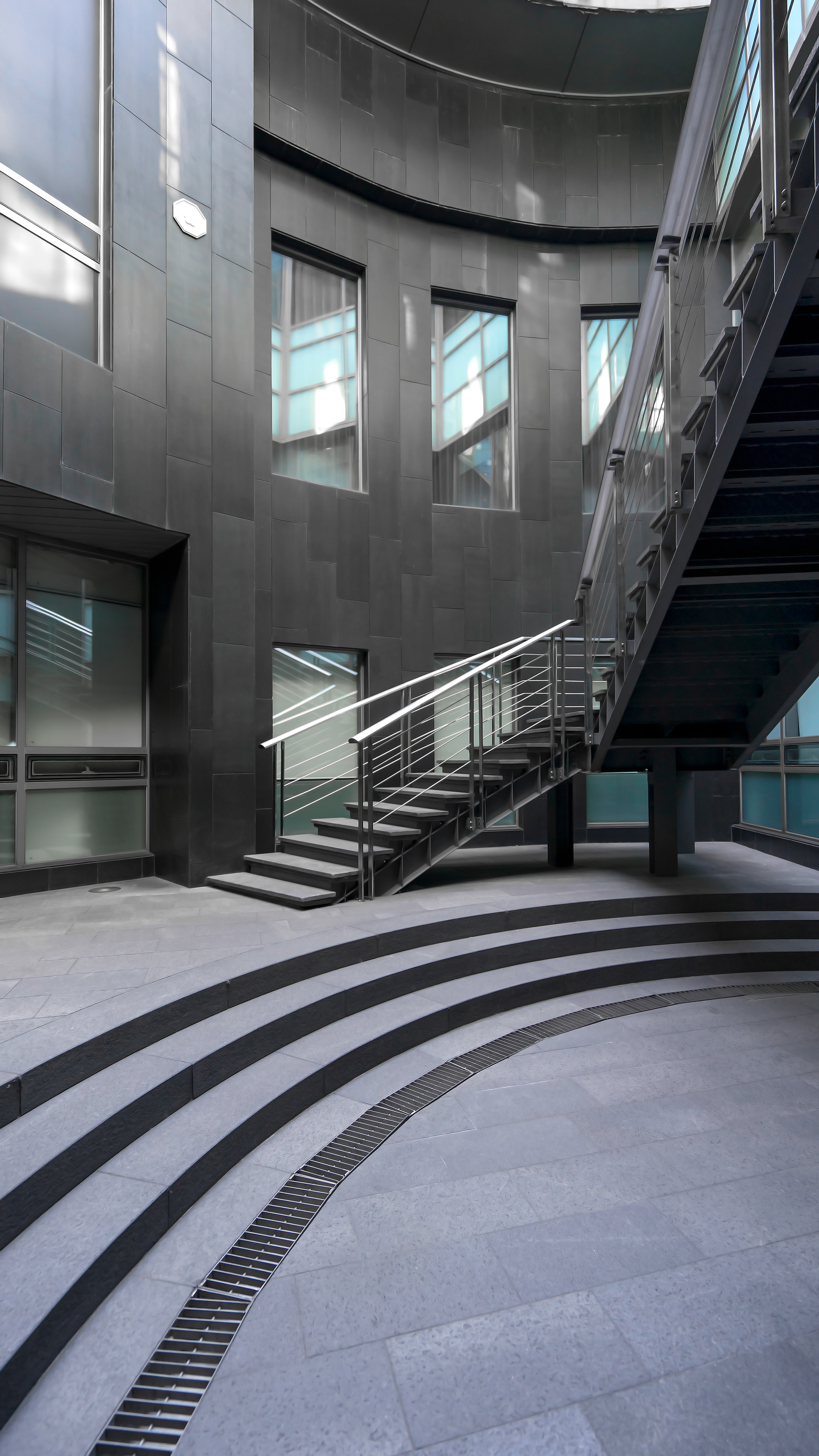
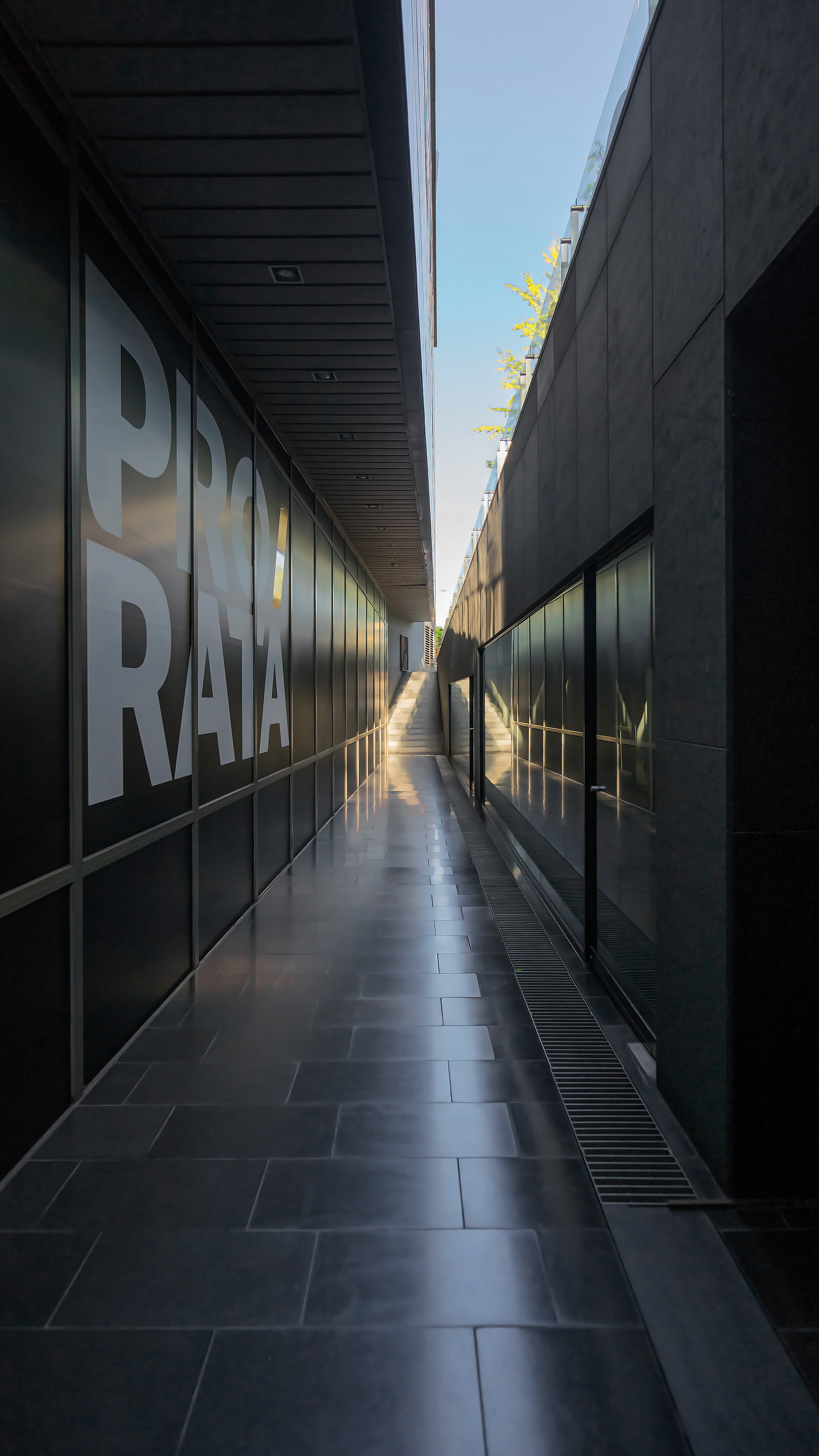
First Floor View And Hallway .
The first floor and hallways of the building have a very geometric structure.
If you follow the road with narrow gaps, the upper part of the building has a glass finish,
and the light coming through the gap is scattered, giving the building a feeling of being a work of art.
There is no common or similar pattern anywhere on the outside.
Each part has a different shape, so it was a look that aroused curiosity about
what kind of space would appear next throughout the passage.
───────────────
Toilet & Elevator .
If you look inside the bathroom, you can see the rhombus-shaped window that
you saw from the exterior of the building.
Unlike the exterior golden finish, the bathroom finish is made of gray and achromatic tones
with partitions and steel to give a sense of unity.
The inside of the art center is designed to give a warm feeling by using daylight lighting,
and the elevator tower is installed with a transparent glass tube inside the spiral staircase
so that the inside can be seen.
Each part has a different color theme to bring out the characteristics of each space well.
───────────────
- Overall Design and Construction Planning -
Yoo Taeyong by THEJE Architects INC .
