───────────────
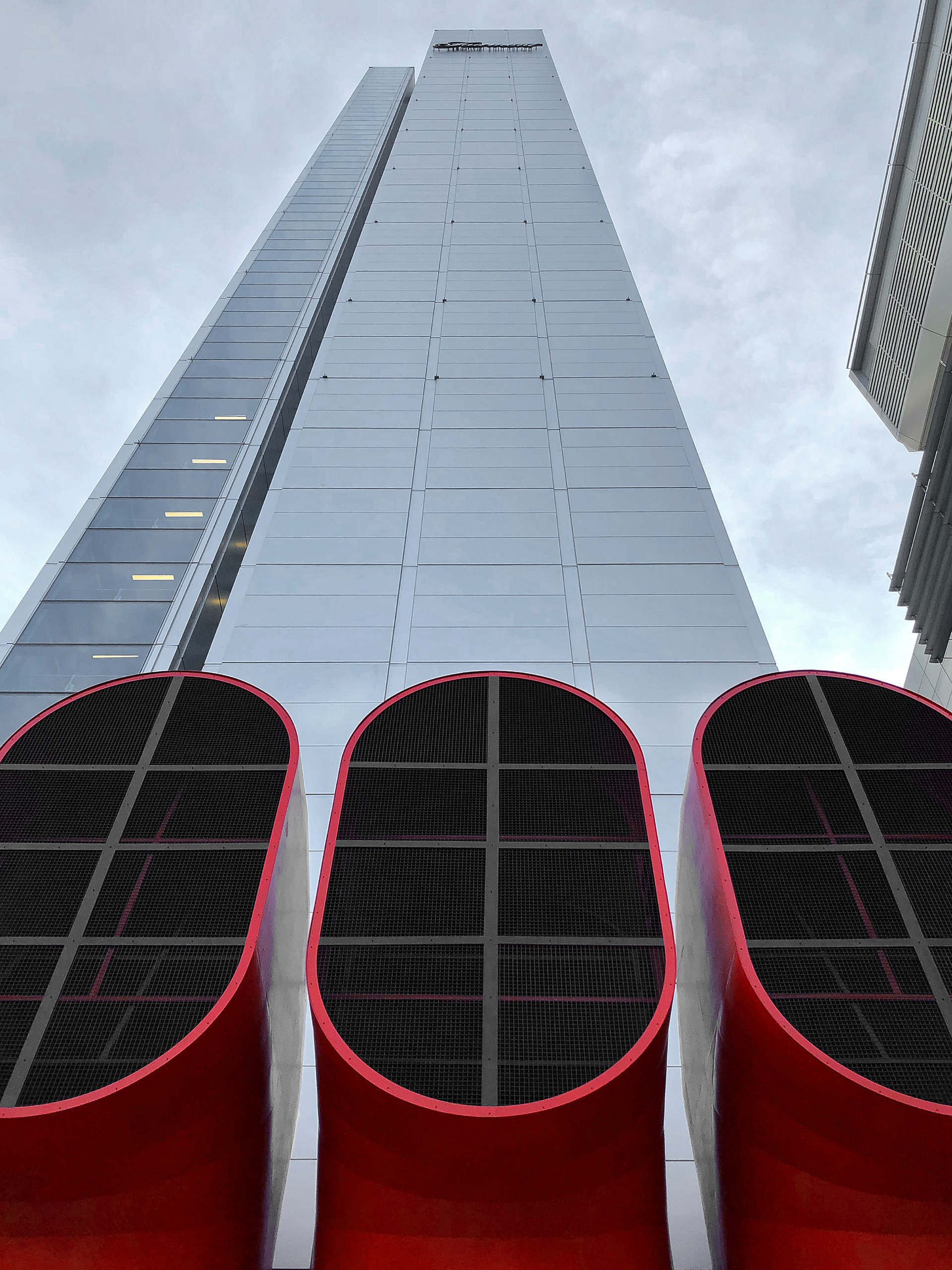
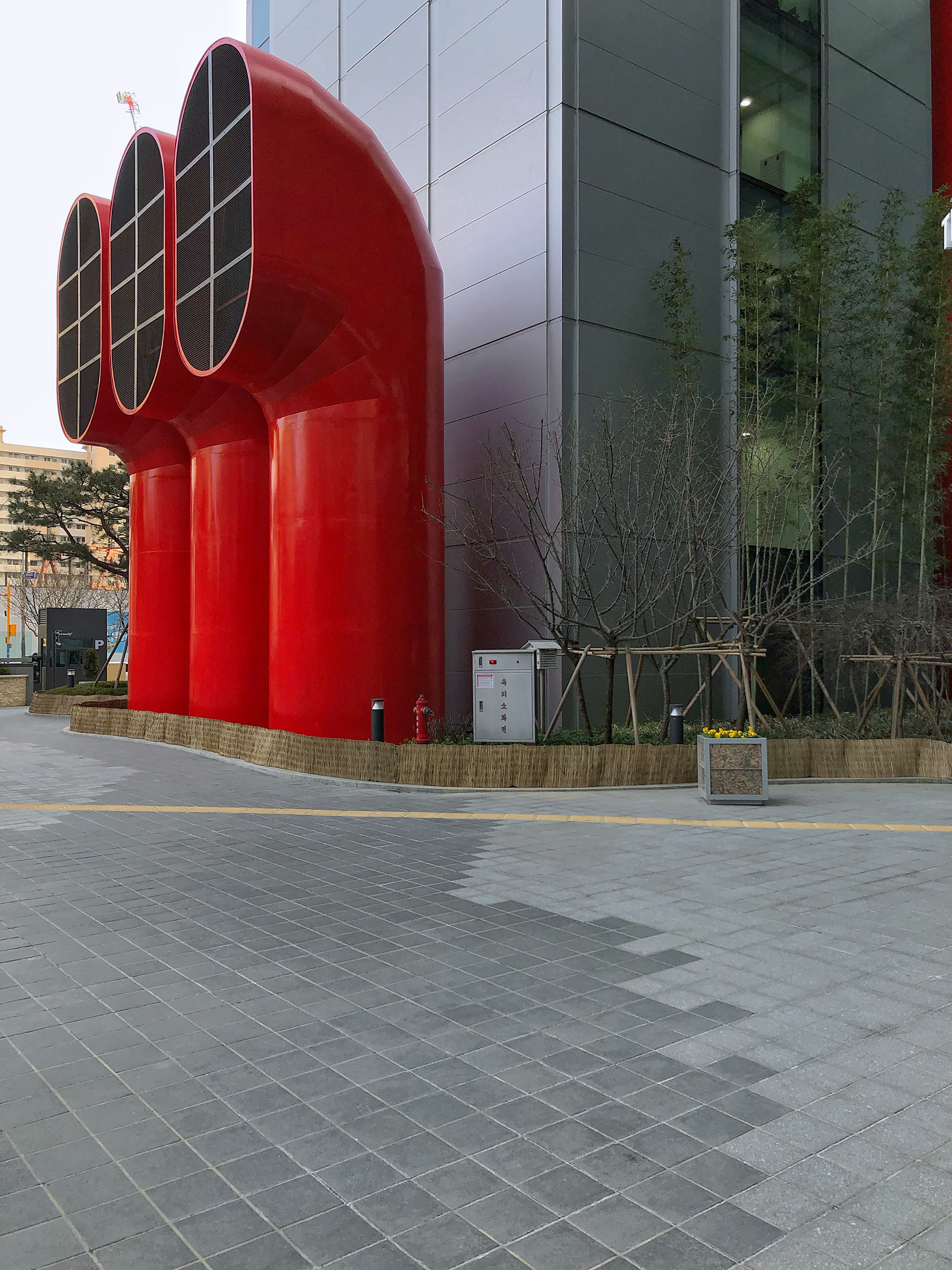
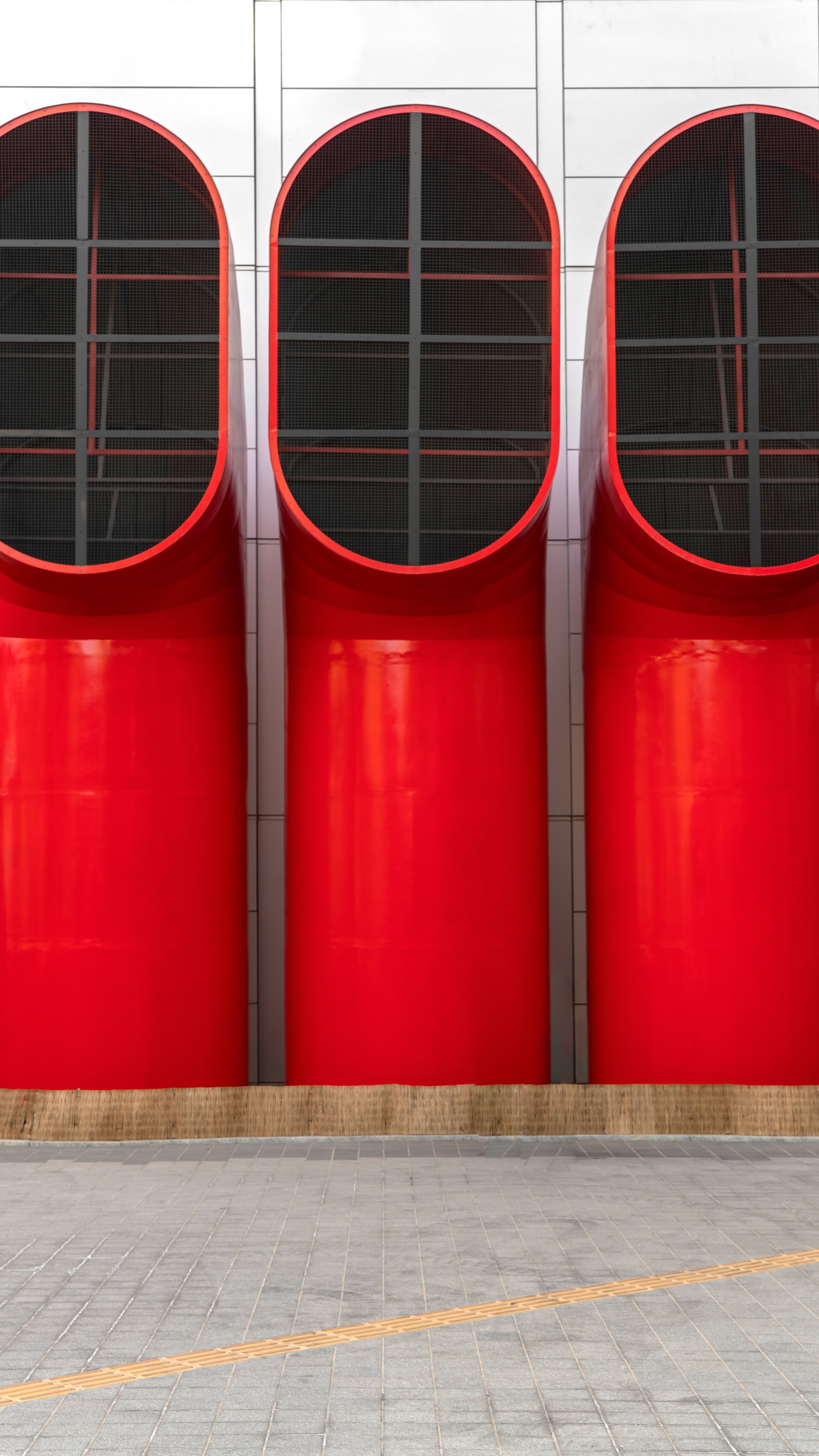
Park One & Big Vent .
The characteristics of the Park One building appear directly from the exterior.
The intense red molding that can be easily seen from afar and the repeated arrangement
of glass and zinc panel materials give it a minimalistic yet clean feel.
As we approached the entrance, the first thing that caught our eye was none other than the underground vent.
In the same way as the red color used on the exterior of the building,
red was applied to the three large vents to achieve a theme without alienation
from the building to such an extent that at first glance,
it could be seen as a sculpture.
───────────────
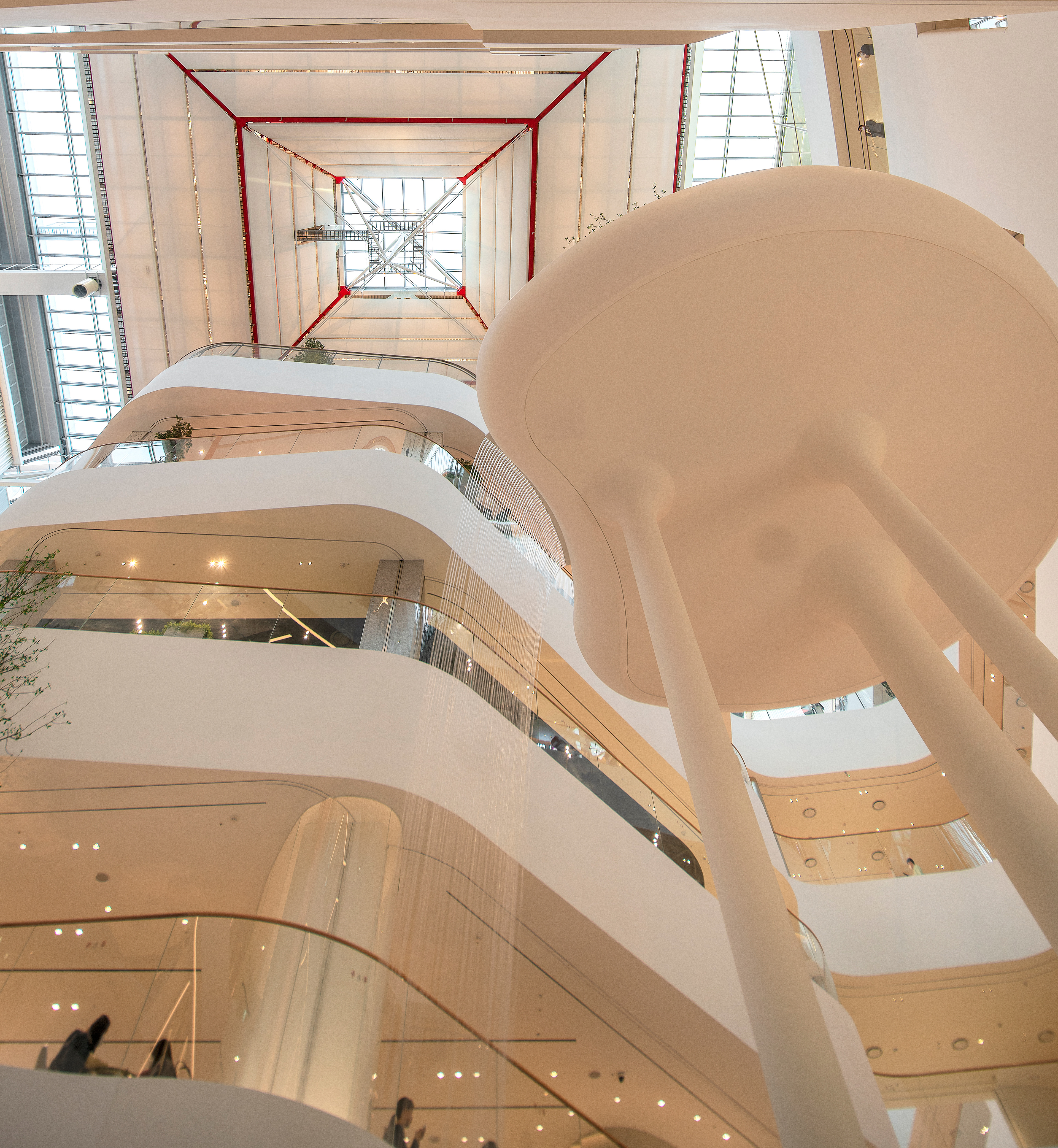

Stairs & Floor Heights .
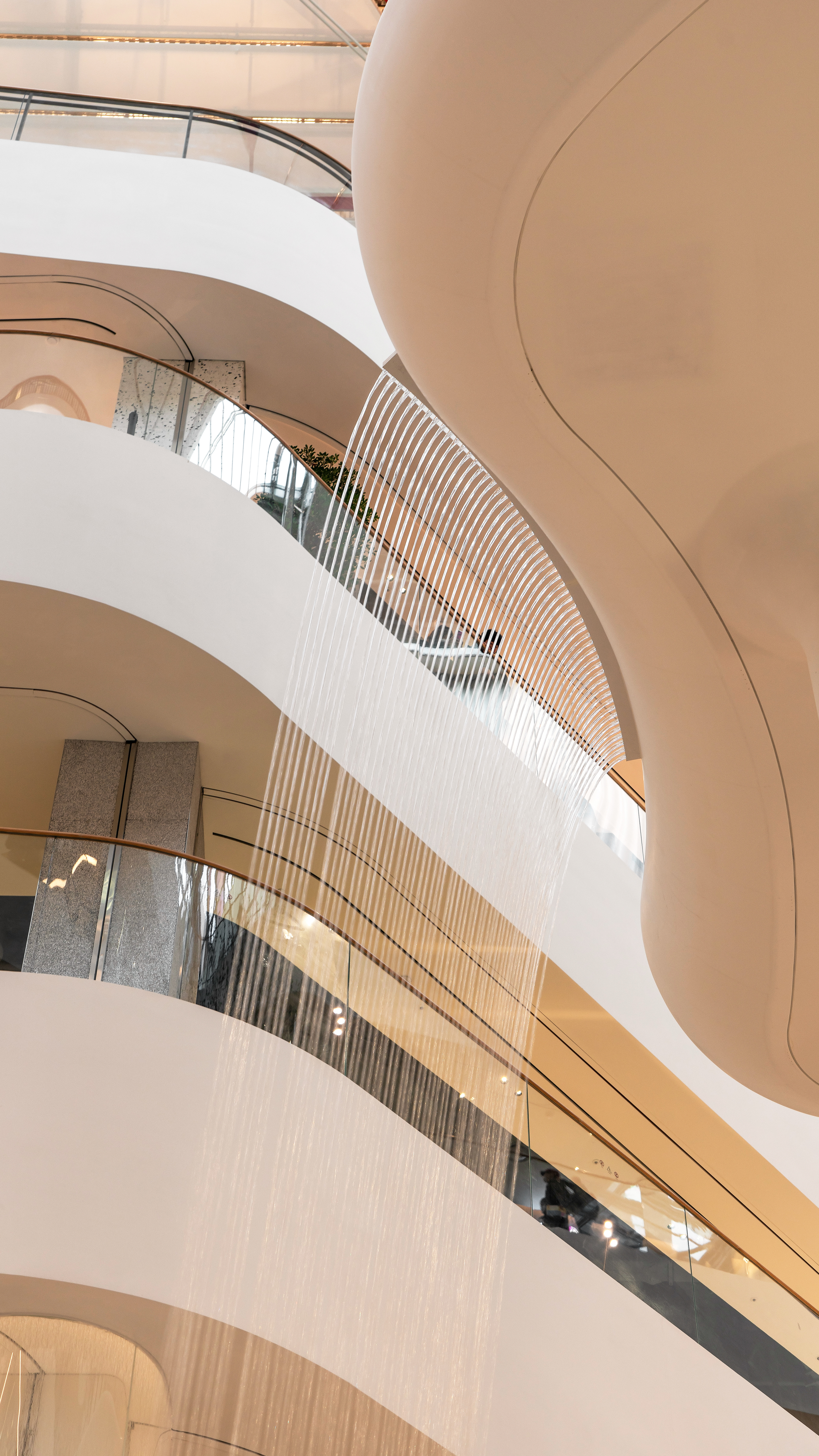
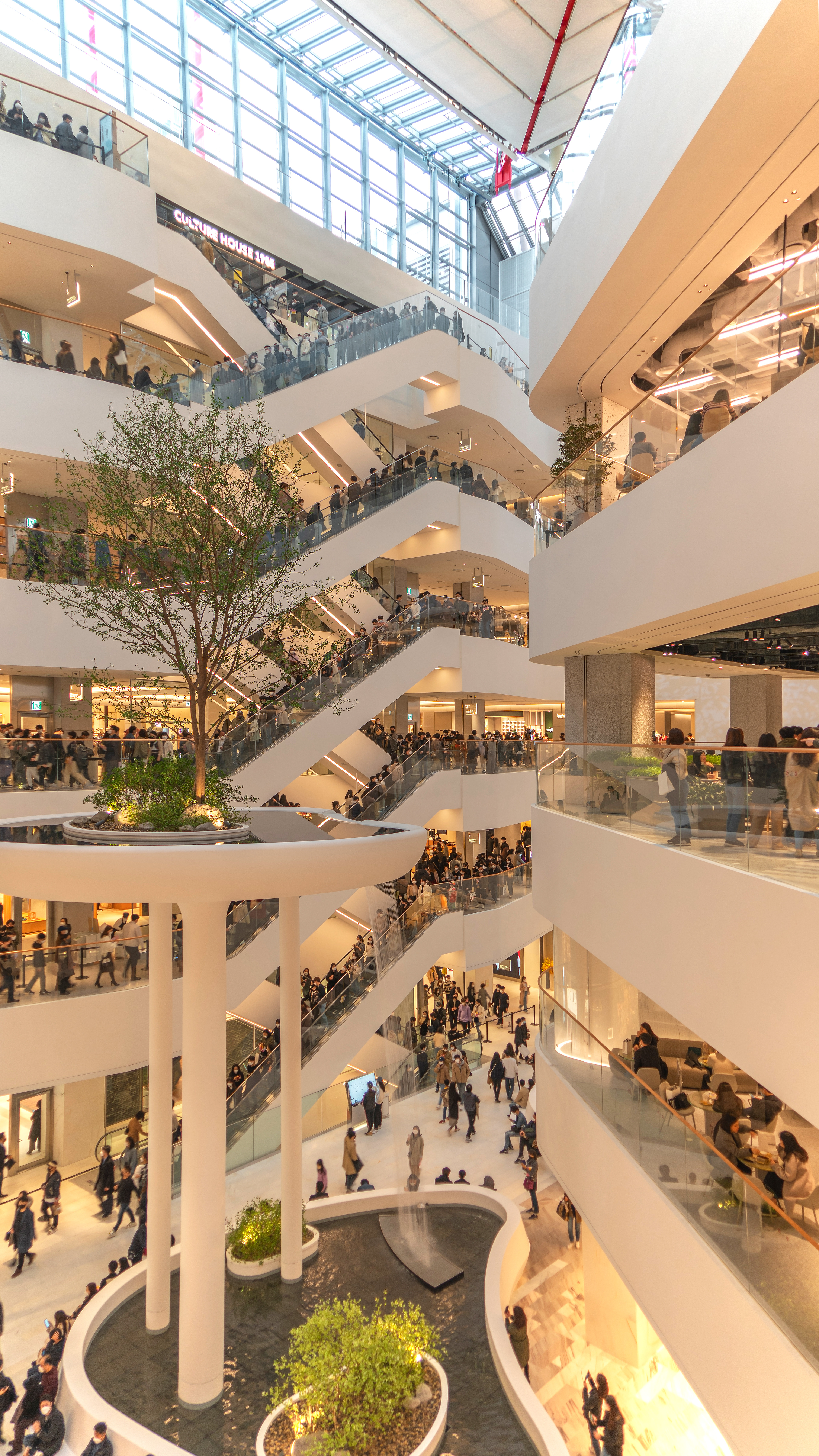
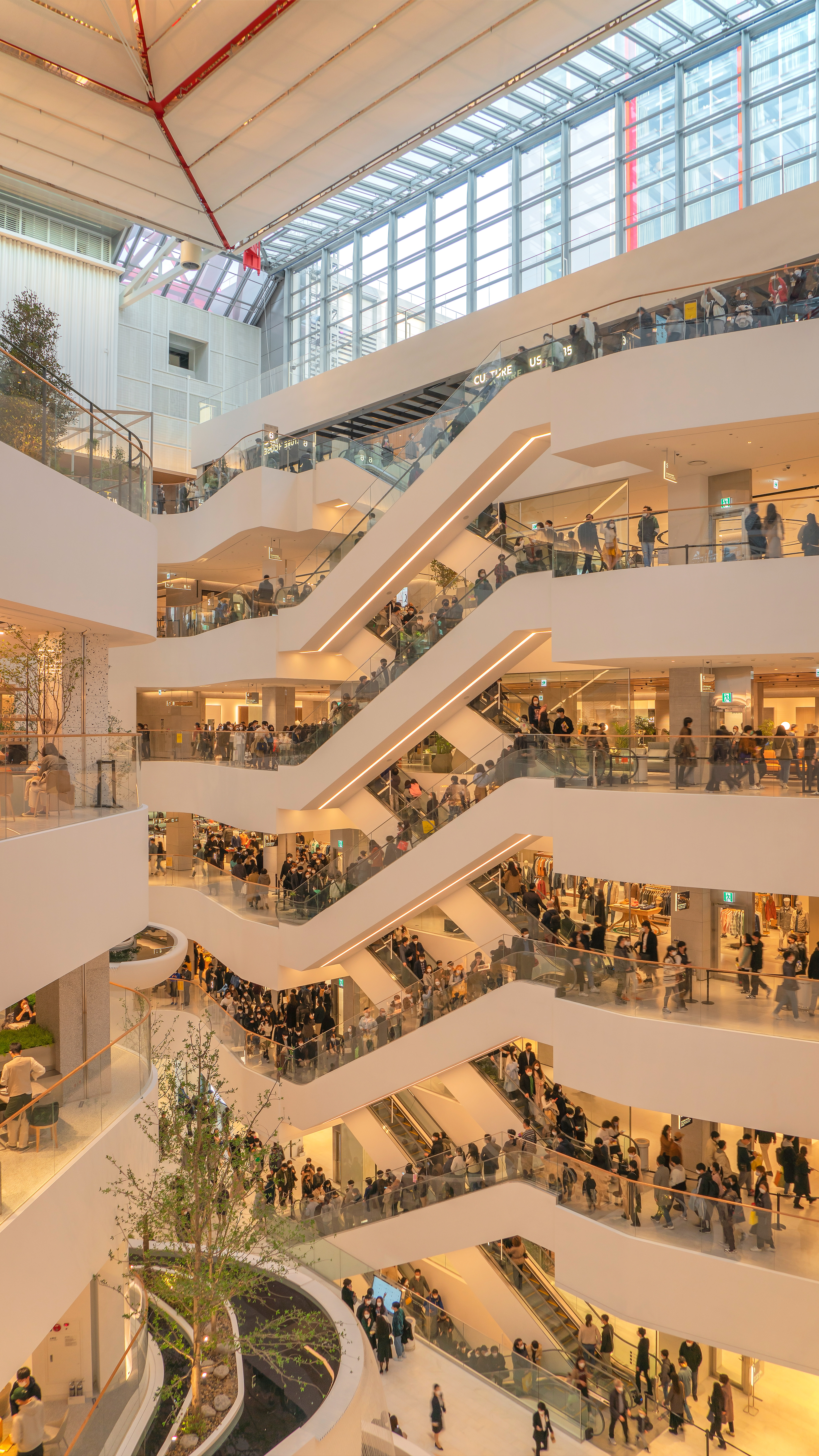
As you enter the interior, you can see the stairs,
floor heights and fountains finished with pure white concrete.
The molding maintains a round shape without sharp or angular places,
and it is difficult to find corners anywhere inside. The fountain,
reminiscent of marshmallows at first glance, is located in the open central hall,
so it is easily visible from anywhere inside the department store.
What is unusual is that the landscaping is installed inside the fountain,
so the appearance of trees living above the fountain is impressive.
The color of the indirect lighting and line lamps are also in the color of light bulbs,
so they blend well with the white concrete background, giving it a warm feeling.
Next to the fountain is the part where hundreds of golden marbles are connected
to the ceiling like a mobile to look like a work of art.
───────────────
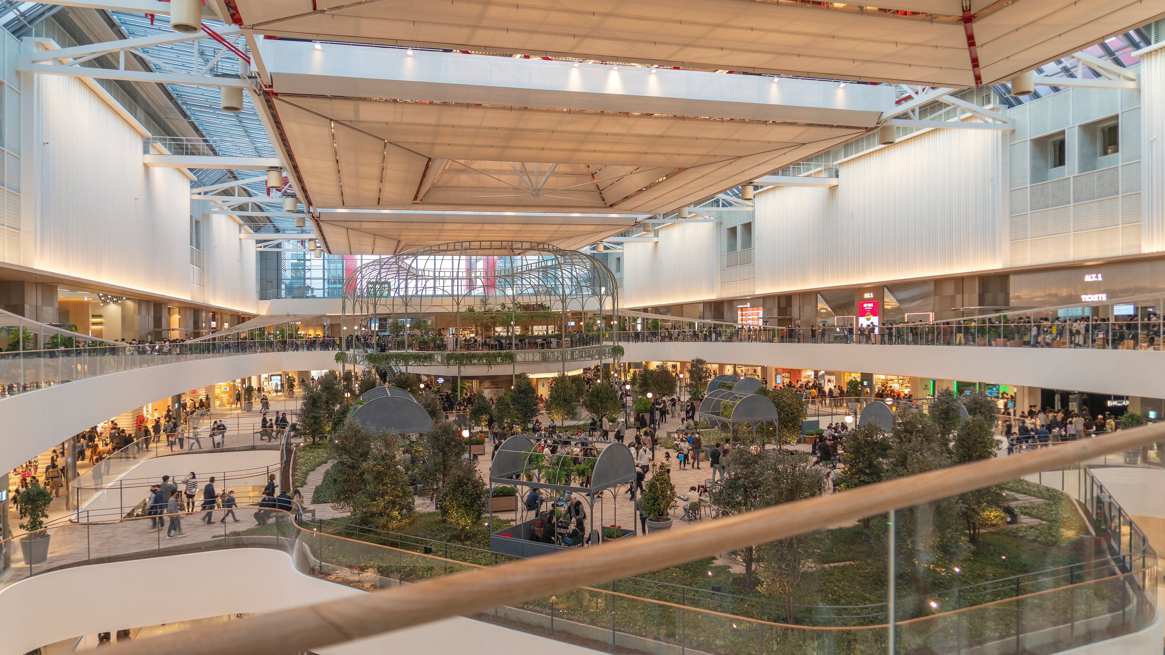
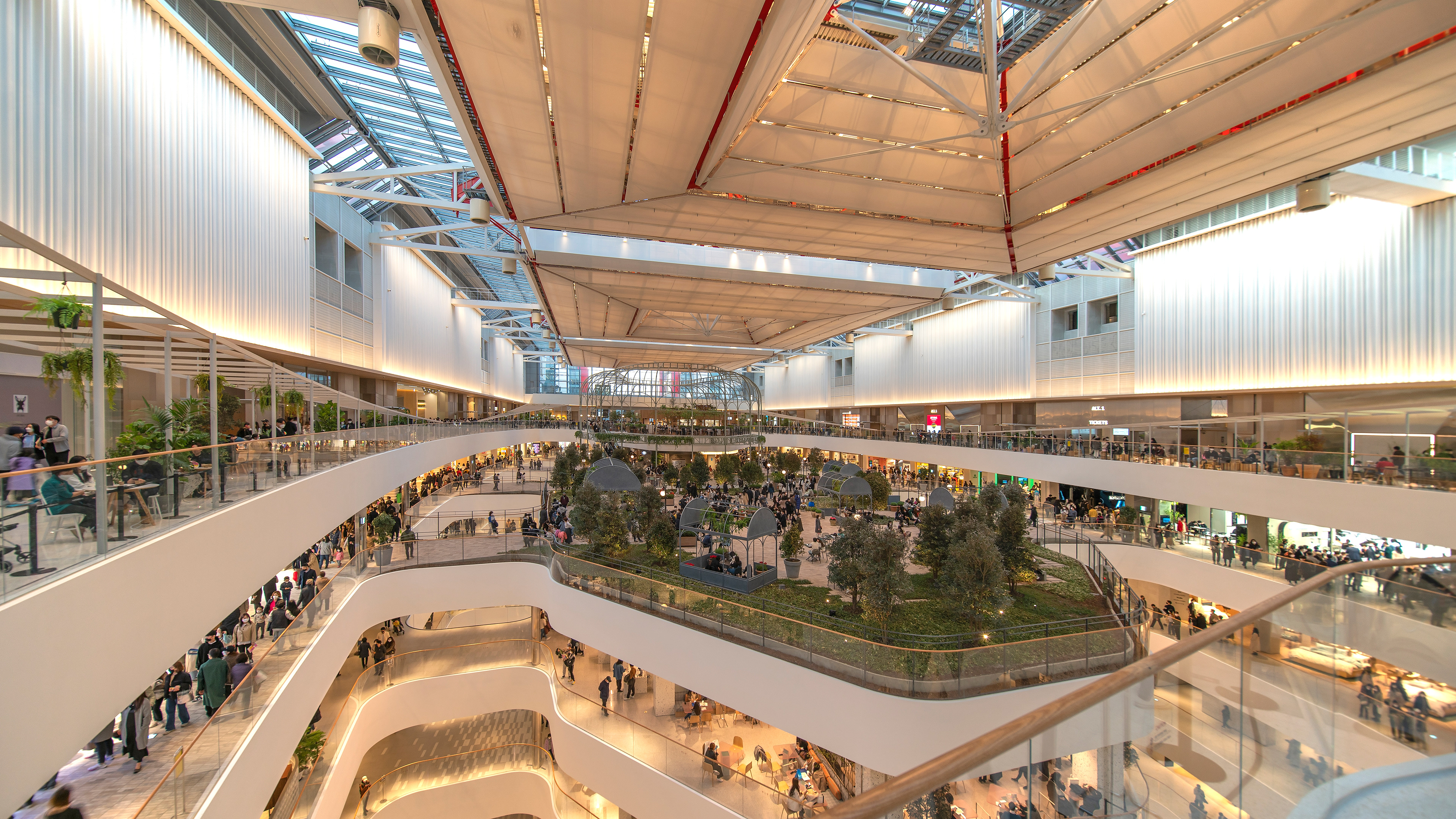

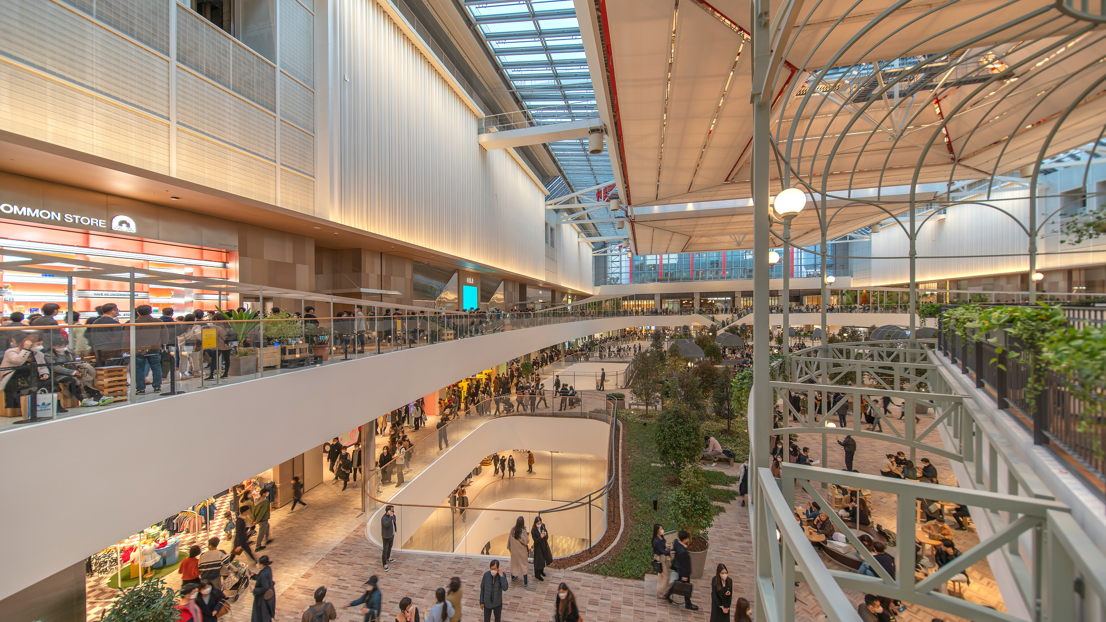
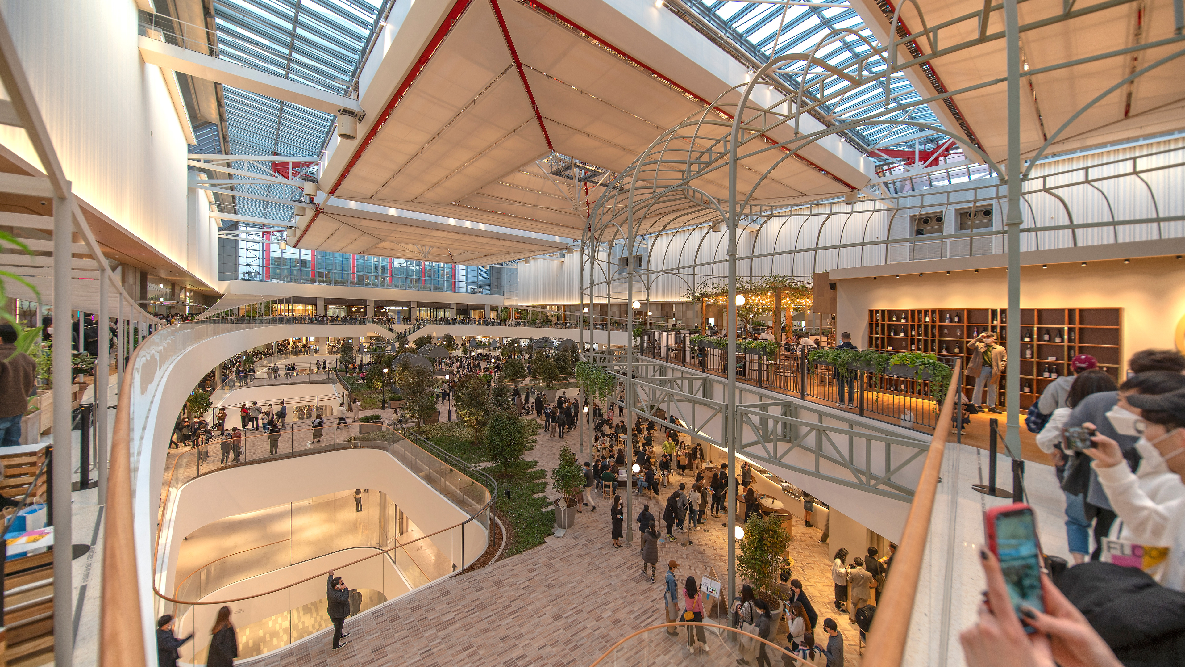
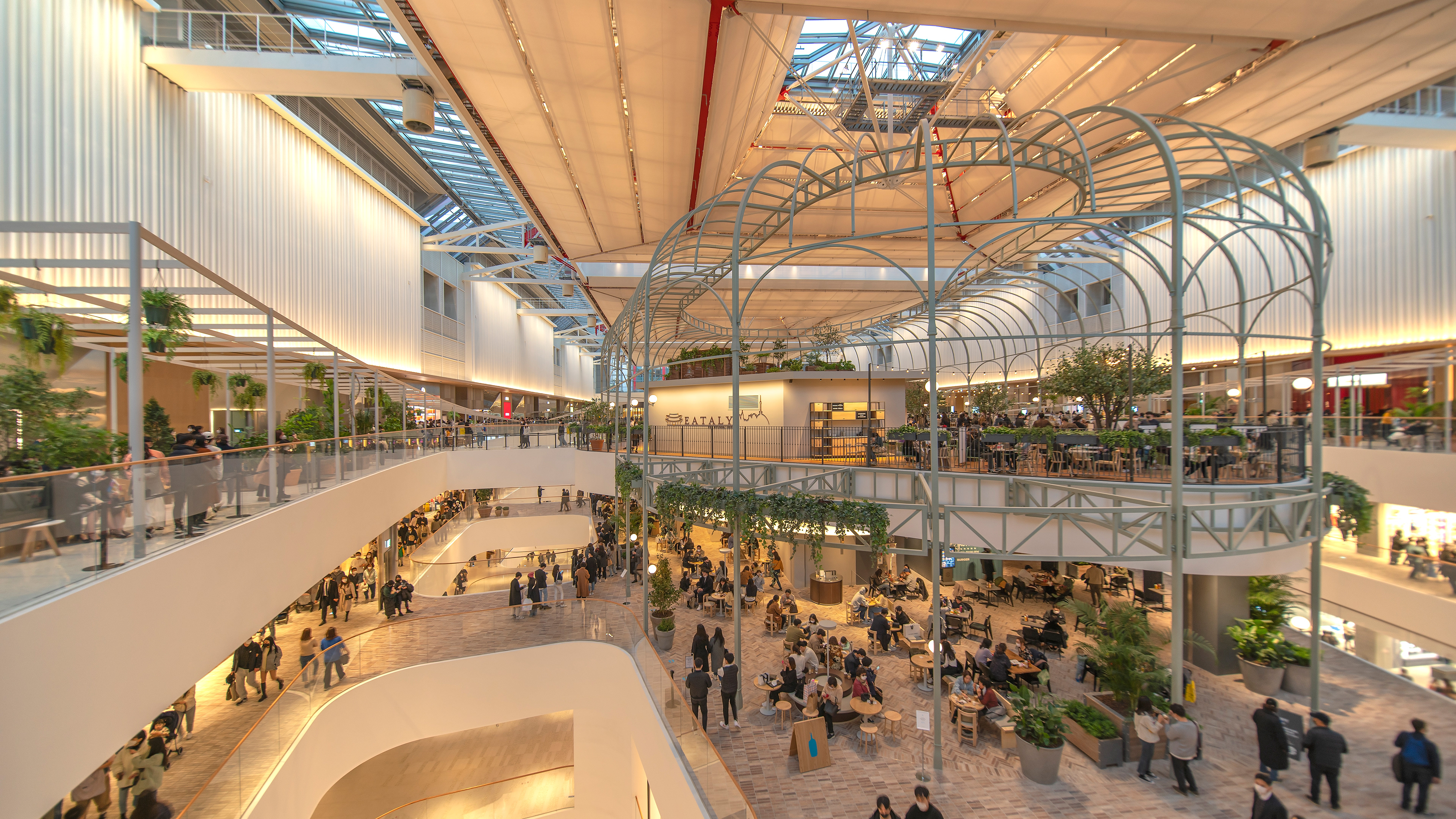
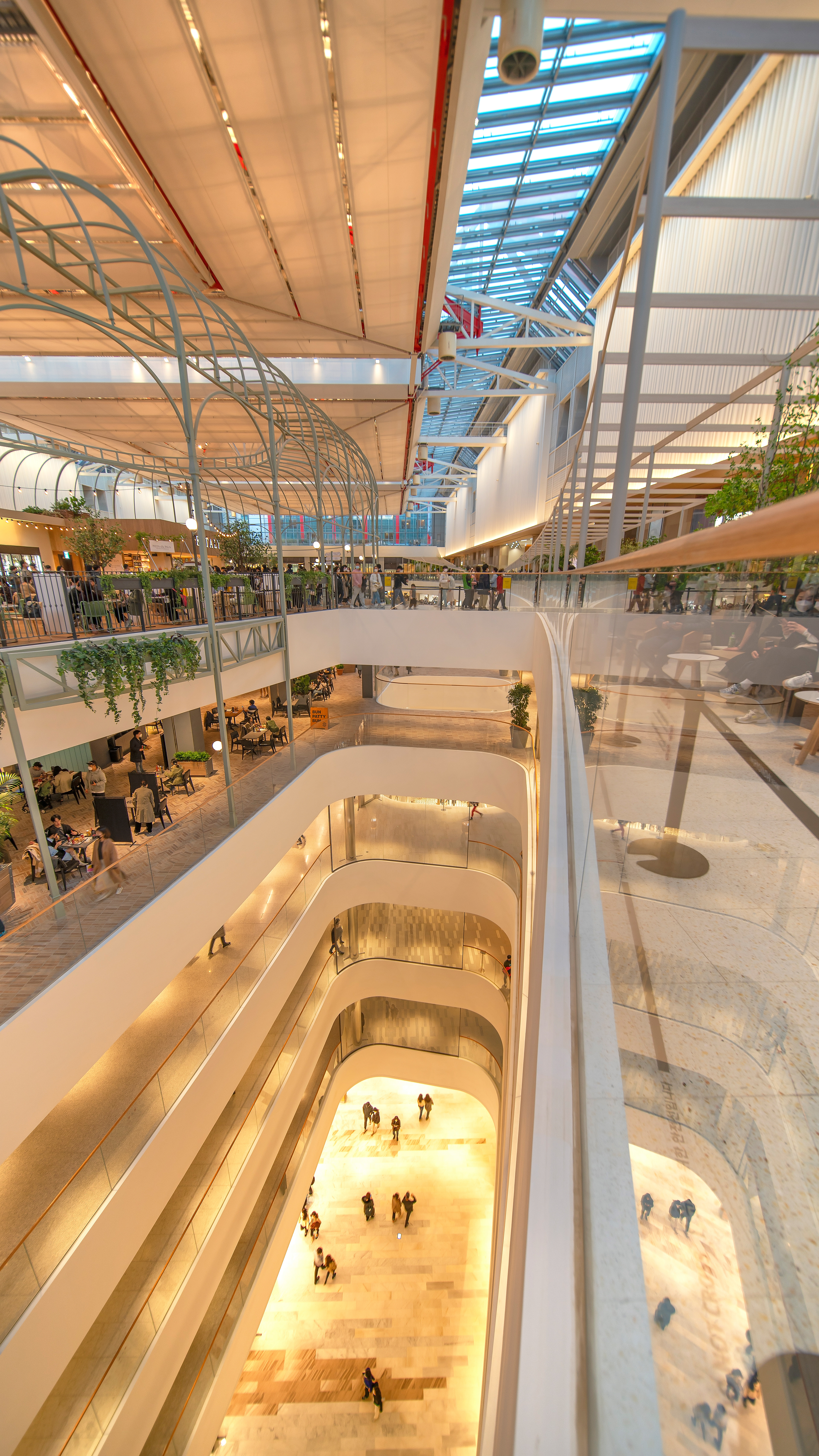
Indoor Landscaping .
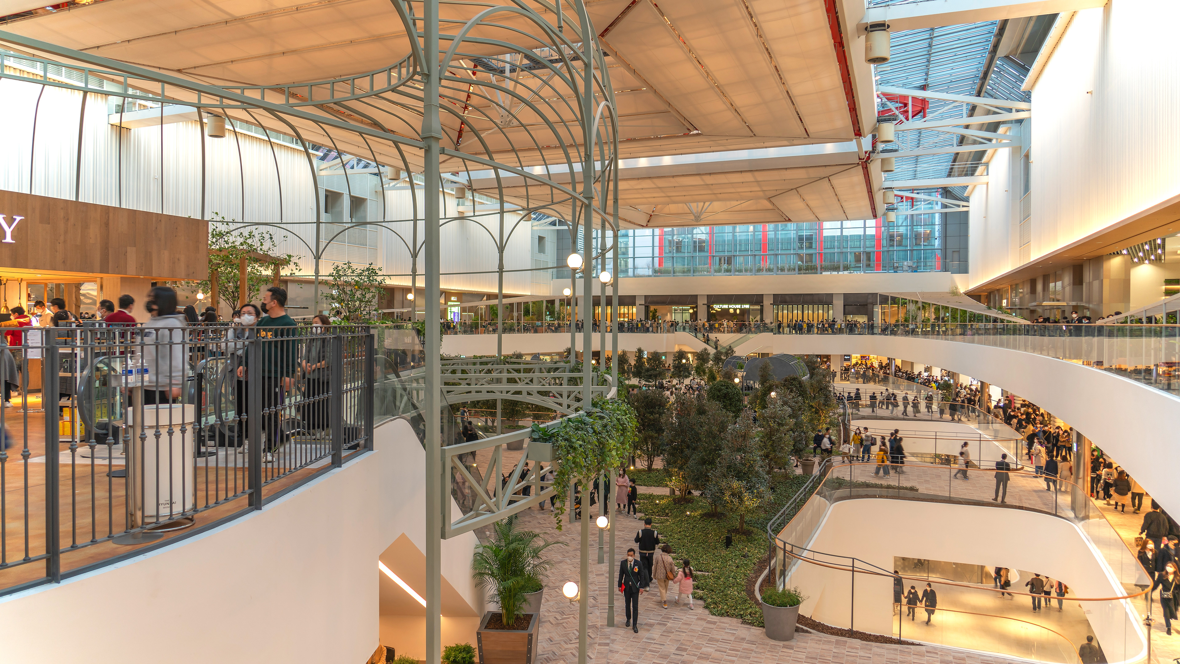
The freshness felt at The Hyundai Seoul is probably thanks to the interior landscaping.
There is a huge garden space in the rest area on the 5th floor,
which was prepared on a large scale so that customers who come
to the department store can take a rest.
Due to the very high ceilings, the feeling of space is really amazing.
It took about ten minutes or more to walk slowly through the garden on the 5th floor and go around it,
creating the illusion of walking in a small park in front of the house.
There are restaurants and cafes all over the garden,
so it is impressive that it is designed so that you can rest comfortably after eating and drinking.
───────────────
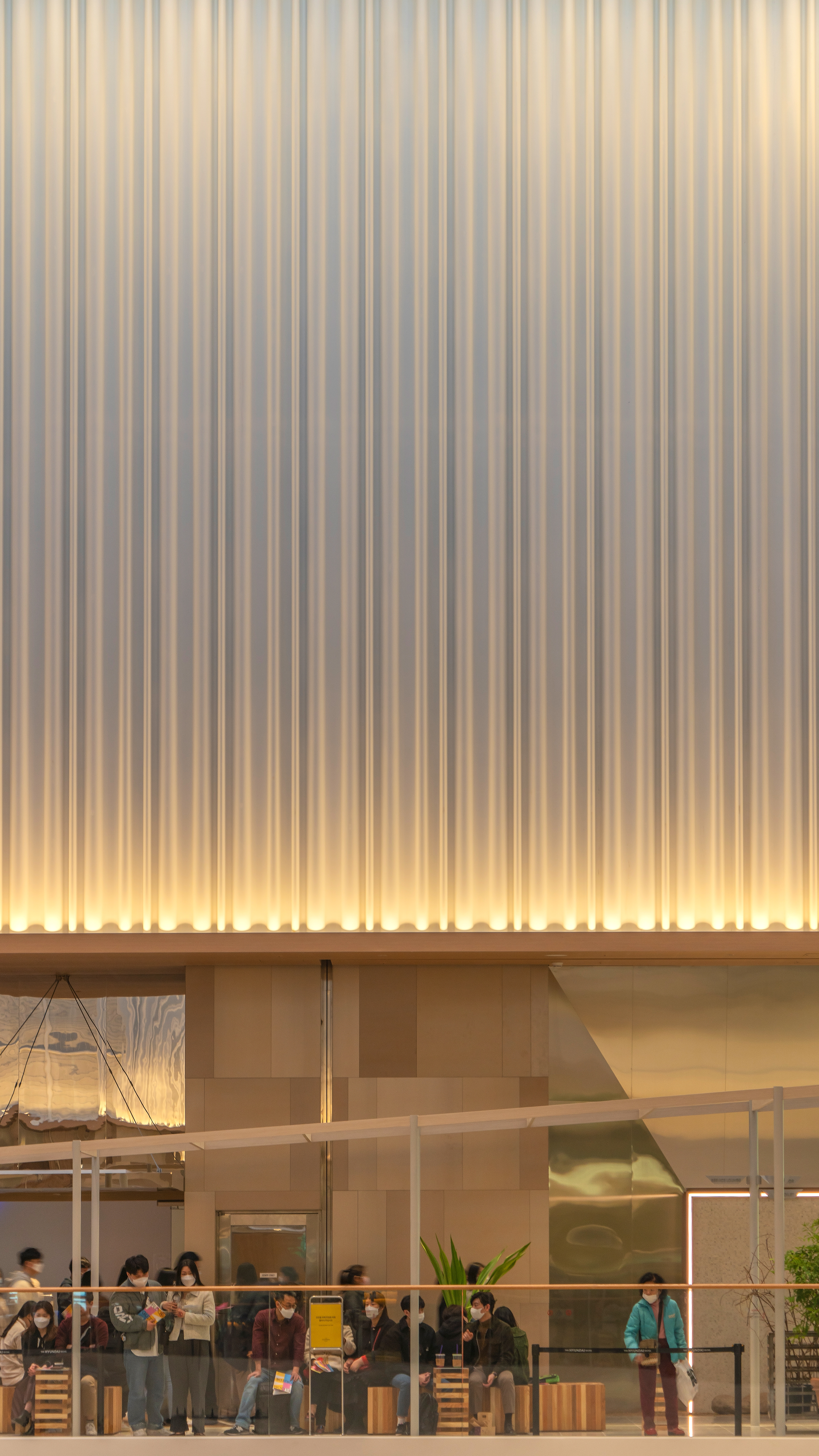


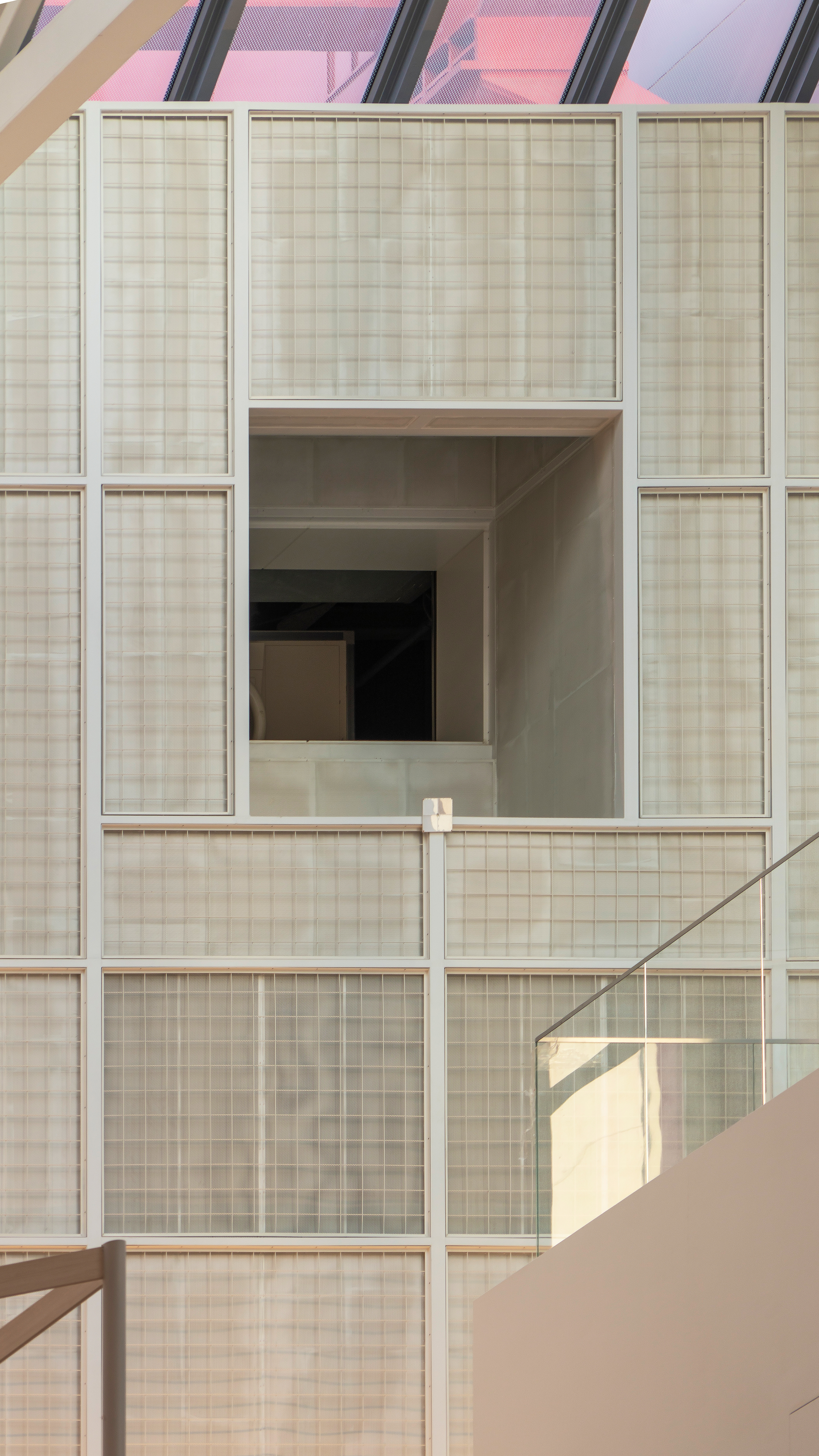
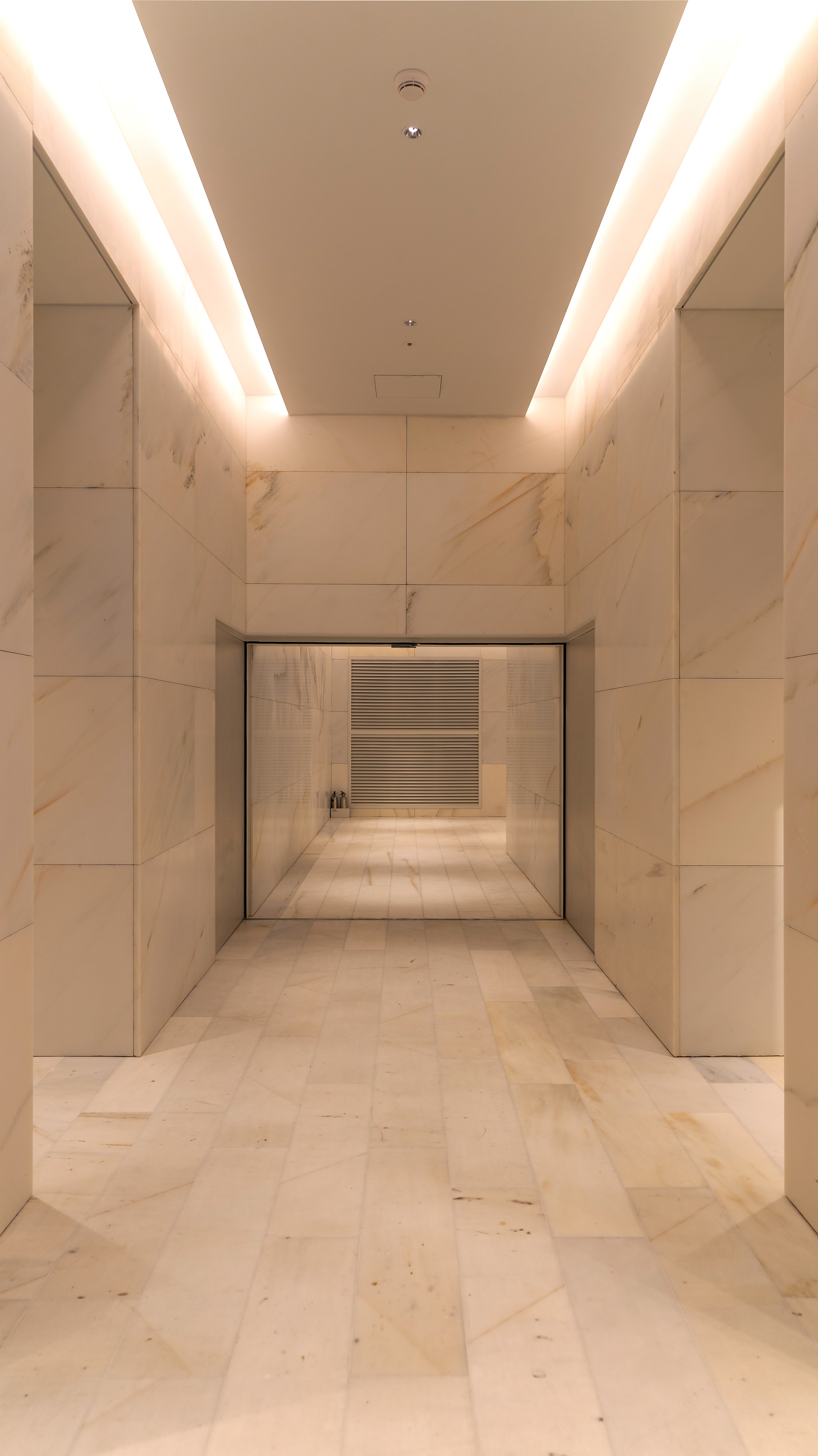
Closeup Detail .
If you look at the ceiling from the garden on the 5th floor,
the vertical wall is finished on the left and right like the outside of the container.
Indirect lighting is placed under the inner wall,
creating a luxurious atmosphere when viewed as a whole.
The floor tiles and the marble interior wall installed
in the middle hallway are enough to enjoy the luxury of a department store.
No matter where you look inside, it is difficult to find awkward or inappropriate materials.
───────────────
" Architecture is responsible for society .
In architecture, people are first, and people are second .
The form of architecture comes from the society it serves .
Architecture does not shape society ."
" 건축은 사회에 대해 책임이 있습니다 .
건축에서는 첫째도 사람, 둘째도 사람입니다 .
건축의 형식은 건축이 섬기는 사회에서 나옵니다 .
건축 형식이 사회를 빚는 것이 아닙니다 . "
- In the words of Richard George Rogers -
